

How to Read Your POS Reports
Two screens answer different questions. The dashboard says how the shop is doing. Reports says what exactly happened.
Both open on a period that is probably not the one you want, so start there.
Step 1: Start on the dashboard
Section titled “Step 1: Start on the dashboard”Go to DevDiggers Plugins → MultiPOS → Dashboard.
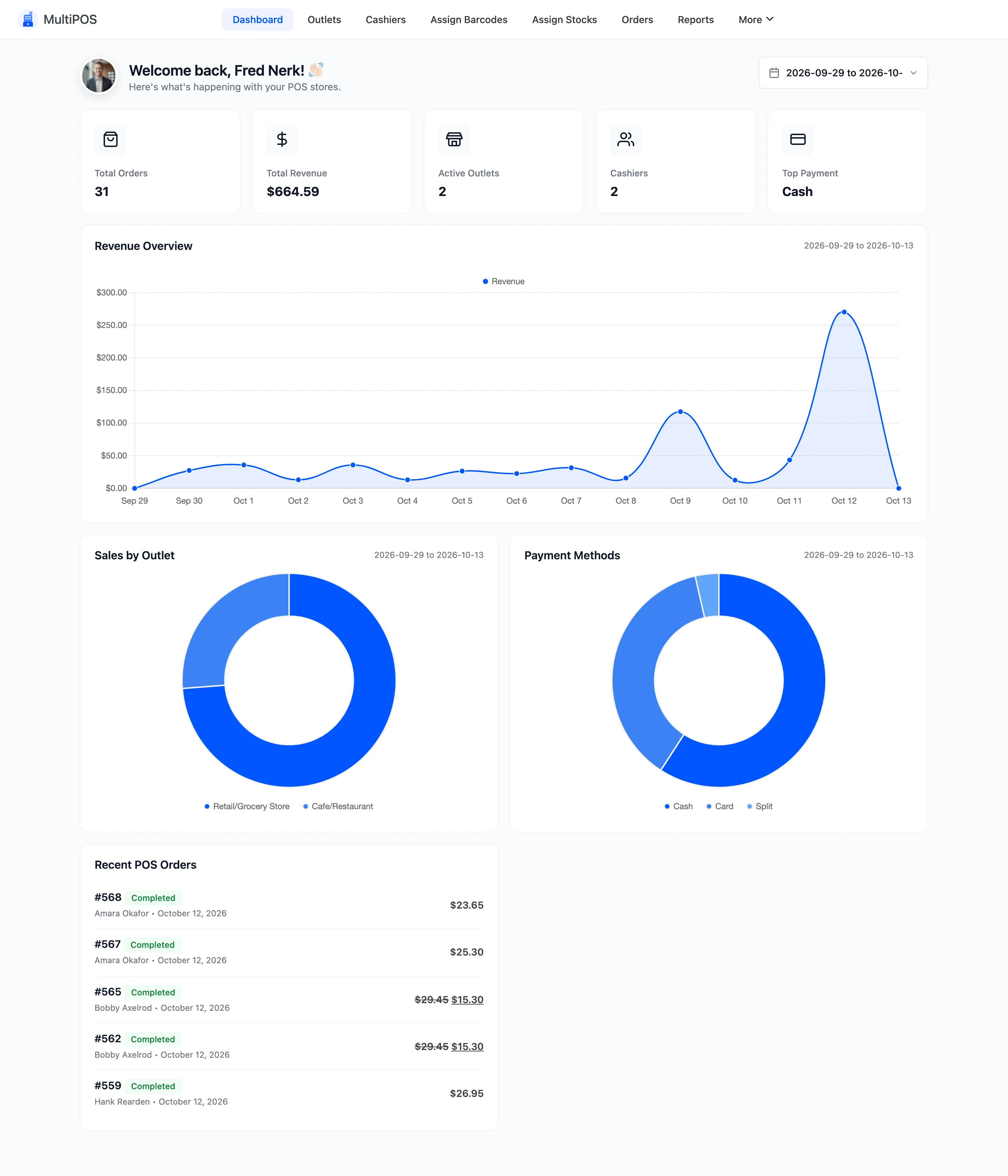
The date selector at the top right sets the period for everything on the screen. It defaults to This Month.
Widen it before you conclude anything. A row of zeros almost always means the data is outside the window, not that the POS took nothing.
Step 2: Read the summary cards
Section titled “Step 2: Read the summary cards”
- Total Orders and Total Revenue each carry a percentage against the previous period of the same length, which is the number worth reading. An absolute figure tells you little without one.
- Top Payment is the method that took the most money.
Step 3: Read the revenue chart
Section titled “Step 3: Read the revenue chart”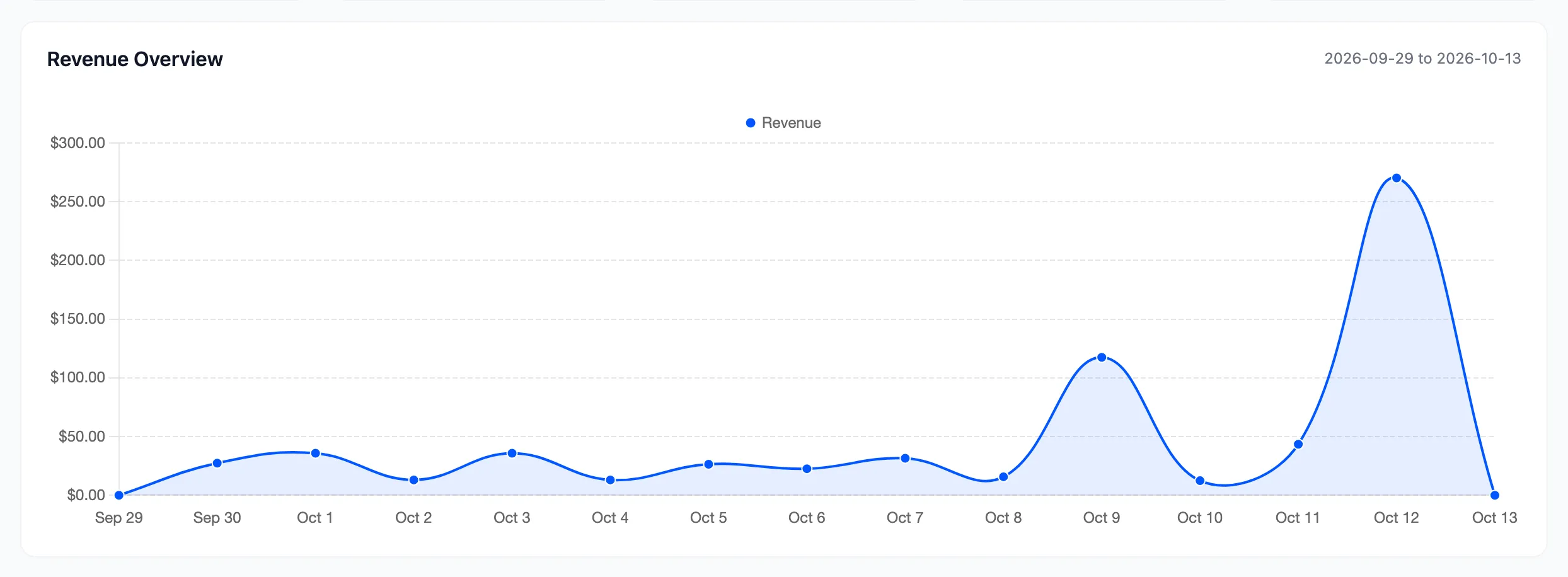
The shape matters more than the total. A flat line with one spike is a promotion. A steady climb is a trend. A cliff is worth investigating the same day.
Step 4: Read the payment split
Section titled “Step 4: Read the payment split”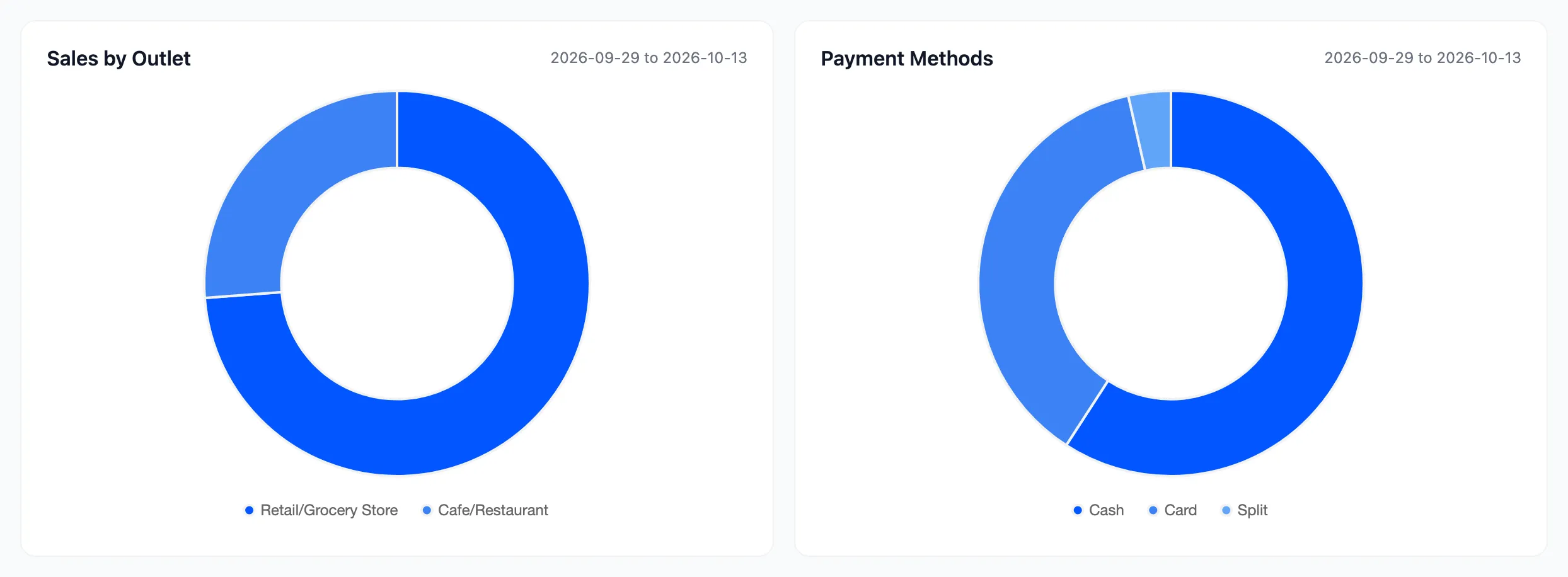
The ring chart splits sales by method. This is the panel to check before deciding whether a card terminal earns its rental, and before assuming everyone pays by card now.
Step 5: Check the recent orders
Section titled “Step 5: Check the recent orders”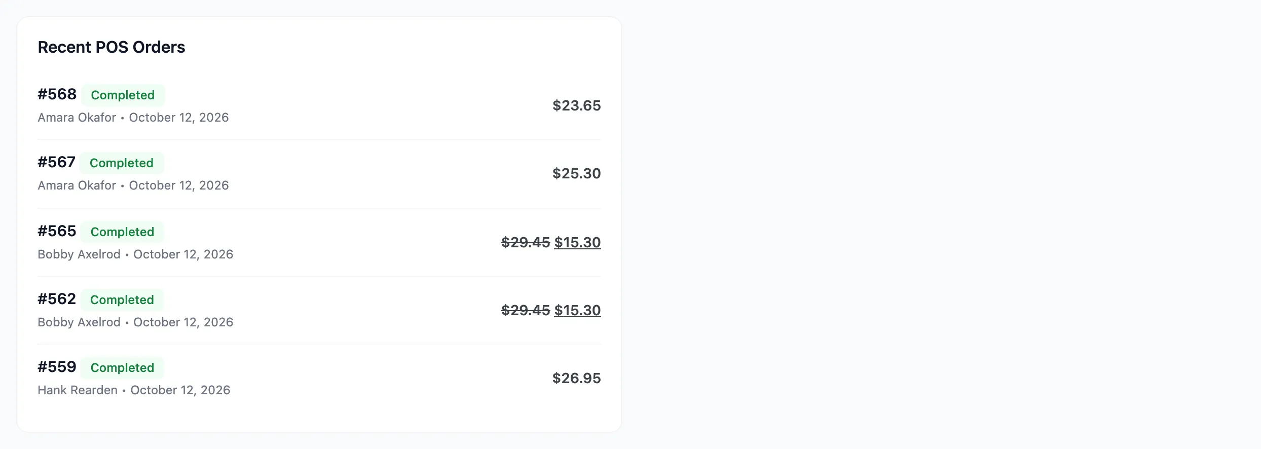
The last few sales with their status and total. Useful for a quick check that the POS is running, not for analysis.
Step 6: Open Reports for detail
Section titled “Step 6: Open Reports for detail”Go to DevDiggers Plugins → MultiPOS → Reports.
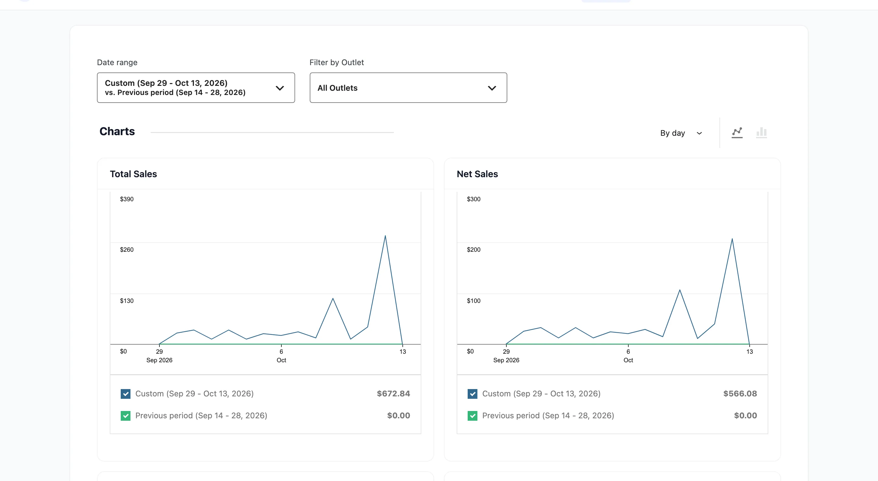
Set the range first.

Date range takes presets or a custom range, and vs. picks the comparison: the previous period or the previous year. Filter by Outlet narrows to one location.
It opens on Month to date, so the same widening rule applies.
Step 7: Work through the five chart pairs
Section titled “Step 7: Work through the five chart pairs”Total Sales and Net Sales
Section titled “Total Sales and Net Sales”Total Sales is everything taken. Net Sales is what survives discounts, refunds, tax and shipping.
Net Sales is the number to plan on. Total Sales is the number to feel good about.
Orders and Average Order Value
Section titled “Orders and Average Order Value”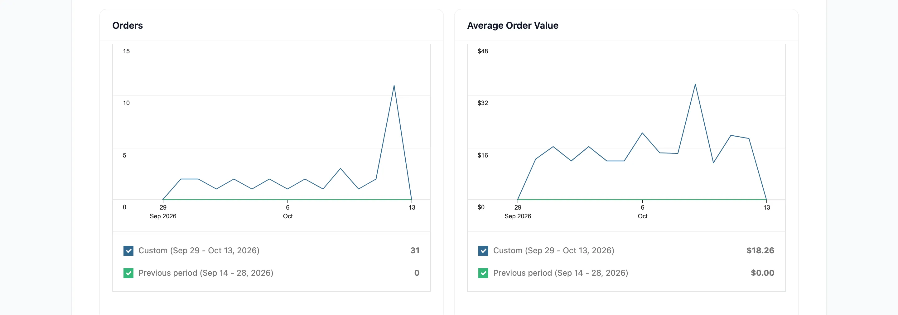
Read the pair together. Fewer orders with a higher average is a different problem from fewer orders at the same average. The first is a footfall problem. The second is both.
Items Sold and Returns
Section titled “Items Sold and Returns”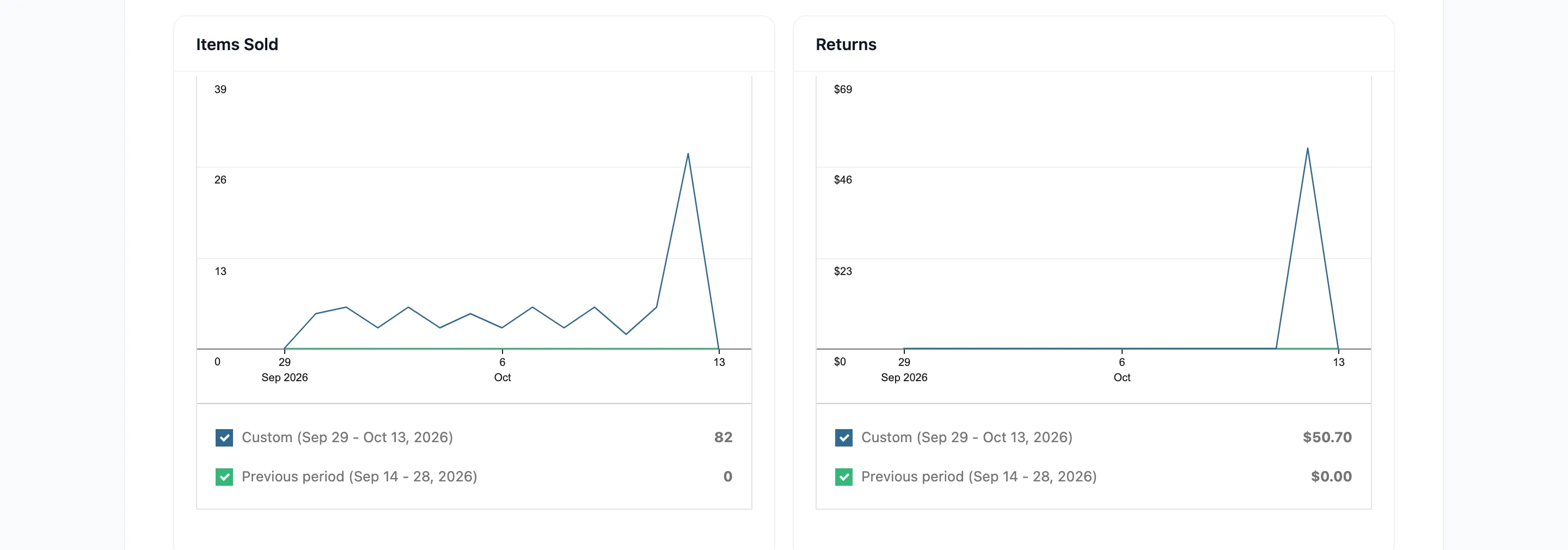
- Items Sold counts line-item quantities rather than orders, so it moves with basket size.
- Returns climbing on one product is usually a sizing or description problem, and this is where you see it before the reviews do.
Discounted Orders and Gross Discounted
Section titled “Discounted Orders and Gross Discounted”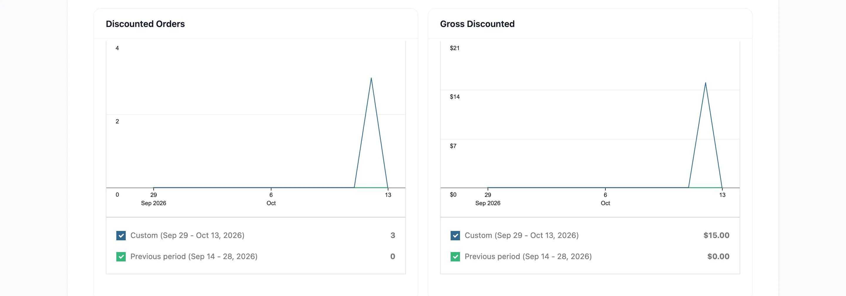
Discounted Orders is how many orders carried a coupon. Gross Discounted is what those coupons cost.
Together they tell you whether a promotion was used widely and cheaply, or narrowly and expensively. A code redeemed twice for a large amount is worth a different conversation from one redeemed two hundred times.
Read them as coupon charts, not discount charts. They come from WooCommerce’s coupon records, so a manual discount a cashier typed in is in neither. If your staff discount by hand, these two numbers understate what was given away and there is no chart that does not.
Total Tax and Order Tax
Section titled “Total Tax and Order Tax”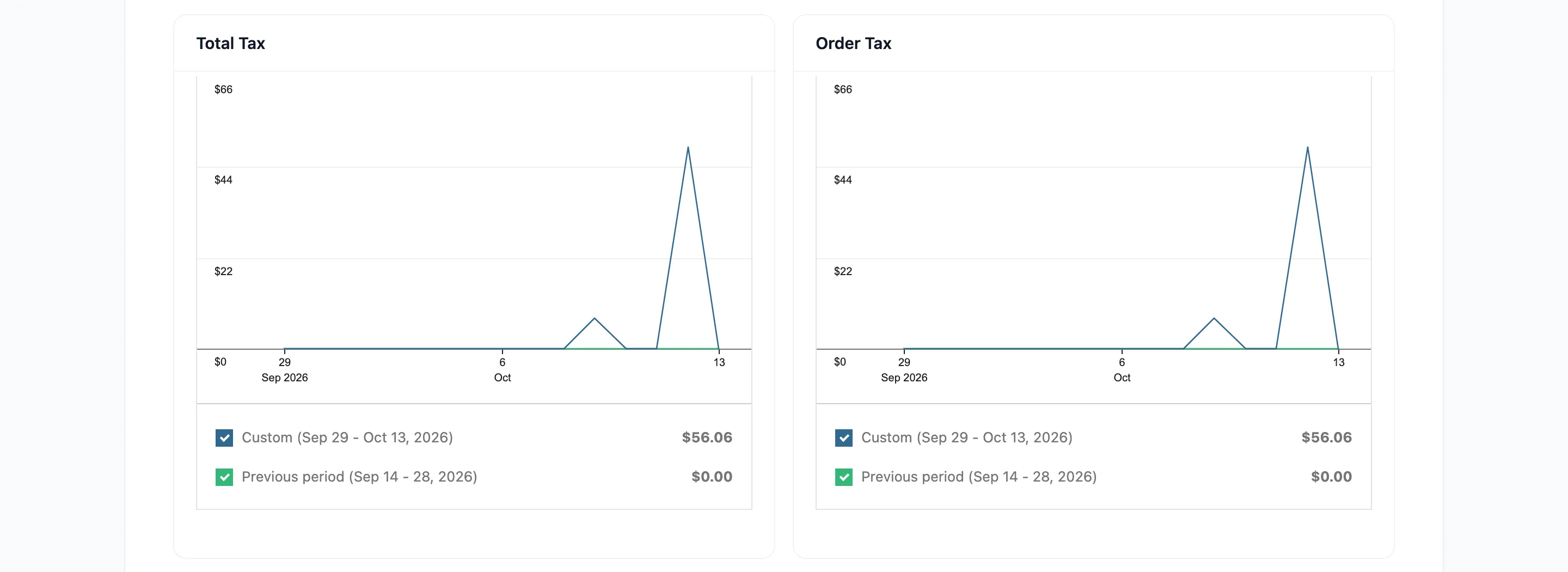
Total Tax is all tax collected. Order Tax is the part charged on goods rather than shipping.
These are the figures your accountant asks for. Pro exports them to CSV.
Reports do not cover the drawer
Section titled “Reports do not cover the drawer”None of this checks the cash. For that you want the transactions list, which is per payment rather than per order.
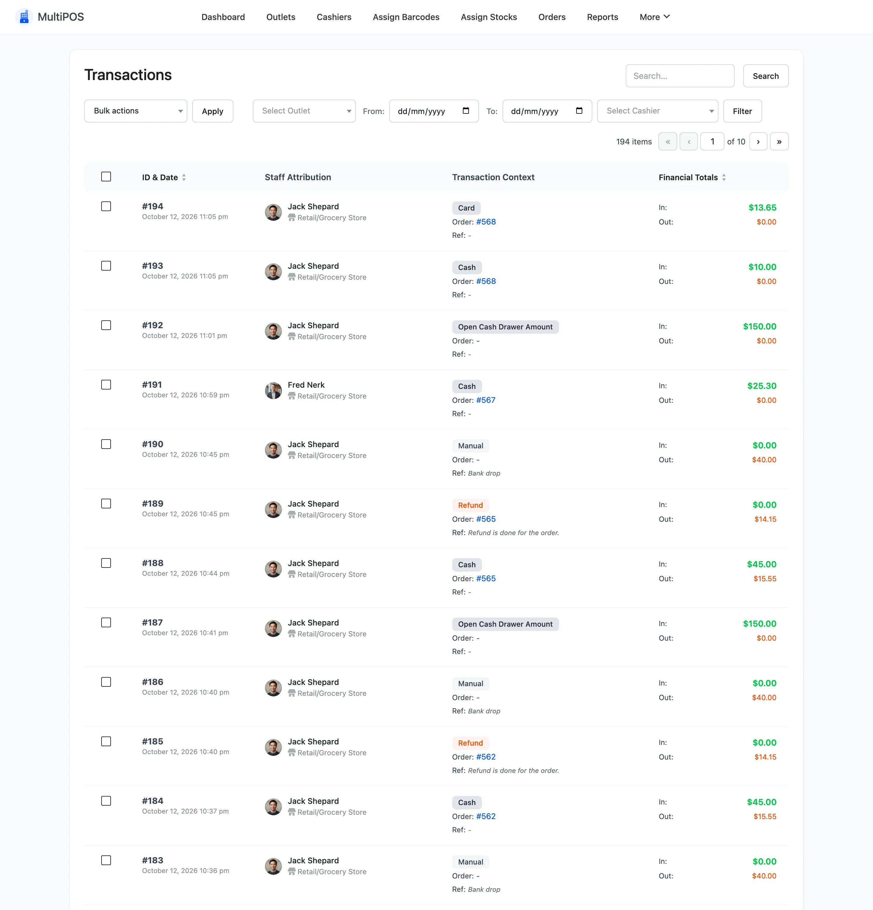
See How to Close the Register (Pro).
Where to go next
Section titled “Where to go next”- Reports for the screen reference.
- Dashboard Overview
- Transactions