

Layout Settings
The Layout tab styles the terminal itself. It does not touch your storefront, your theme or the WordPress admin.
Almost all of it is free. Two fields under Product Display and Product Details are Pro, and both are marked on the screen.
Open the tab
Section titled “Open the tab”Go to DevDiggers Plugins → MultiPOS → Configuration → Layout.
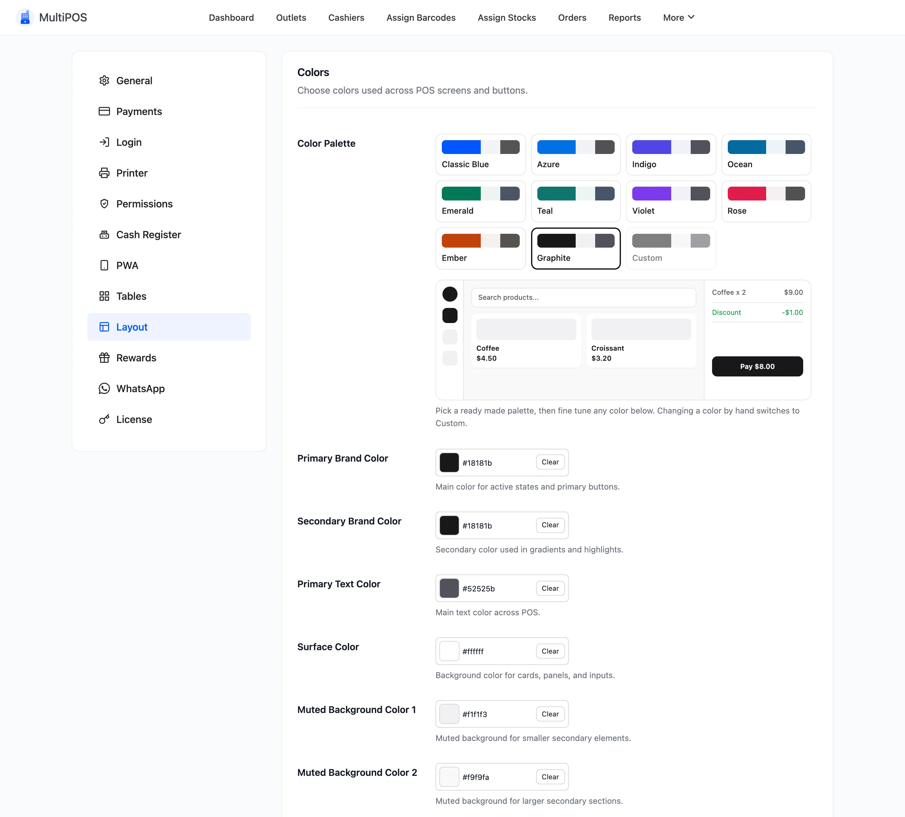
Colors
Section titled “Colors”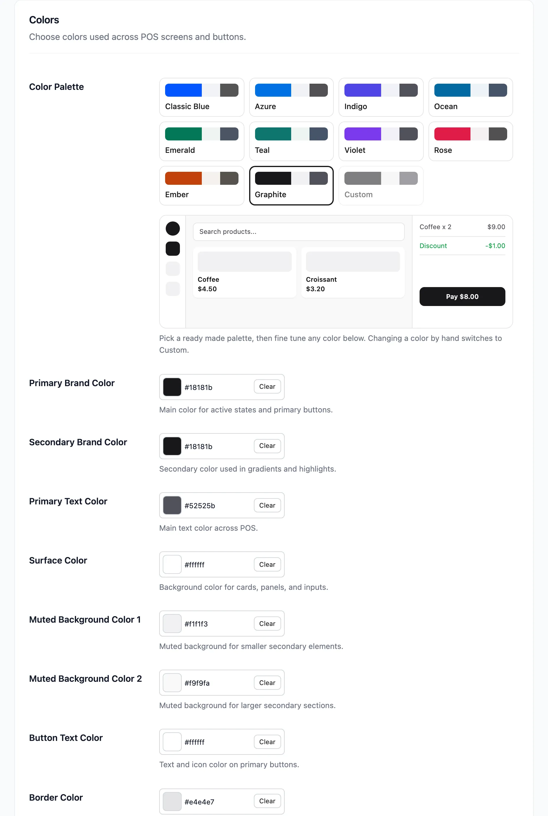
Color Palette comes first: ten ready-made palettes, Classic Blue, Azure, Indigo, Ocean, Emerald, Teal, Violet, Rose, Ember and Graphite. A small live preview of POS buttons sits beside the swatches. Pick one, then fine-tune any colour below it. Changing a colour by hand switches the palette to Custom.
Below it are nine pickers. The palette and the pickers are all free.
| Field | Default | What it paints |
|---|---|---|
| Primary Brand Color | #0256ff |
Active states and primary buttons |
| Secondary Brand Color | #0256ff |
Gradients and highlights |
| Primary Text Color | #555 |
Body text across the terminal |
| Surface Color | #fff |
Cards, panels and inputs |
| Muted Background Color 1 | #f1f3f7 |
Smaller secondary elements |
| Muted Background Color 2 | #f9fafb |
Larger secondary sections |
| Button Text Color | #fff |
Text and icons on primary buttons |
| Border Color | #e1e4e8 |
Card, input and section borders |
| Success Color | #15b71a |
Success states and positive amounts |
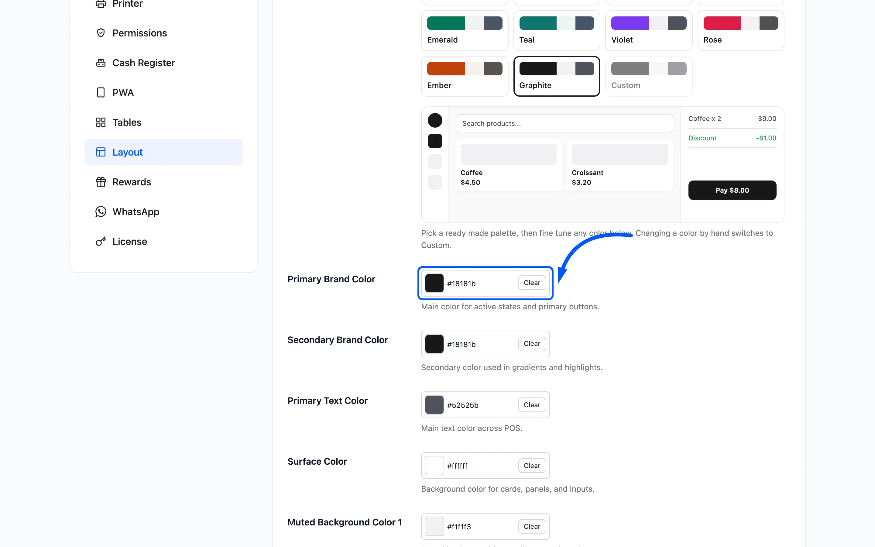
Primary Brand Color is the one worth setting. It is on every button a cashier presses, so it is what makes the POS look like your shop.
The two brand colours ship identical. Set them apart only if you want a visible gradient. Two strongly different colours make the buttons look broken rather than branded.
Button Text Color has to survive on top of Primary Brand Color. If you pick a pale brand colour, change this to something dark or the labels vanish.
Success Color marks positive amounts and confirmations. Keep it green. Cashiers read it at a glance and a non-standard colour costs them a beat.
Typography
Section titled “Typography”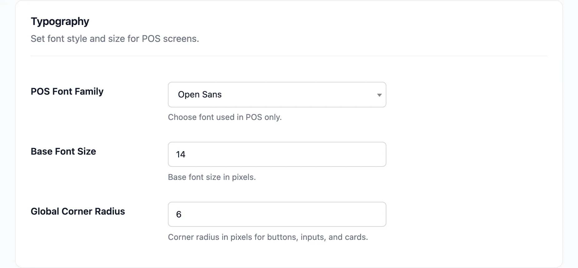
POS Font Family picks from five: Open Sans (the default), Poppins, Lato, Montserrat and Nunito. It applies to the terminal alone, not to your site.
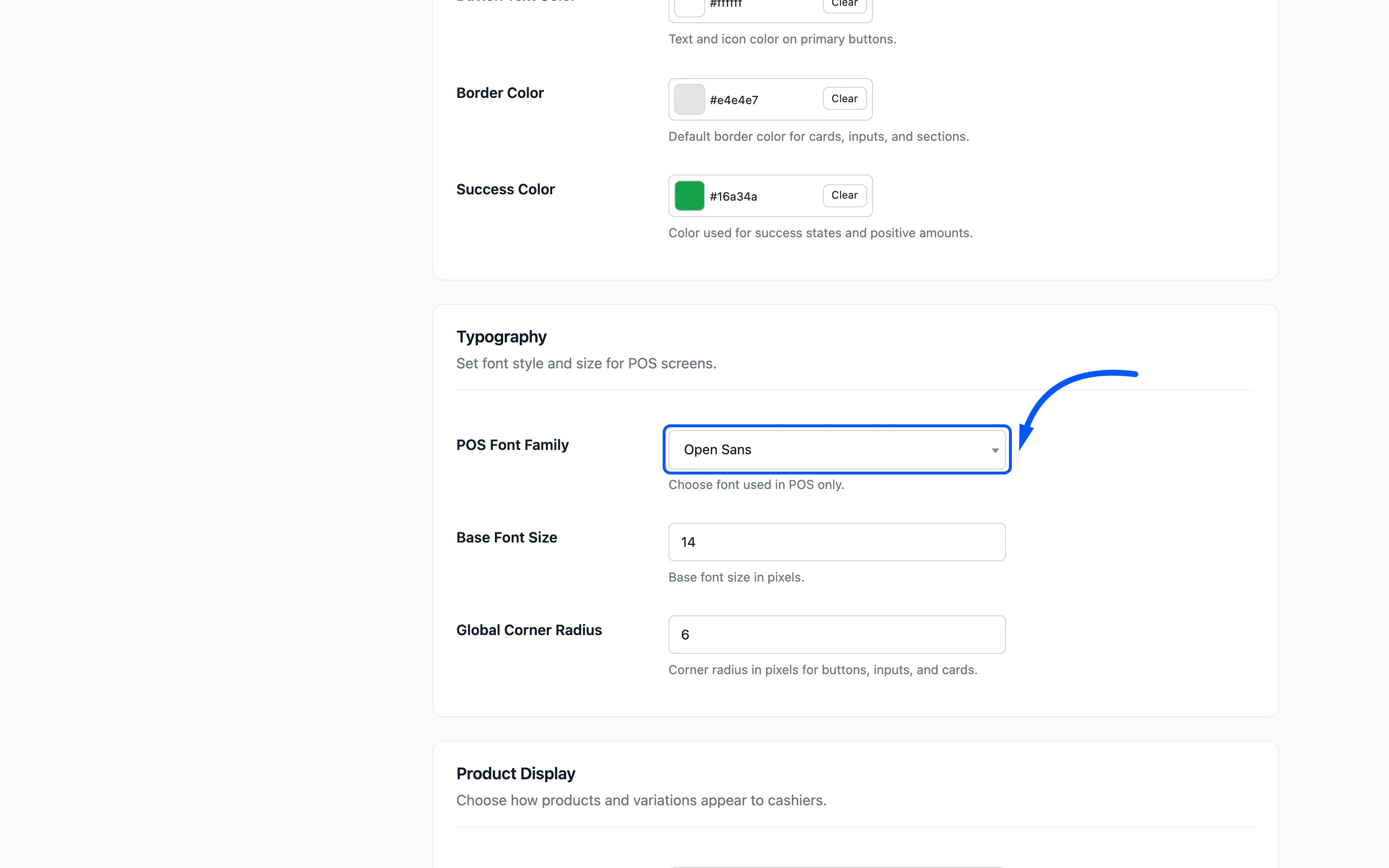
Base Font Size defaults to 14 pixels. Raise it to 15 or 16 for a wall-mounted screen or an
older team. Cashiers read this in a hurry.
Global Corner Radius defaults to 6 pixels and rounds every button, input and card. Zero gives
you square corners.
Product Display
Section titled “Product Display”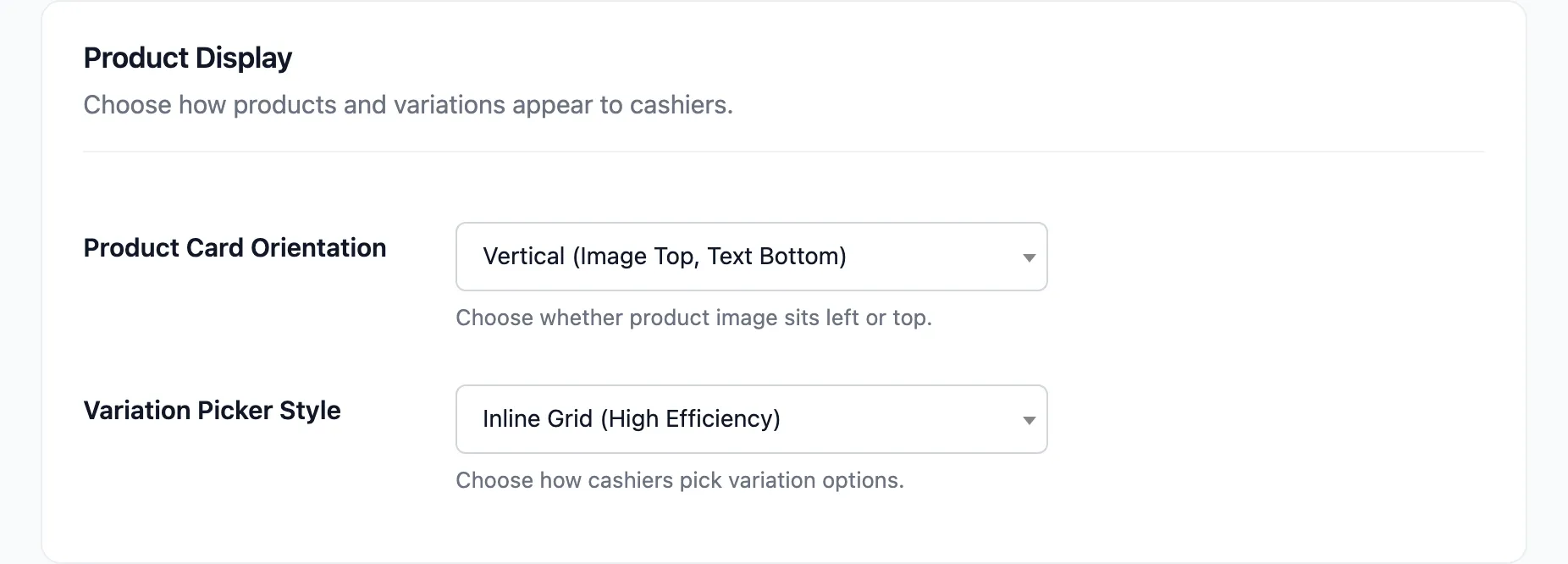
Product Card Orientation is Vertical (Image Top, Text Bottom), the default, or Horizontal (Image Left, Text Right).
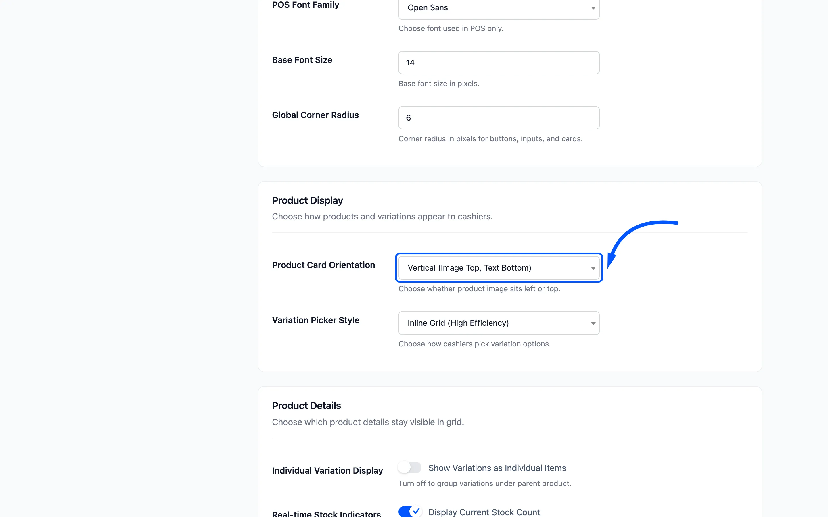
Vertical fits more products on a screen and reads well when your photos matter. Horizontal gives the name more room, which is what long product names need.
Variation Picker Style chooses between an Inline Grid and a Modal Popup when a cashier taps a variable product.
Product Details
Section titled “Product Details”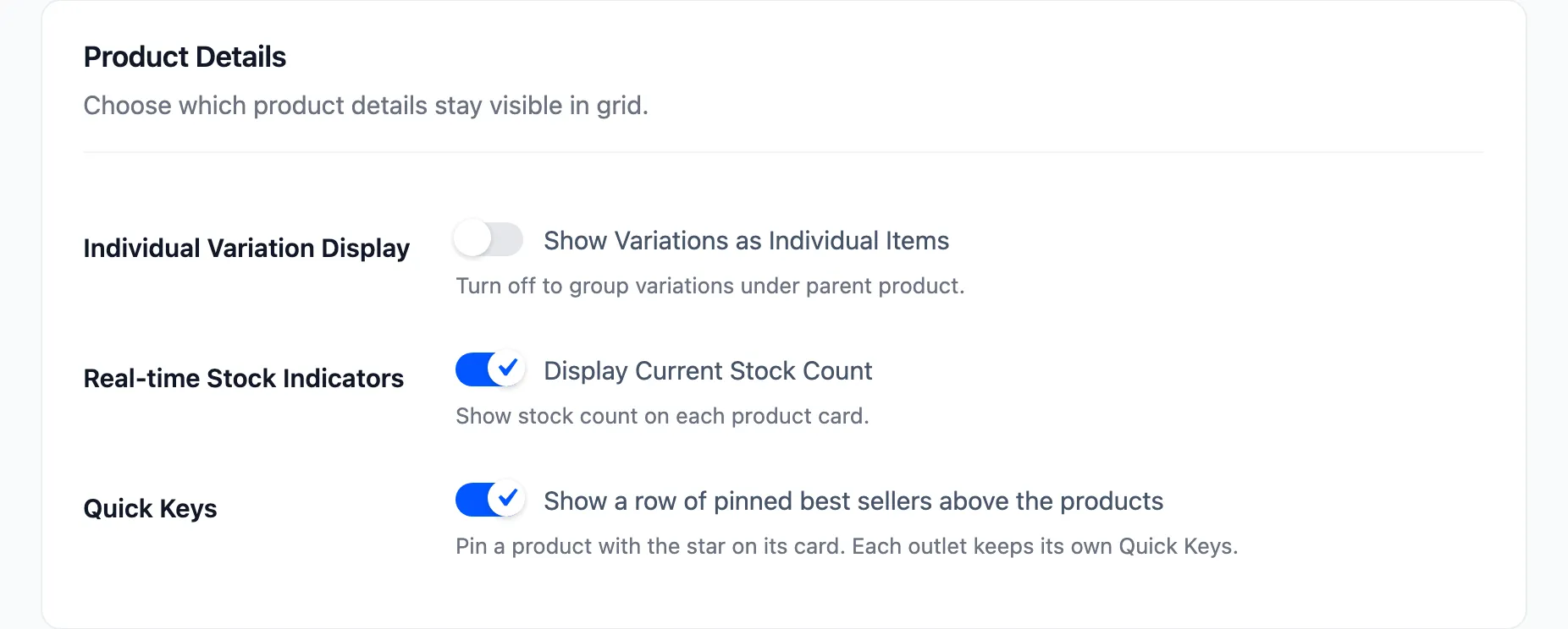
- Individual Variation Display, labelled Show Variations as Individual Items, lists each variation as its own card instead of grouping them under the parent. Pro.
- Real-time Stock Indicators, labelled Display Current Stock Count, prints the stock figure on every product card. On by default, and free.
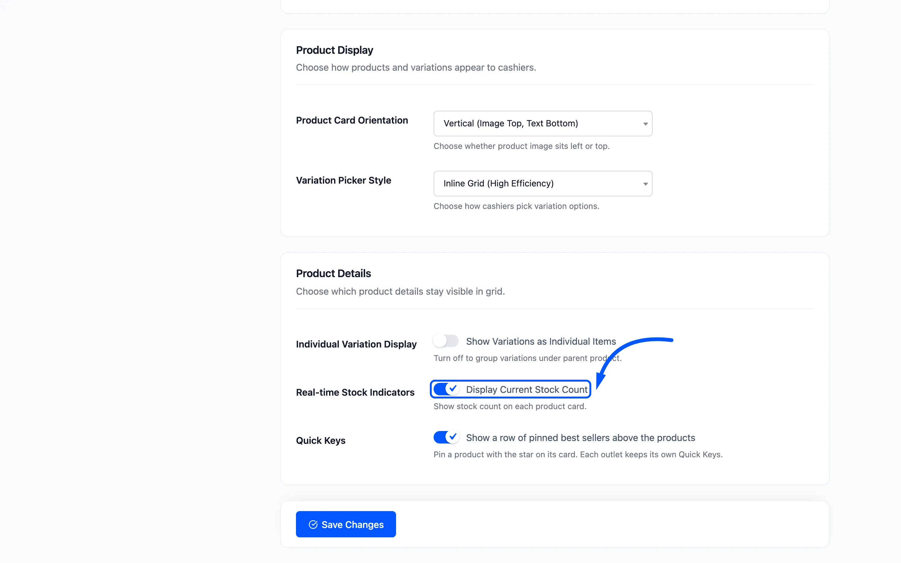
Keep it on. A cashier who can see one left in stock does not promise a second to the next customer.
- Quick Keys, labelled Show a row of pinned best sellers above the products, adds a row of pinned products above the grid. A product is pinned with the star on its card, and each outlet keeps its own row. Pro. See How to Pin Best Sellers as Quick Keys (Pro).
What it looks like
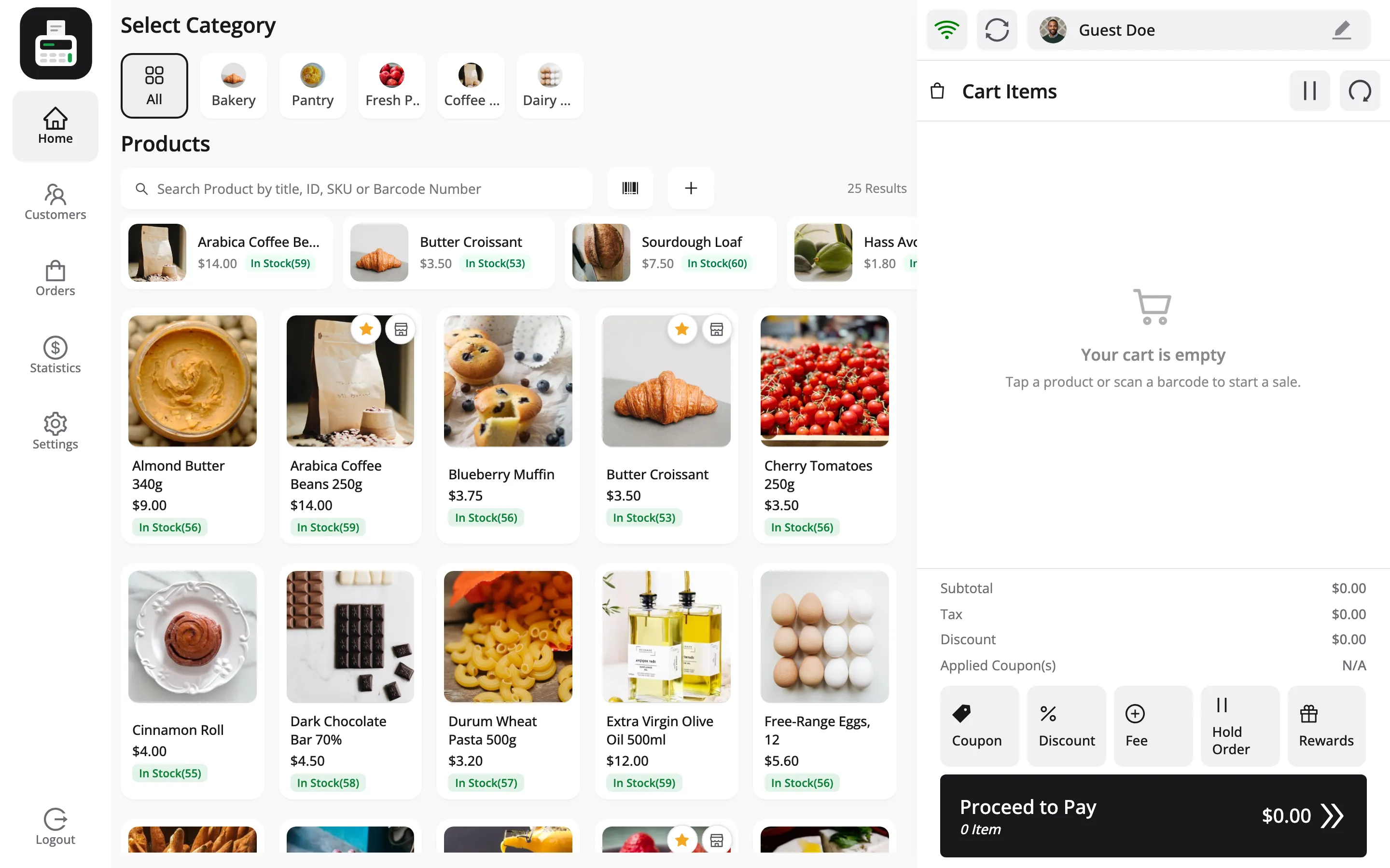
Section titled “What it looks like”Here is the terminal with the defaults.
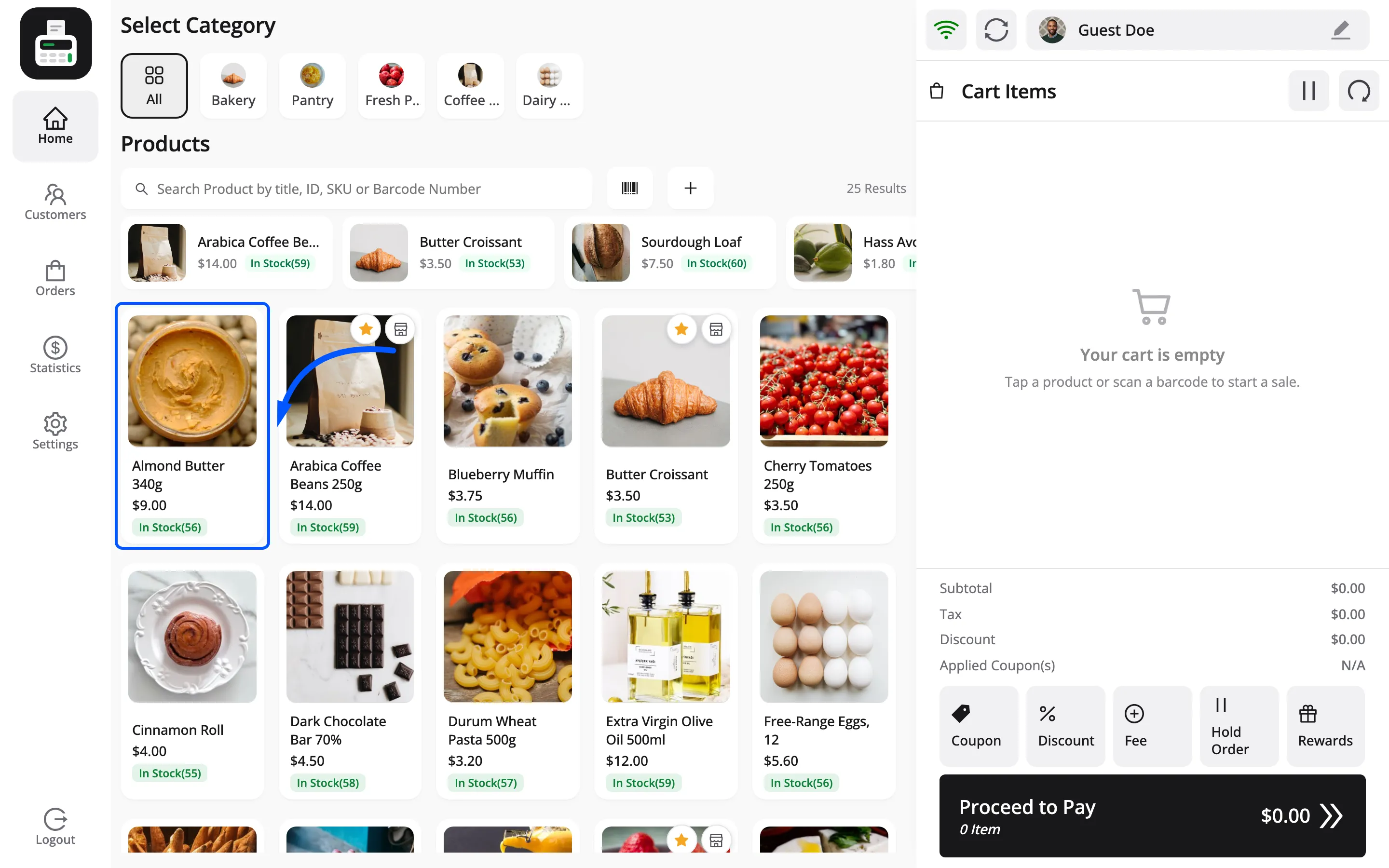
And a single product card, which is what most of this tab styles.
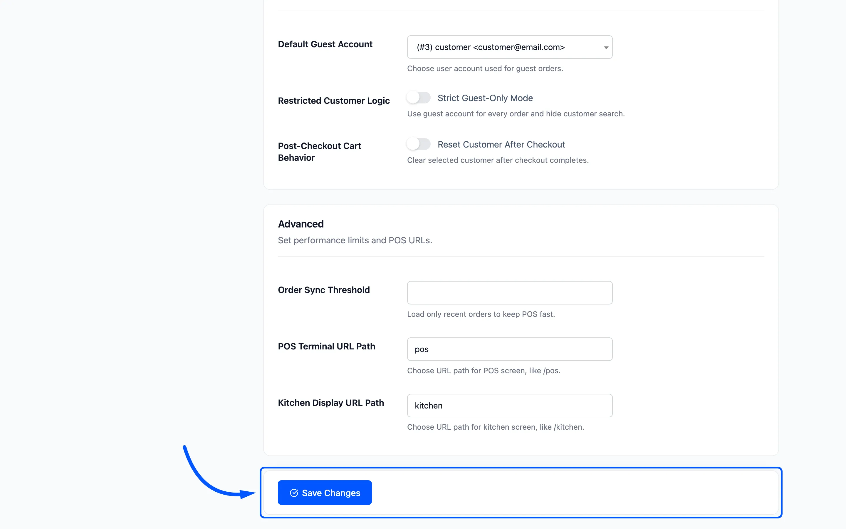
Click Save Changes, then reload the terminal. The colours are injected as CSS variables, so a plain refresh picks them up.
Where to go next
Section titled “Where to go next”- How to Brand the POS Terminal
- Login Screen for the screen before this one.