

Reports (Pro)
Reports is the detail behind the dashboard. Where the dashboard answers “how are we doing”, this answers “what exactly happened, over which period, at which outlet”.
Open the screen
Section titled “Open the screen”Go to DevDiggers Plugins → MultiPOS → Reports.
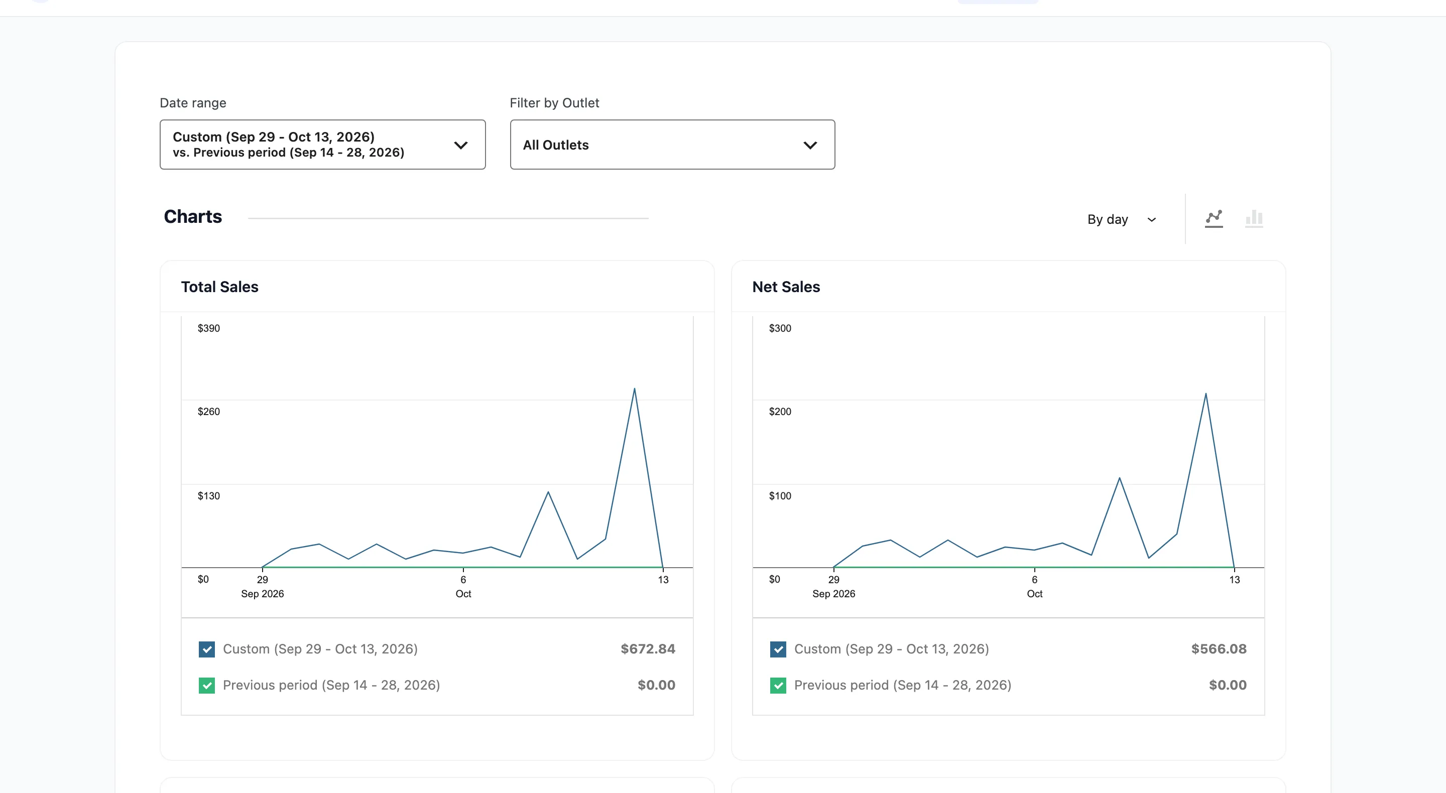
The screen is built on WooCommerce Analytics, so the controls behave the way WooCommerce’s own reports do.
Set the date range first
Section titled “Set the date range first”
Date range opens presets plus a custom range, and vs. picks what the period is compared against, either the previous period or the previous year.
It opens on Month to date. A store whose POS trading was last quarter reads as a row of empty charts until you widen it. That is the single most common reason this screen looks broken.
Filter by Outlet narrows everything to one location, or leaves it at All Outlets.
The ten charts
Section titled “The ten charts”Five pairs, in this order.
Total Sales and Net Sales
Section titled “Total Sales and Net Sales”The first pair, in the screenshot at the top of this page.
Total Sales is everything taken. Net Sales is what is left after discounts, refunds, tax and shipping.
Net Sales is the number to plan on. Total Sales is the number to feel good about.
Orders and Average Order Value
Section titled “Orders and Average Order Value”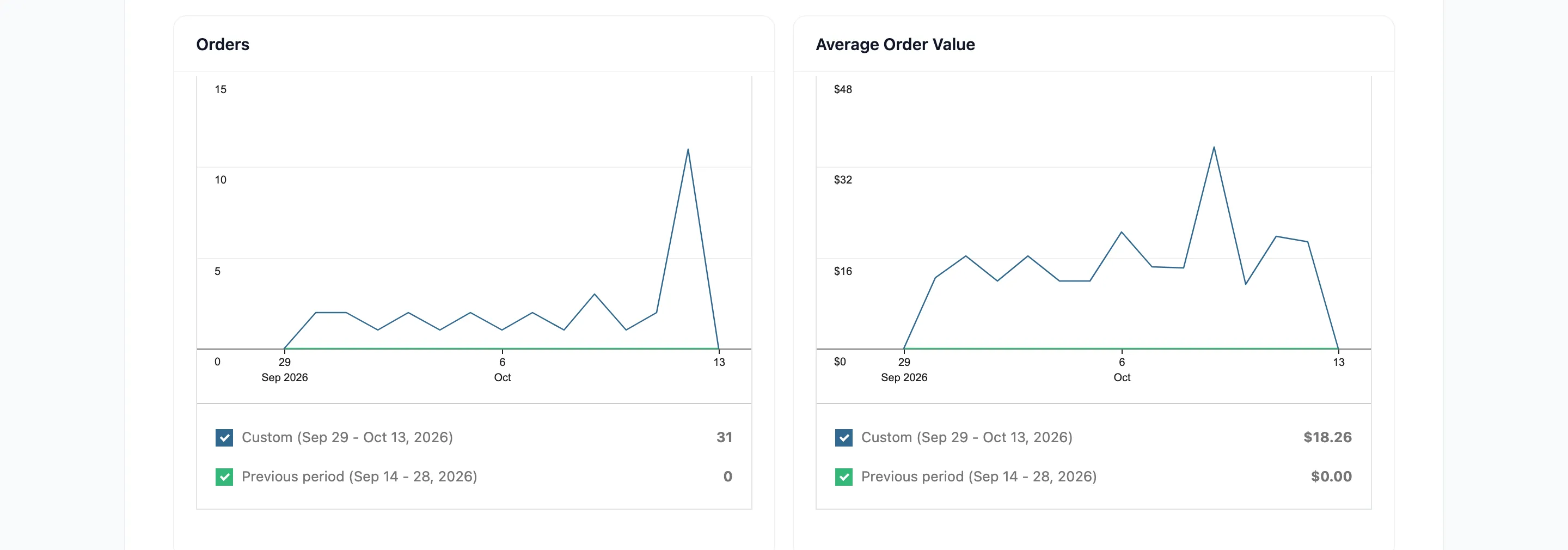
Orders counts POS orders in the period. Average Order Value is Net Sales divided by that count.
Read them together. Falling orders with a rising average means fewer, bigger baskets, which is a different problem from fewer, smaller ones.
Items Sold and Returns
Section titled “Items Sold and Returns”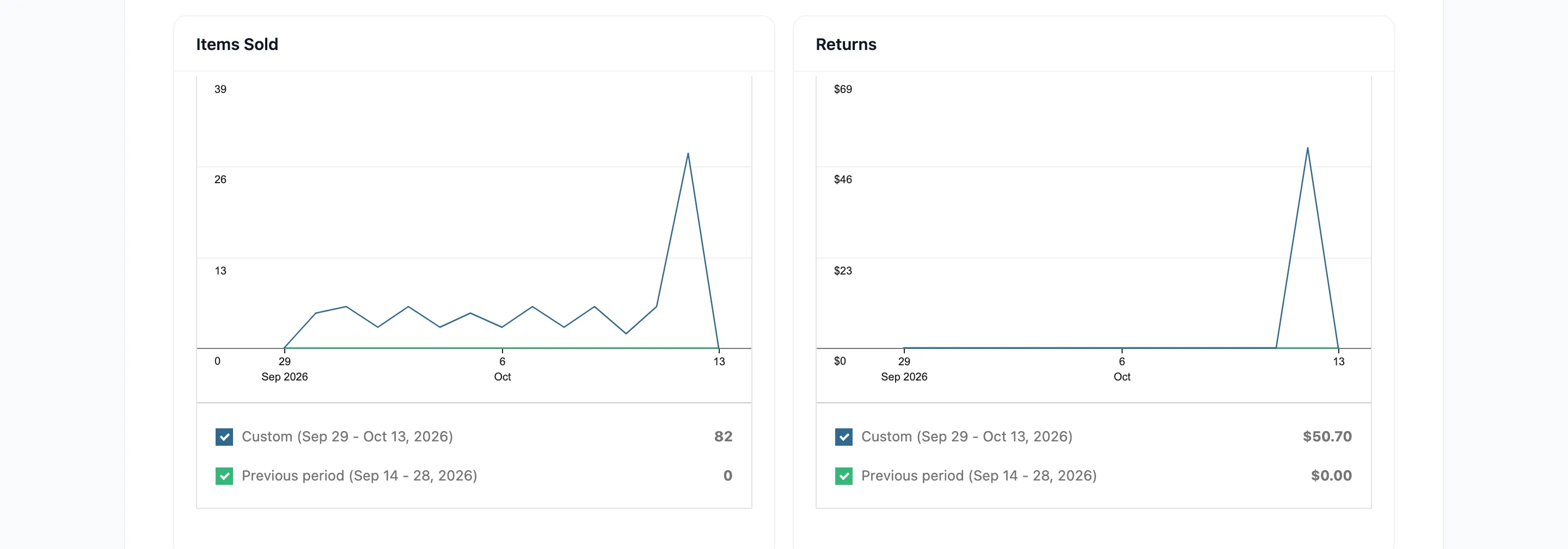
Items Sold counts line-item quantities, not orders. Returns counts what came back.
A return rate that climbs on one product is usually a sizing or a description problem. This is where you see it before the reviews do.
Discounted Orders and Gross Discounted
Section titled “Discounted Orders and Gross Discounted”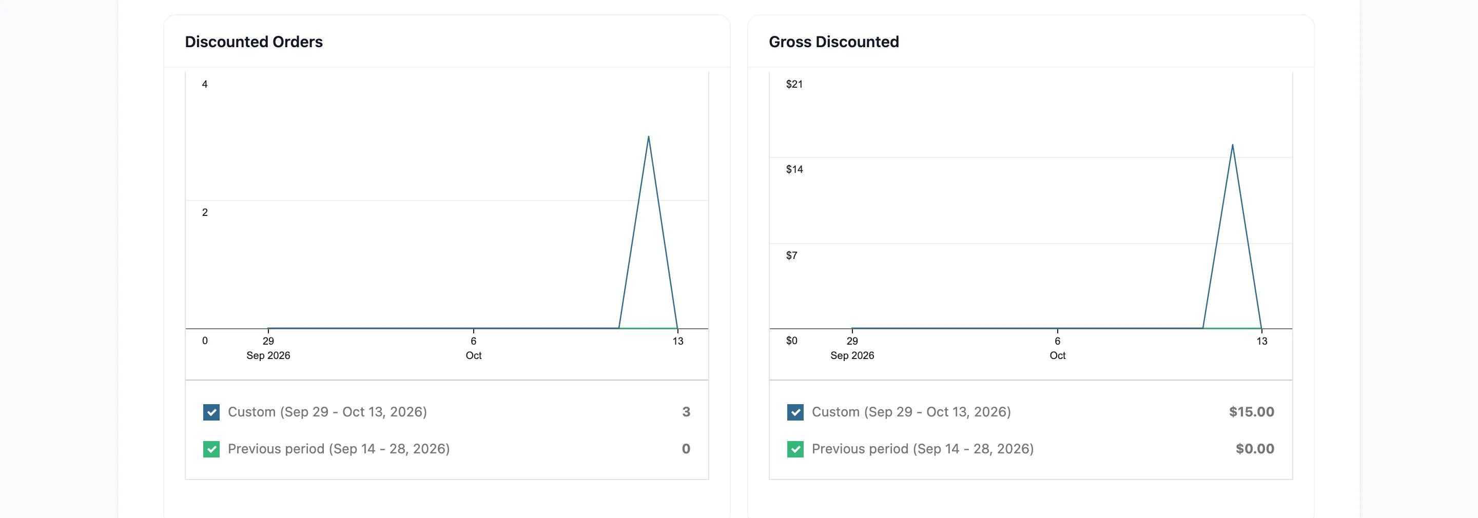
Discounted Orders counts how many orders carried a coupon. Gross Discounted is what those coupons cost you.
The pair together tells you whether a promotion was used widely and cheaply, or narrowly and expensively.
Both charts are coupons only. They are built from WooCommerce’s coupon records, so a manual discount typed in at the counter appears in neither. A shop that discounts by hand will read a Gross Discounted of zero on a day it gave money away. See How to Give a Discount at the Counter.
Total Tax and Order Tax
Section titled “Total Tax and Order Tax”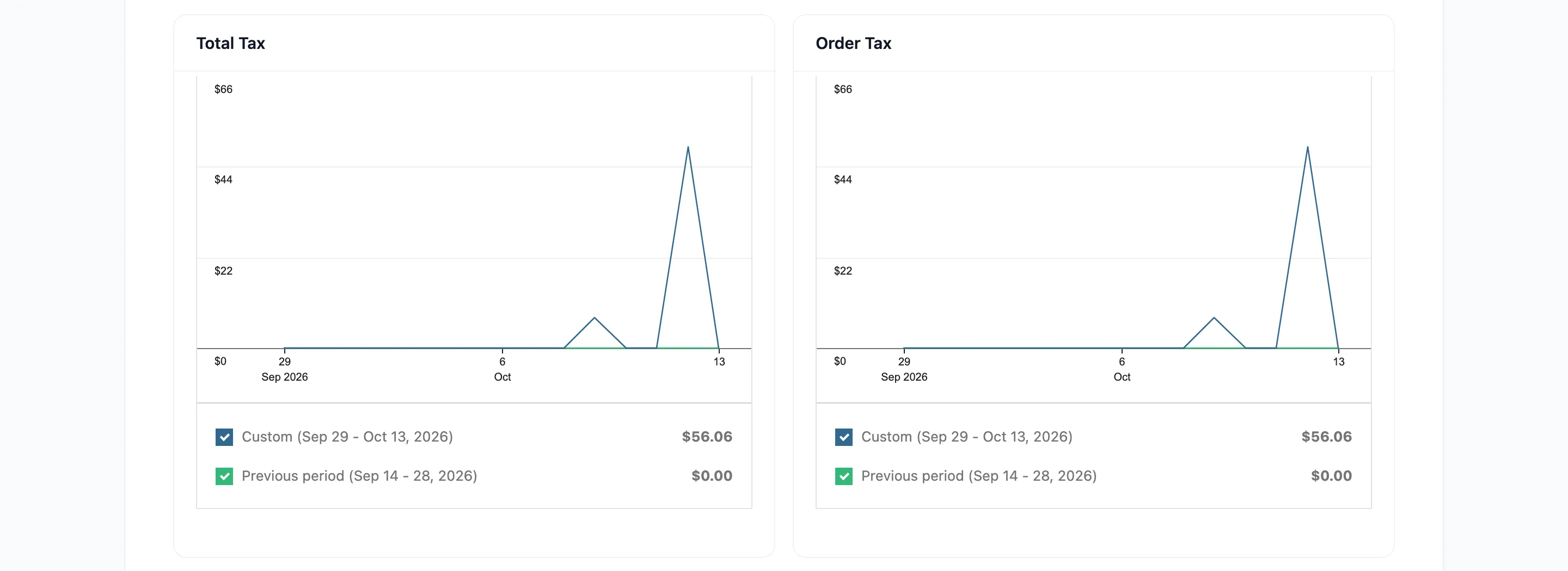
Total Tax is all tax collected. Order Tax is the part charged on the goods rather than on shipping.
These are the figures your accountant asks for.
Reading a chart
Section titled “Reading a chart”Each chart carries its own period label and a comparison line, so you can see this month against last year without changing anything. Hovering a point gives the exact figure and date.
Exporting
Section titled “Exporting”Pro exports report data to CSV for accounting and audits.
Where to go next
Section titled “Where to go next”- Dashboard Overview for the free summary view.
- How to Read Your POS Reports
- Transactions for the payment-level record.