

How to Brand the POS Terminal
Two tabs do the work: Layout for the terminal and Login for the screen before it. Both are free, and neither touches your storefront or your theme.
Step 1: Upload your logo
Section titled “Step 1: Upload your logo”Go to DevDiggers Plugins → MultiPOS → Configuration → General → Branding.
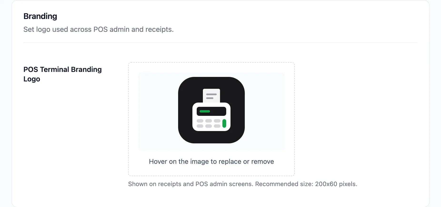
POS Terminal Branding Logo appears in the terminal sidebar and on printed receipts. The recommended size is 200 by 60 pixels.
One image does both jobs, so it has to survive a thermal printer. Use a simple, high-contrast version. Fine detail and soft gradients turn to mud on receipt paper.
Click Save Changes.
Step 2: Set the terminal colours
Section titled “Step 2: Set the terminal colours”Go to Configuration → Layout.
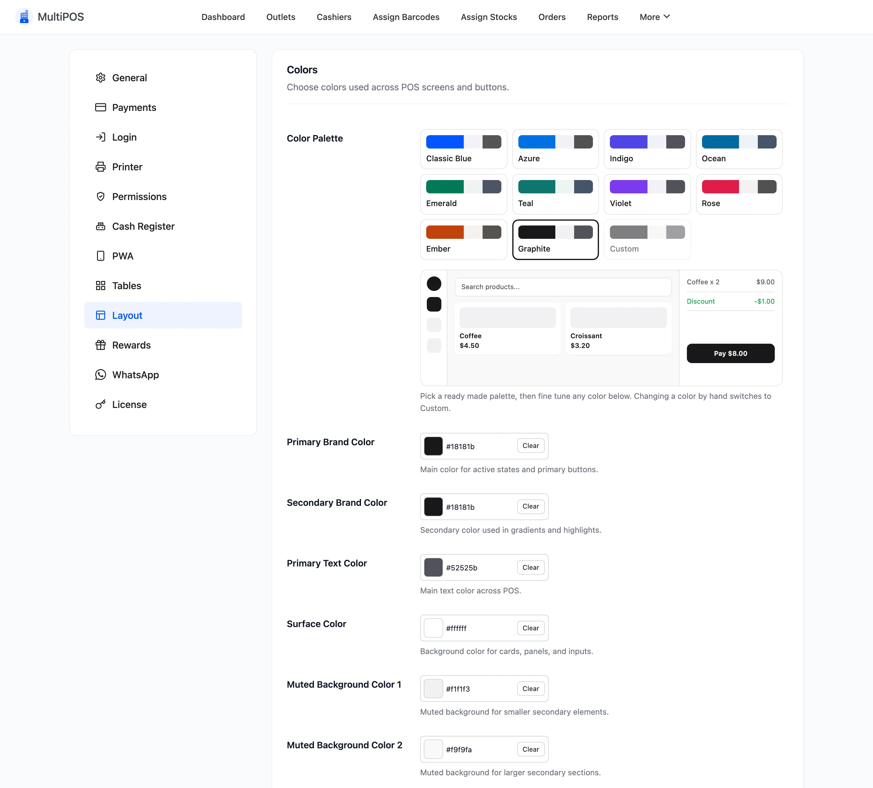
Nine pickers, and two of them decide how the POS reads.
Primary Brand Color paints every active state and primary button. It defaults to #0256ff. This
is the one that makes the terminal look like your shop.
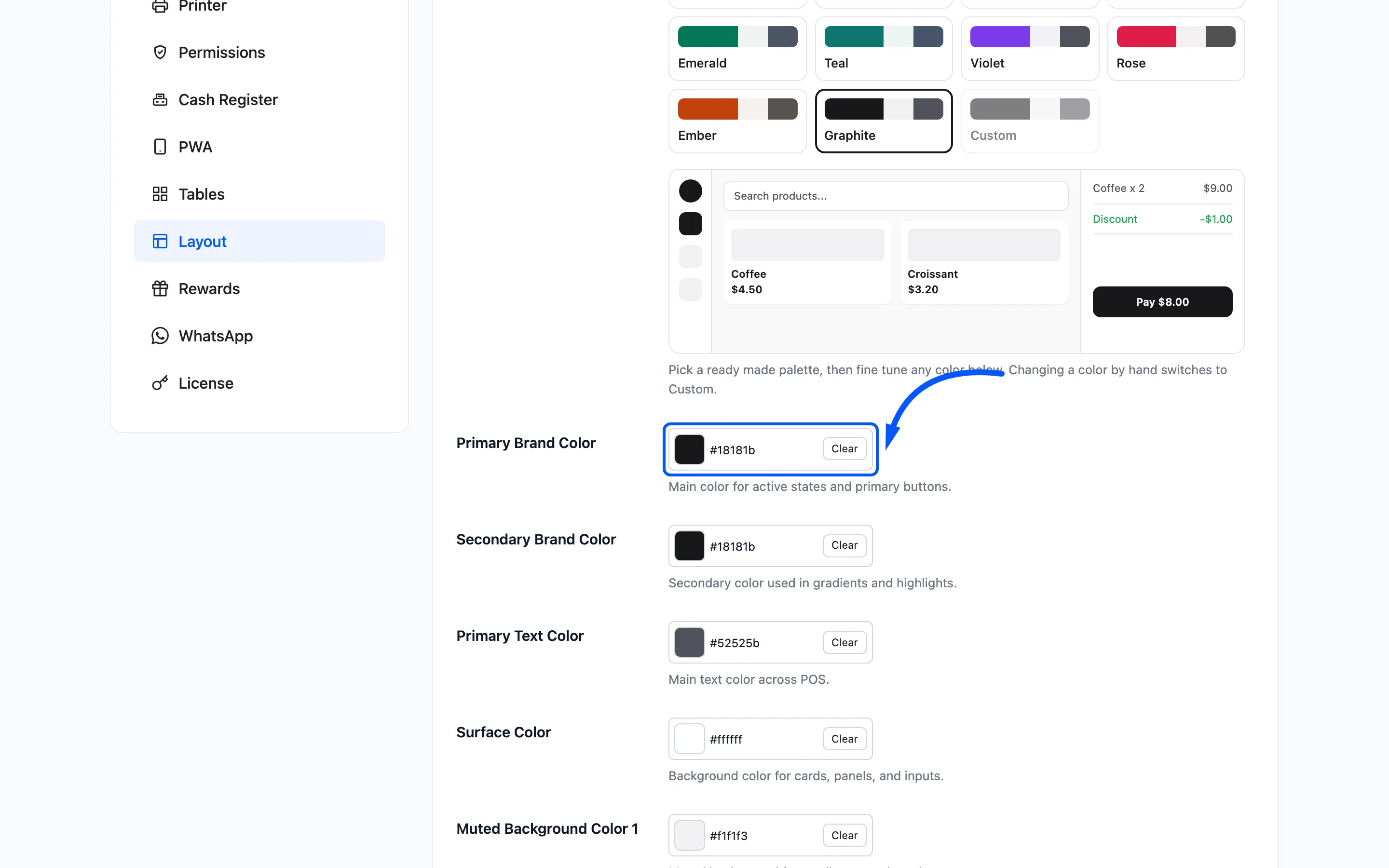
Button Text Color is what sits on top of it, defaulting to white. Change it to something dark if your brand colour is pale, or the labels vanish.
Check that pairing rather than assuming. A cashier reading a button in a hurry needs contrast.
Secondary Brand Color ships identical to the primary. Set them apart only for a deliberate gradient. Two unrelated colours make the buttons look broken.
Success Color should stay green. Cashiers read it at a glance and a non-standard colour costs them a beat every time.
Step 3: Choose a font and sizing
Section titled “Step 3: Choose a font and sizing”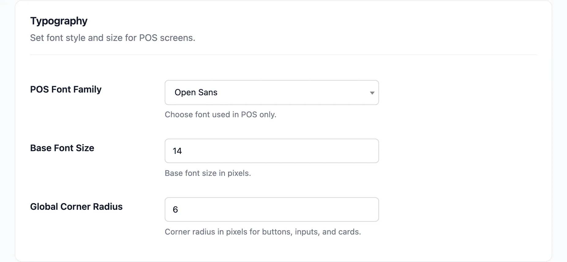
POS Font Family picks from five: Open Sans, Poppins, Lato, Montserrat and Nunito. It applies to the terminal alone.
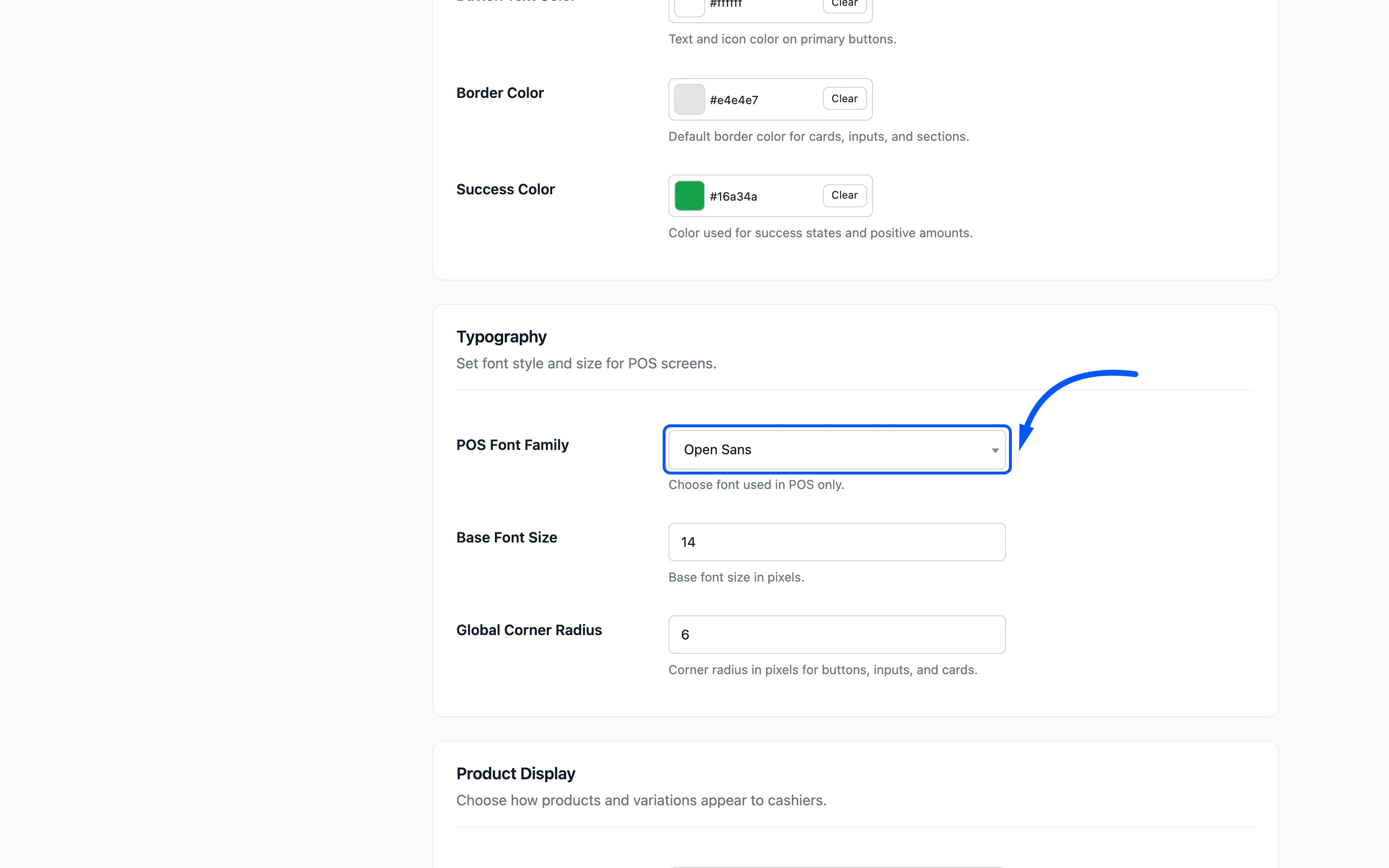
Base Font Size defaults to 14 pixels. Raise it to 15 or 16 for a wall-mounted screen, or for an older team. Legibility beats fitting one more row of products.
Global Corner Radius defaults to 6 pixels. Zero gives square corners, which suits a sharper brand.
Step 4: Decide how products look
Section titled “Step 4: Decide how products look”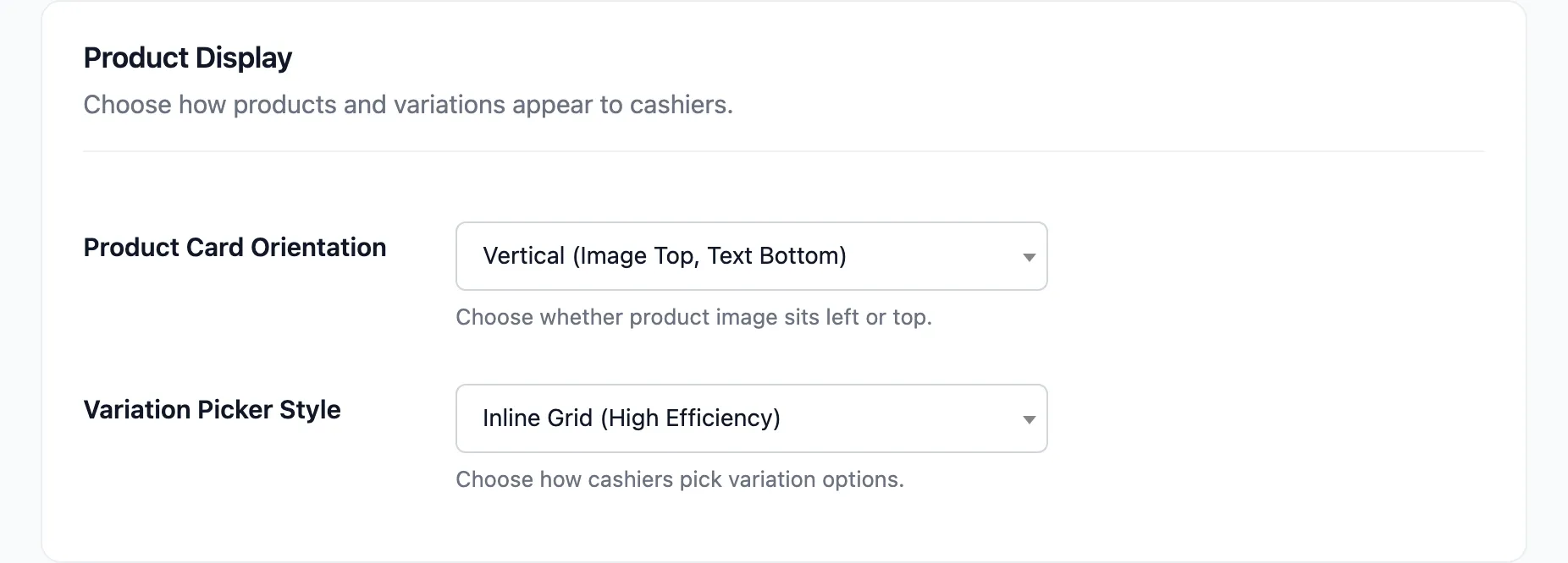
Product Card Orientation is vertical by default, with the image on top.
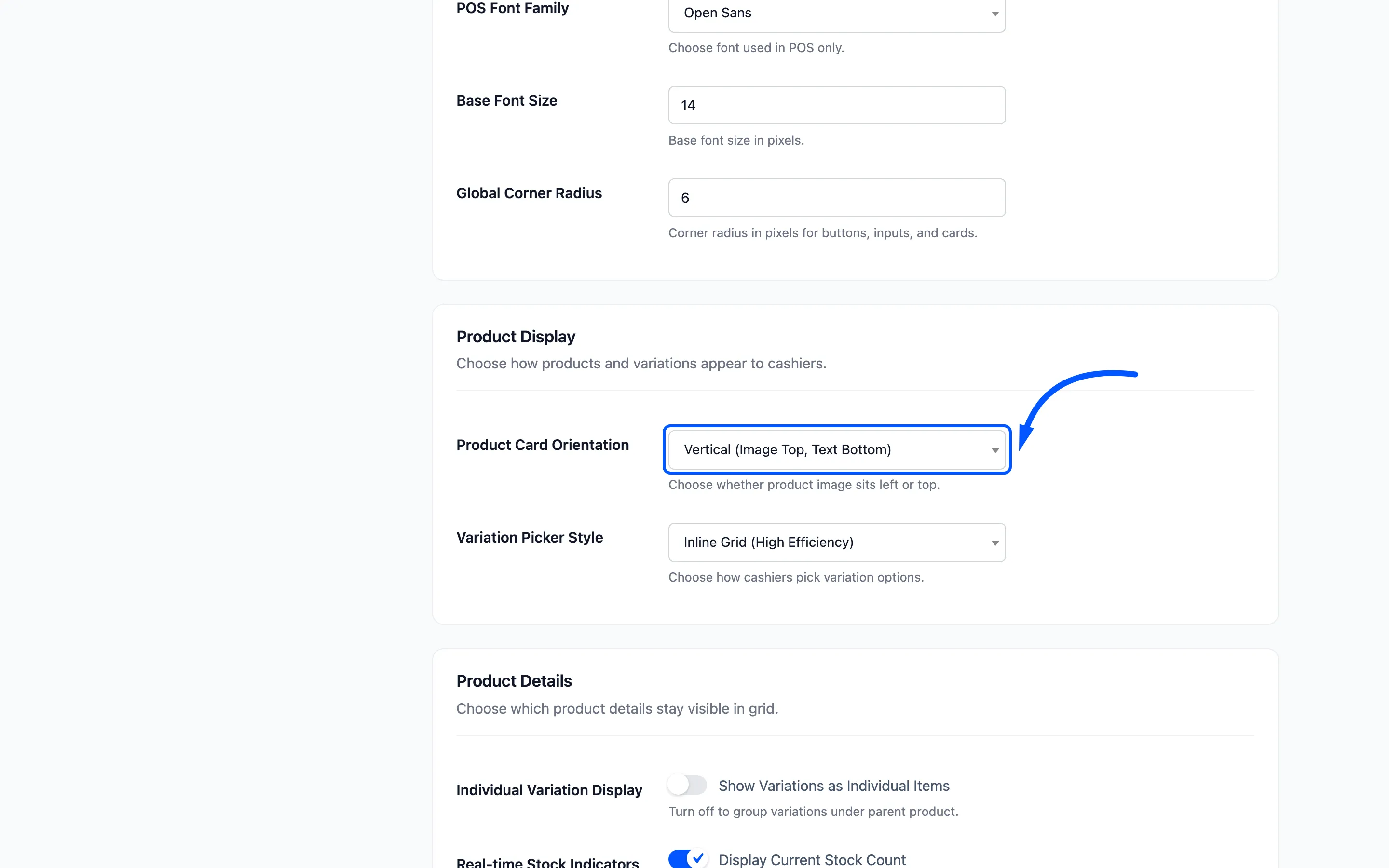
Vertical fits more products on a screen. Horizontal gives the name more room, which is what long product names need.
Leave Display Current Stock Count on.
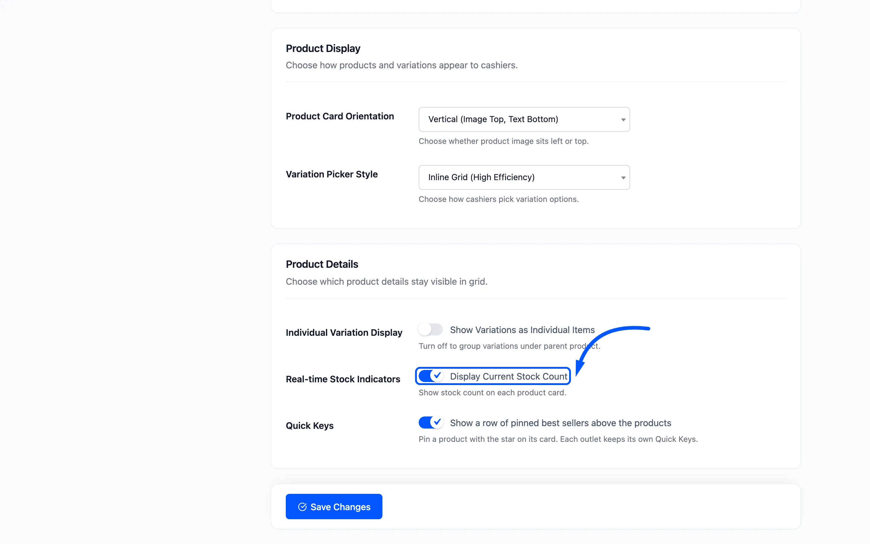
A cashier who can see one left in stock does not promise a second to the next customer.
Click Save Changes.
Step 5: Brand the login screen
Section titled “Step 5: Brand the login screen”Go to Configuration → Login. This is a separate screen with its own wording and its own colours.
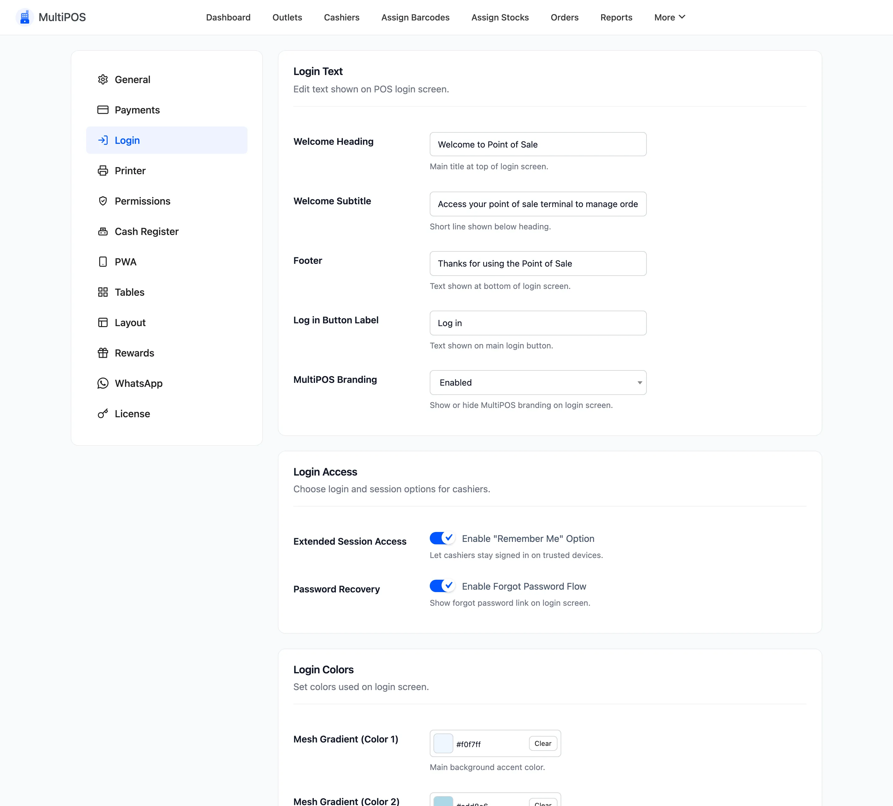
Change the heading first.
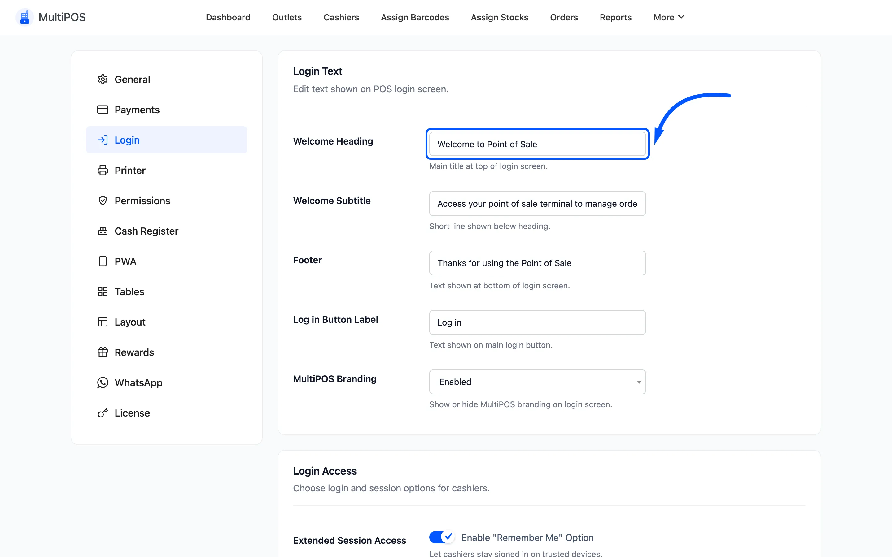
Put your shop’s name in it. A cashier who works two jobs on two systems should be able to tell at a glance which terminal they have open.
Then the subtitle, the footer line and the button label.
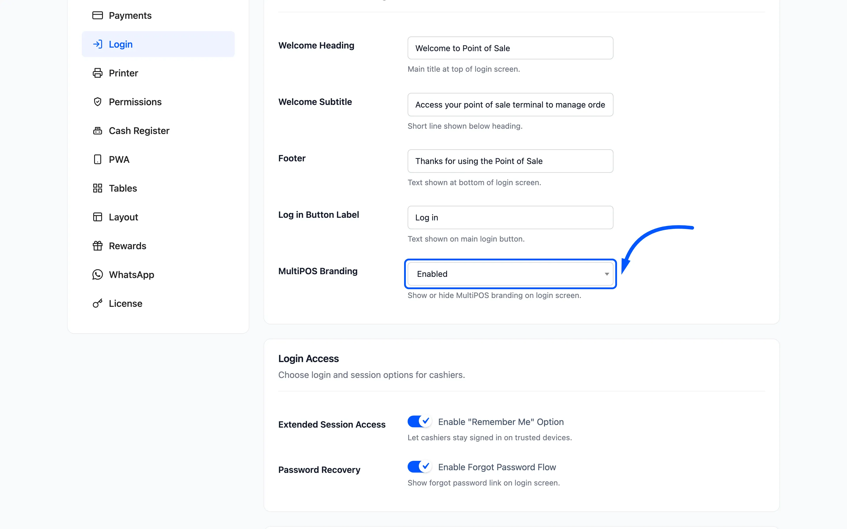
MultiPOS Branding shows a “Powered by MultiPOS” link in the footer, and is on out of the box. Turn it off for a screen carrying only your own name.
Step 6: Set the login colours
Section titled “Step 6: Set the login colours”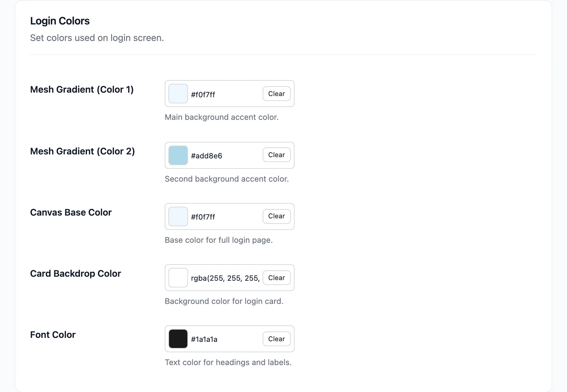
Five pickers. Mesh Gradient (Color 1) and (Color 2) blend into the soft background behind the card, so pick two shades from the same family. Two unrelated colours smear.
Canvas Base Color is the page behind it all. Card Backdrop Color takes an rgba value and ships translucent so the gradient shows through. Font Color should stay dark against a pale canvas.
Click Save Changes.
Step 7: Check it in a private window
Section titled “Step 7: Check it in a private window”Open a private browsing window and go to the terminal URL. Your admin session would otherwise skip the login screen.
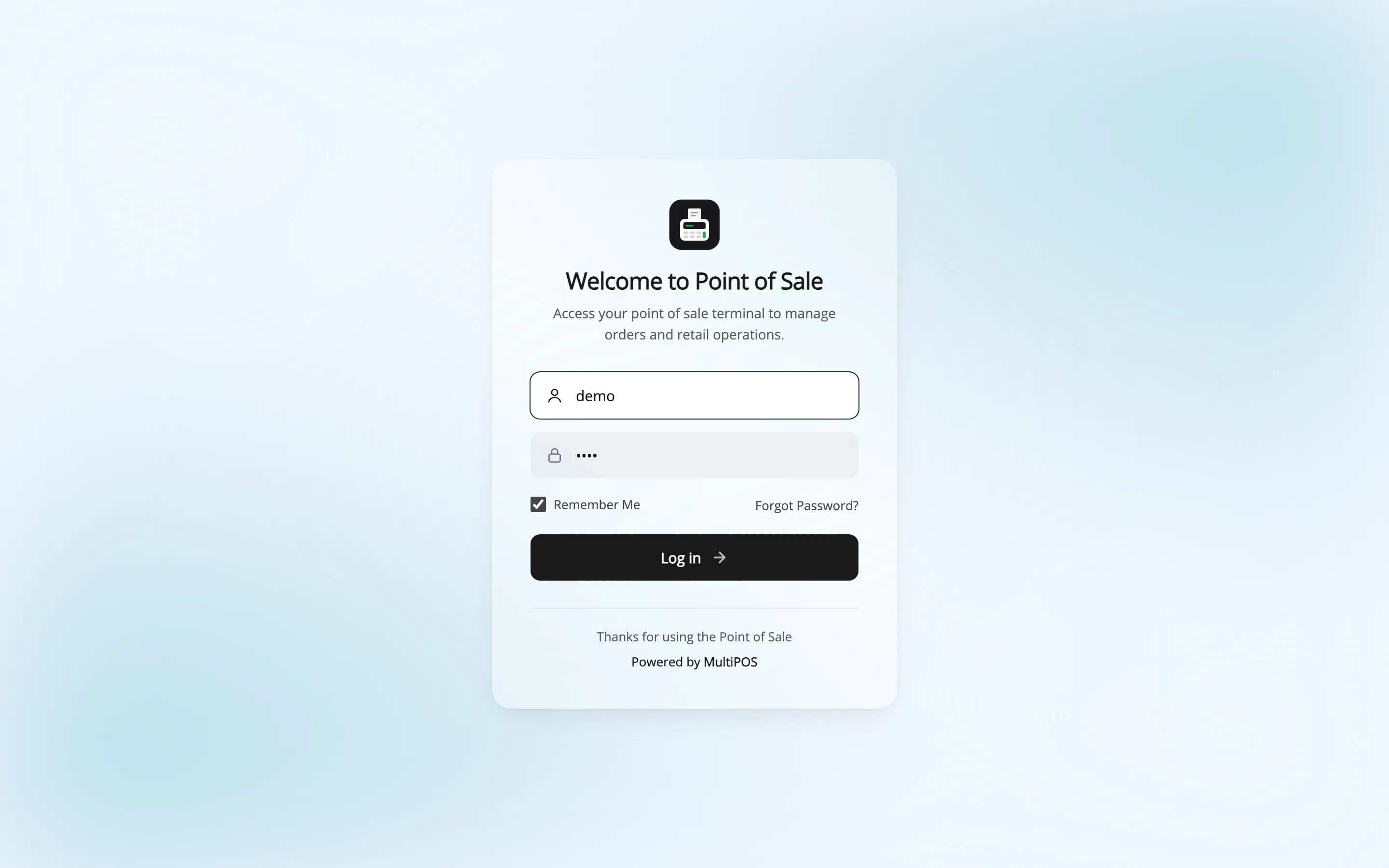
Sign in and check the terminal.
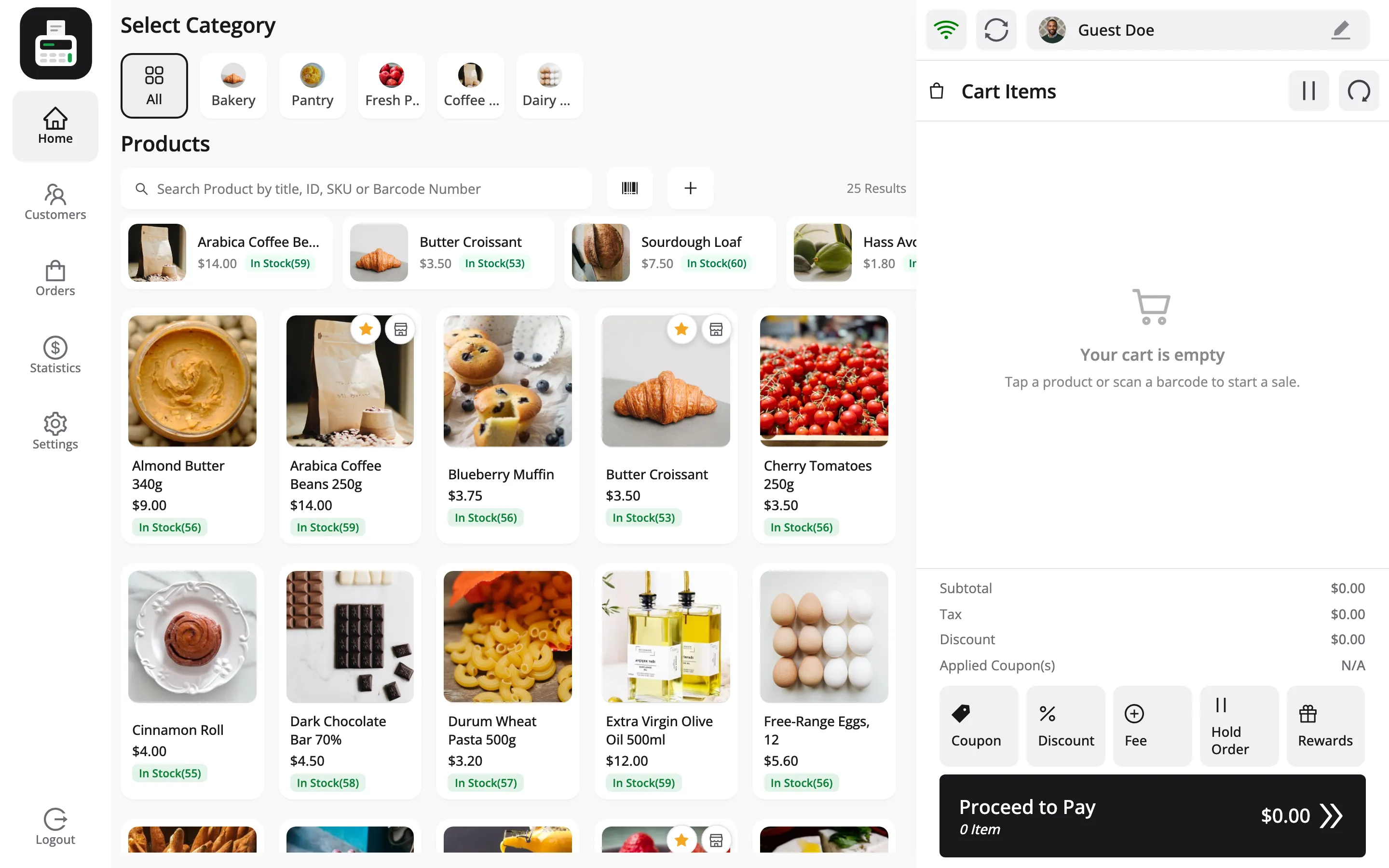
The colours are injected as CSS variables, so a plain refresh picks up a change. There is no cache to clear.
Where to go next
Section titled “Where to go next”- Layout Settings for the field reference.
- Login Screen
- How to Install the POS as an App