

MultiPOS for WCFM Layout Settings
The Layout tab styles the POS. It does not touch your storefront, your theme or the store manager.
Go to DevDiggers Plugins → MultiPOS → Configuration → Layout.
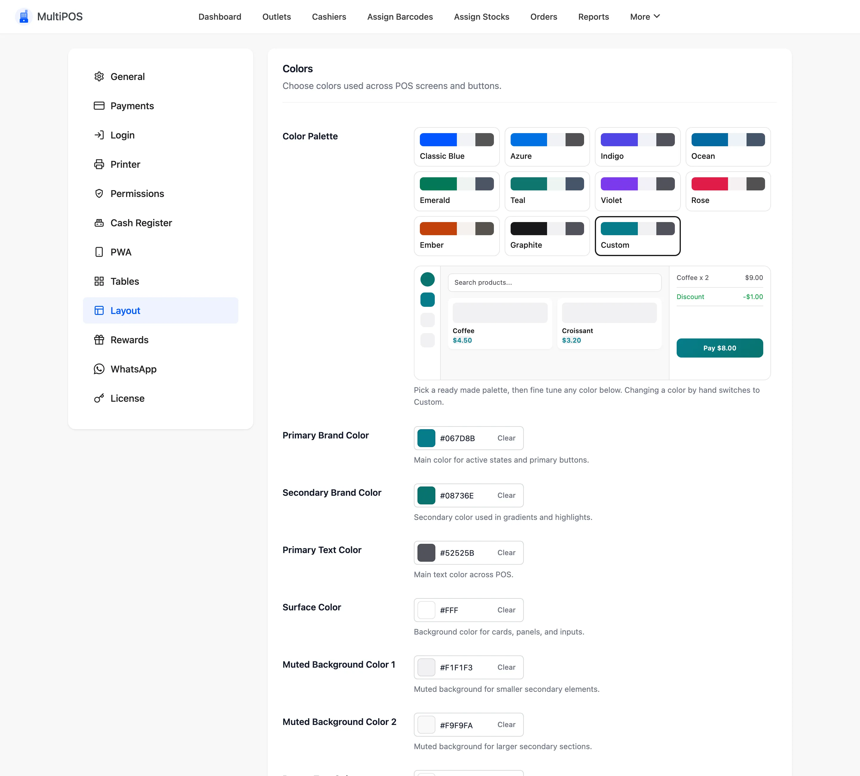
Colors
Section titled “Colors”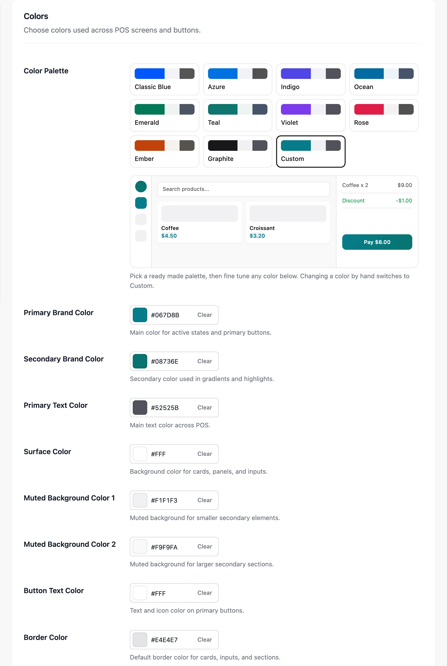
Color Palette offers ten ready-made sets: Classic Blue, Azure, Indigo, Ocean, Emerald, Teal, Violet, Rose, Ember and Graphite. Below it, nine pickers fine-tune each colour; changing one by hand switches the palette to Custom.
| Field | What it paints |
|---|---|
| Primary Brand Color | Active states and primary buttons |
| Secondary Brand Color | Gradients and highlights |
| Primary Text Color | Body text |
| Surface Color | Cards, panels and inputs |
| Muted Background Color 1 | Smaller secondary areas |
| Muted Background Color 2 | Larger secondary areas |
| Button Text Color | Text on primary buttons |
| Border Color | Card, input and section borders |
| Success Color | Confirmations and positive amounts |
Keep Button Text Color readable on Primary Brand Color. A pale brand colour needs dark button text.
Typography
Section titled “Typography”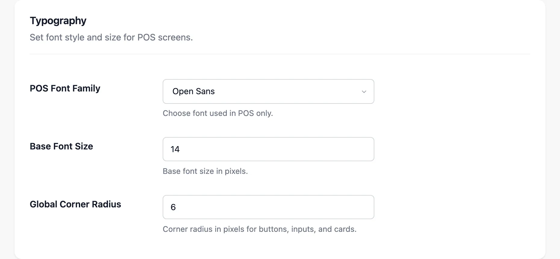
- POS Font Family: Open Sans, Poppins, Lato, Montserrat or Nunito.
- Base Font Size: 14 pixels by default. Raise it for a wall-mounted screen.
- Global Corner Radius: Rounds every button, input and card.
0gives square corners.
Product Display
Section titled “Product Display”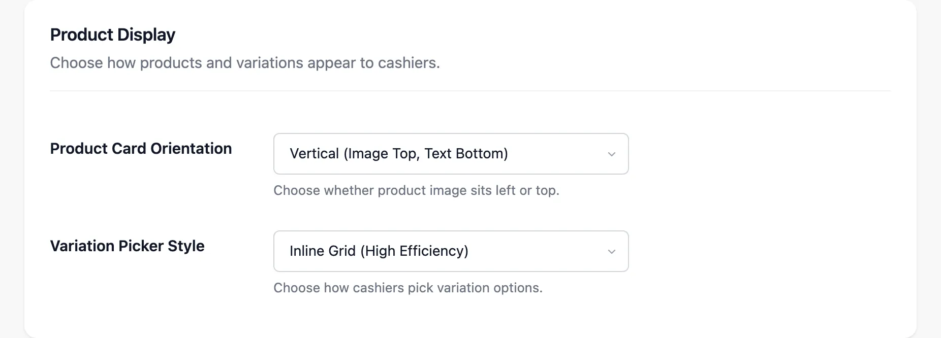
- Product Card Orientation: Image on top, or image on the left for long product names.
- Variation Picker Style: Inline Grid or Modal Popup, for picking a variation.
Product Details
Section titled “Product Details”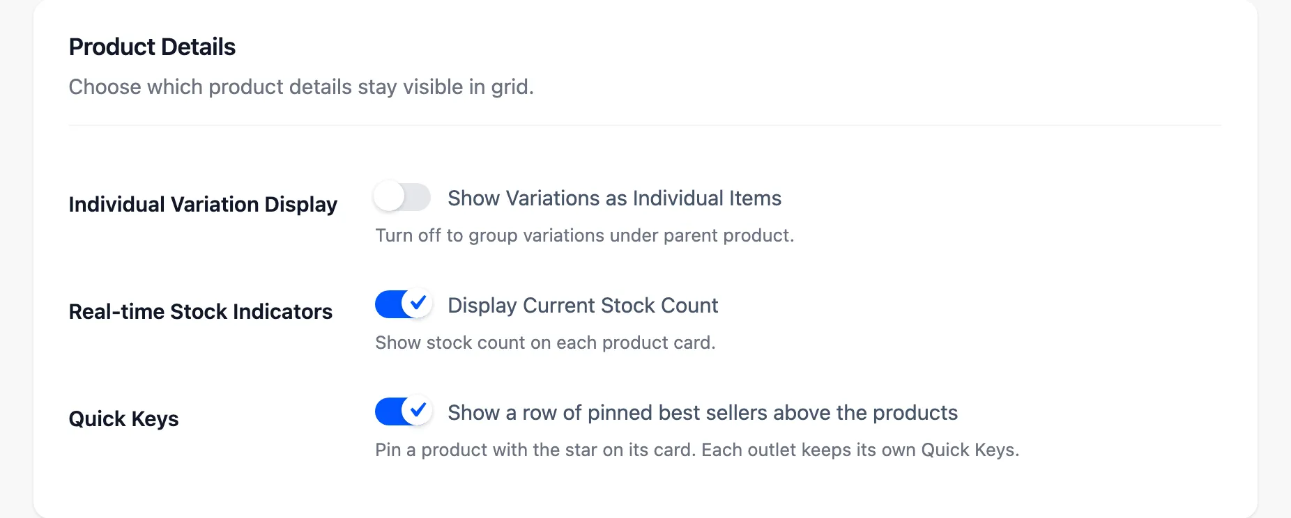
- Individual Variation Display: Lists each variation as its own card in the grid.
- Real-time Stock Indicators: Prints the stock count on every card.
- Quick Keys: Shows the row of pinned products above the grid.
A vendor’s own look
Section titled “A vendor’s own look”A vendor’s Layout tab has every field, so a vendor can give their POS their own colours and font.
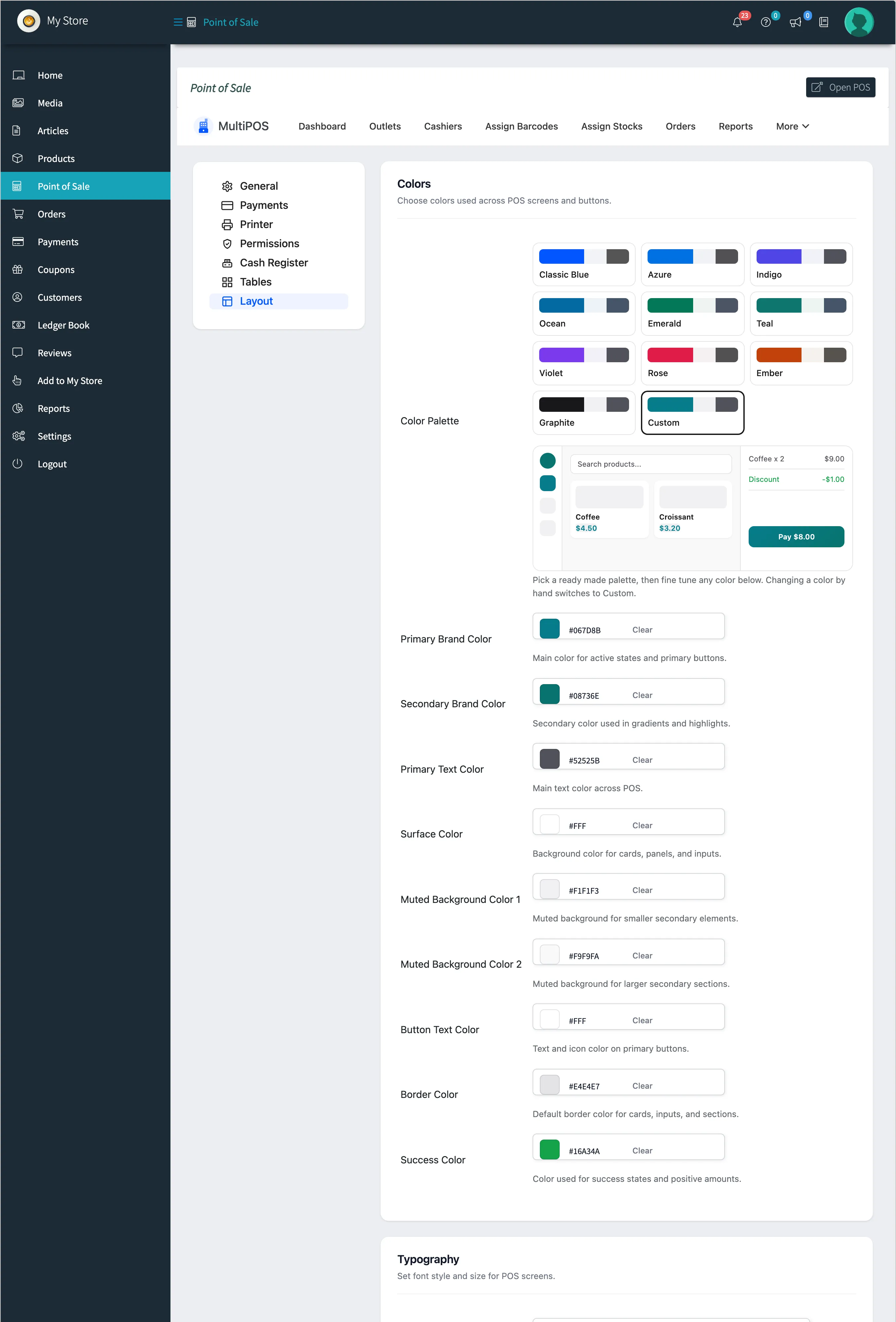
The look follows whoever signs in. A vendor’s cashiers see the vendor’s colours, and the owner’s cashiers see the owner’s.
Where to go next
Section titled “Where to go next”- General Settings for the logo.
- How to Pin Quick Keys