

How to Customize the Affiliate Dashboard
The affiliate dashboard is a page on your site, seen by people who have chosen to represent your brand. Left at the defaults it looks like a plugin. Twenty minutes of colour work makes it look like part of your store.
Step 1: Choose where the dashboard lives
Section titled “Step 1: Choose where the dashboard lives”Go to DevDiggers Plugins → Affiliates → Configuration → General.
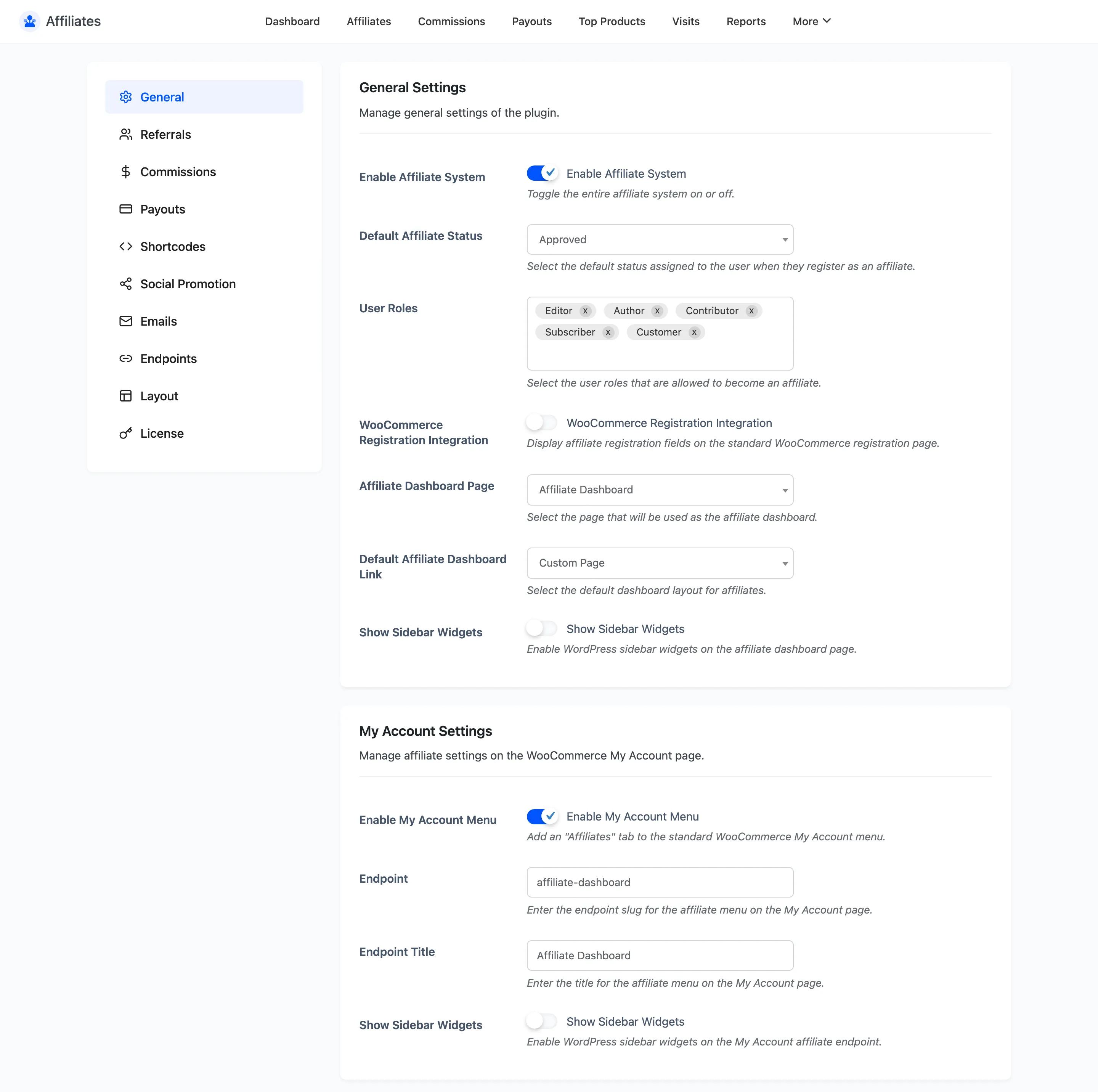
There are two places the dashboard can appear, and you can run both.
- Affiliate Dashboard Page is a standalone page holding the dashboard shortcode. Activation created one.
- Enable My Account Menu adds an Affiliate Dashboard tab inside WooCommerce My Account.
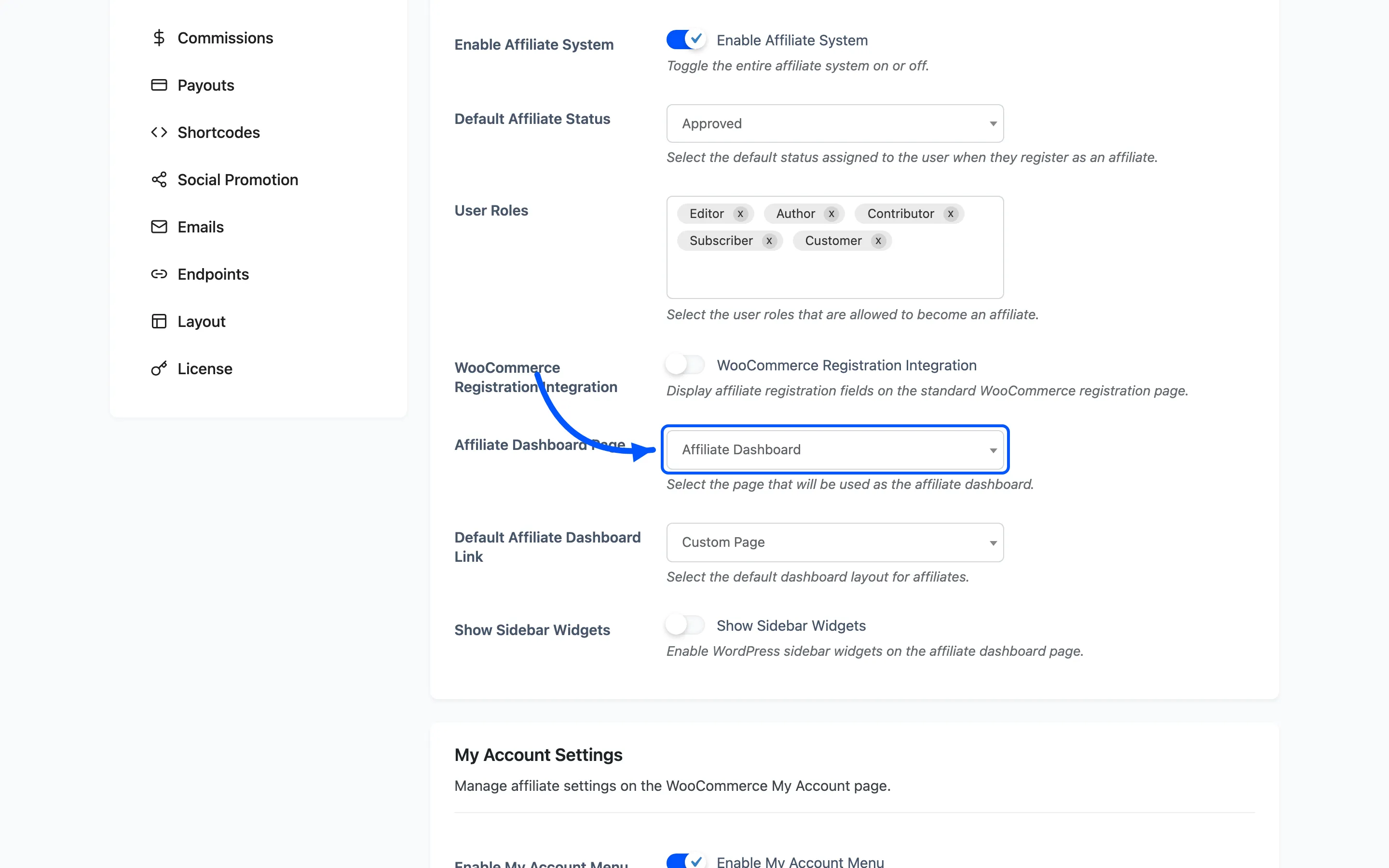
Default Affiliate Dashboard Link decides which one the plugin treats as the main one. It is what an affiliate is redirected to after logging in.
Pick My Accounts Page if most of your affiliates are also customers. They are already used to finding things there. Pick Custom Page if the dashboard needs its own full-width layout.
Show Sidebar Widgets appears once for each location. Leave both off unless you have a widget that genuinely belongs beside the dashboard; the sections are wide and a sidebar squeezes them.
Step 2: Set your brand colour
Section titled “Step 2: Set your brand colour”Go to Configuration → Layout.
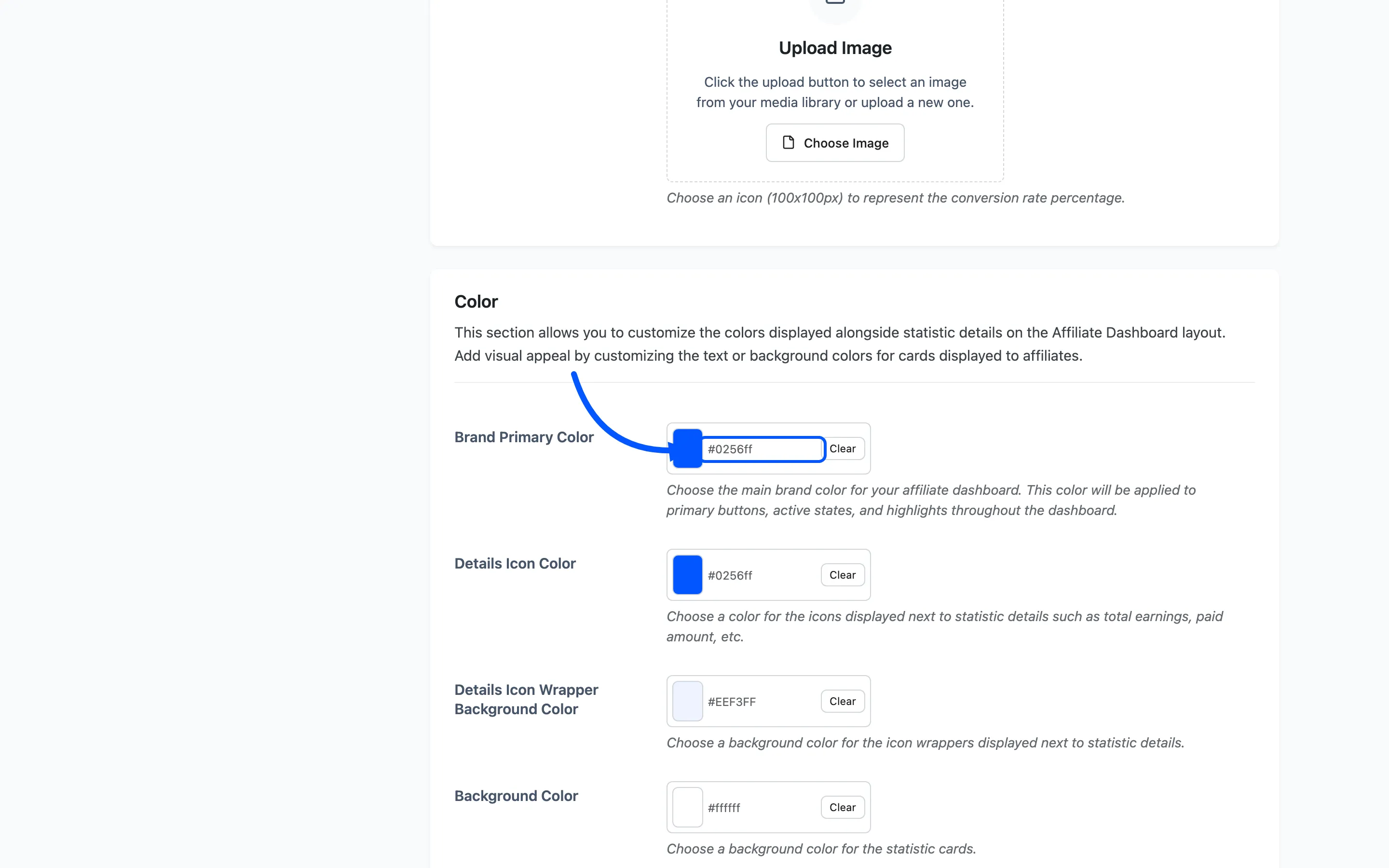
Brand Primary Color is the single highest-value change on this tab. It sets the Filter button,
the active navigation item and every highlight across the dashboard. The default is #0256ff.
Paste your own brand hex here first and look at the result before touching anything else. On many stores that alone is enough.
Step 3: Style the statistic cards
Section titled “Step 3: Style the statistic cards”Six cards sit at the top of the affiliate dashboard. Five pickers control them.
| Field | What it colours | Default |
|---|---|---|
| Background Color | The card itself | #ffffff |
| Border Color | The card border | #dce6ff |
| Text Color | The card title | #121212 |
| Value Color | The figure | #121212 |
| Details Icon Wrapper Background Color | The tinted square behind the icon | #EEF3FF |
Value Color against Background Color is the pair that matters. The figure is what the affiliate came to read, so give it the strongest contrast on the screen.
Two common looks:
- Light, which is the default. White cards, a pale tinted icon square, near-black figures.
- Bordered flat: White cards, a stronger border colour, and Show Wrapper turned off so the icons sit directly on the card.
Step 4: Set the icons
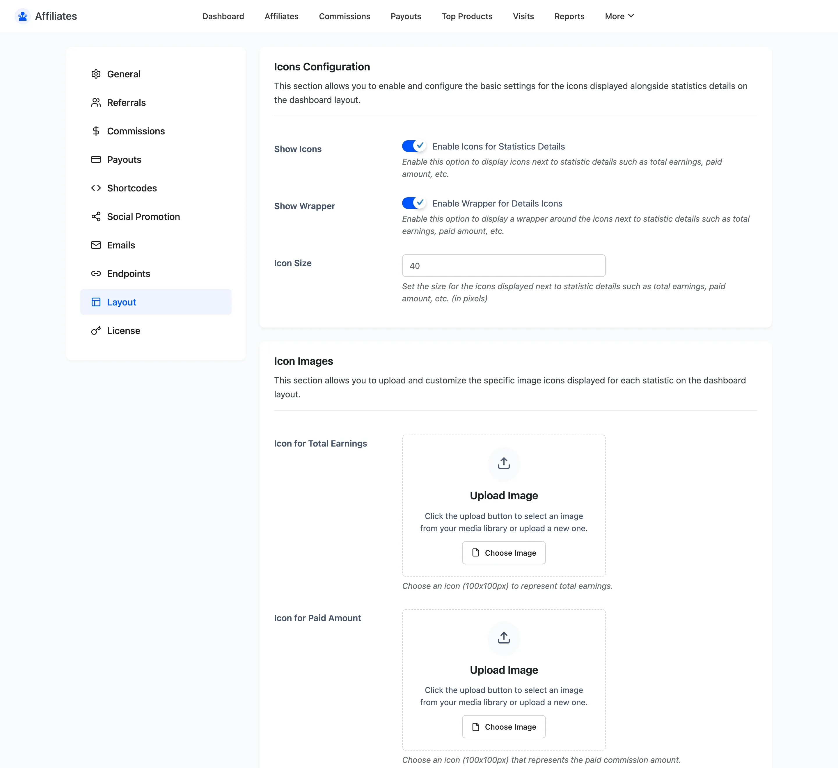
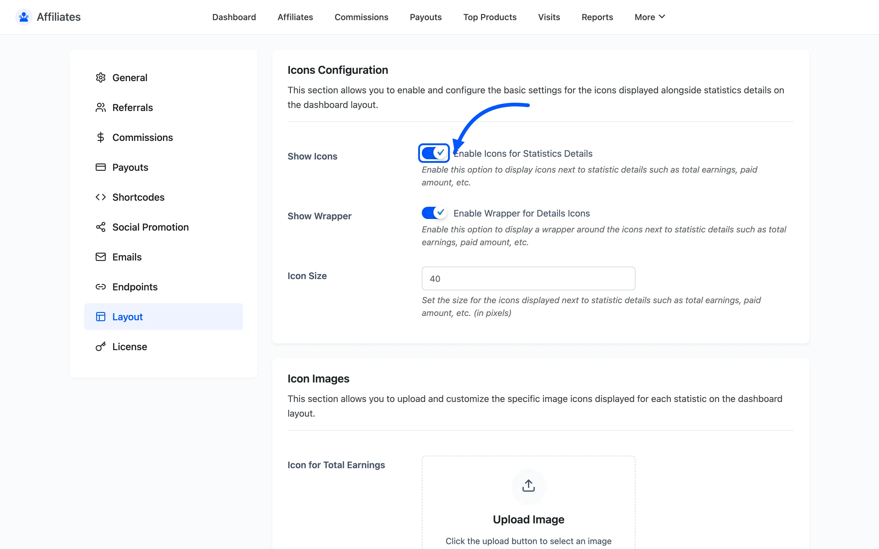
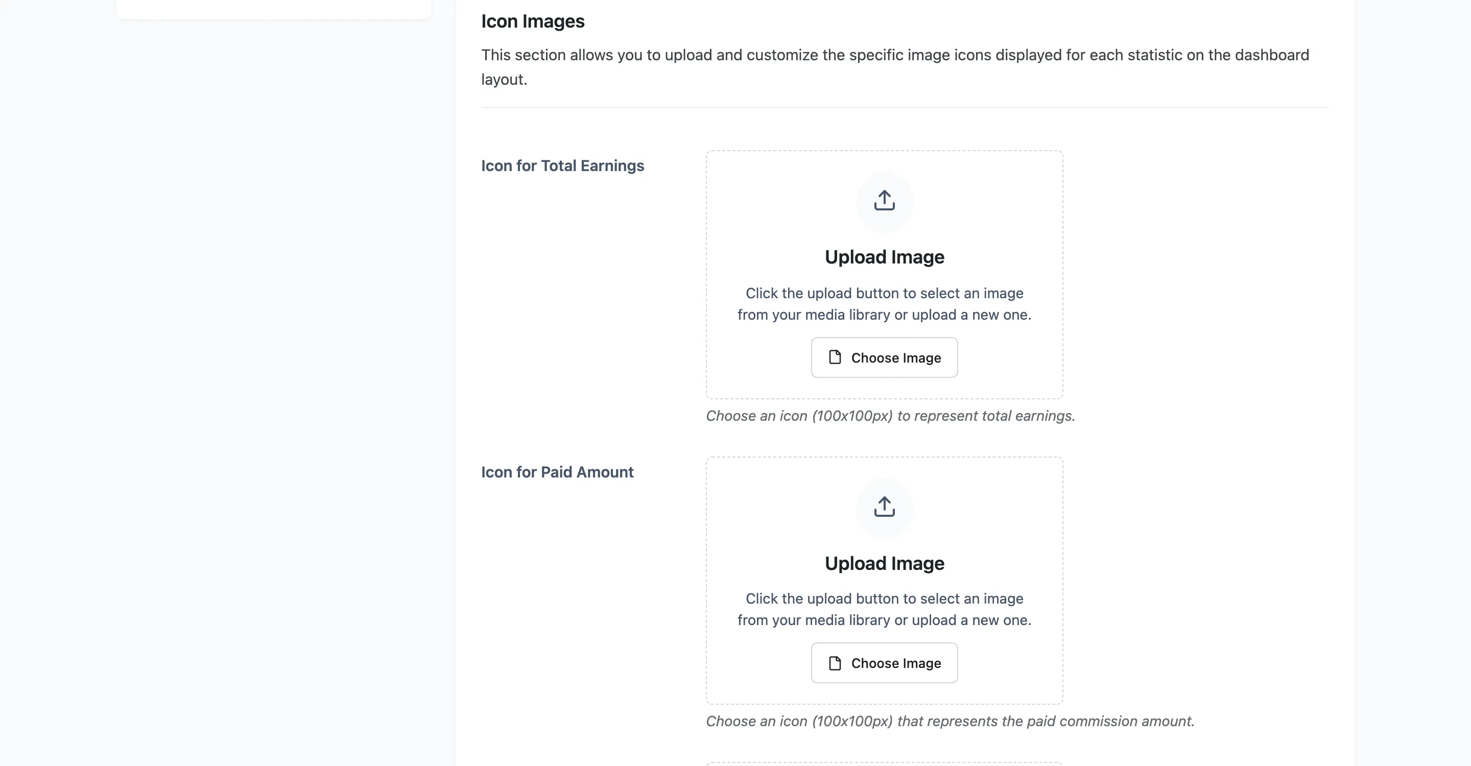
Section titled “Step 4: Set the icons”Three fields under Icons Configuration control the card icons.
- Show Icons turns them on or off. On by default.
- Show Wrapper draws the tinted rounded square behind each one. On by default.
- Icon Size is the pixel size. The default is 40. Drop it to 28 for a denser look.
Details Icon Color under the Colour section sets the icon itself. Match it to your brand colour or leave it in the blue family; a dashboard with three unrelated accent colours reads as unfinished.
Step 5: Style the tables
Section titled “Step 5: Style the tables”Five of the dashboard sections are tables: commissions, payouts, visits, top products and coupons. Two pickers cover all of them.
- Table Header Background Color, default
#f5f7f9 - Table Header Text Color, default
#121212
Change the background and check the text colour in the same pass. A dark header with the default near-black text is unreadable, and it is the single most common mistake on this tab.
Click Save Changes when the colours are set.
Step 6: Rename the sections
Section titled “Step 6: Rename the sections”Go to Configuration → Endpoints.
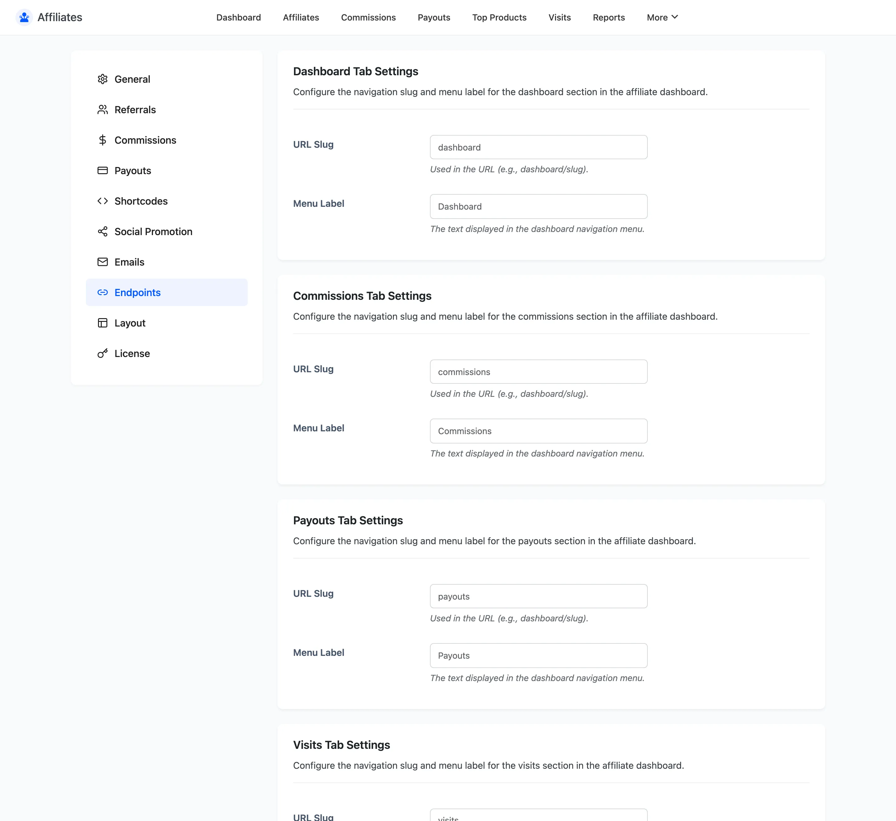
Every dashboard section gets two fields.
- URL Slug is the path segment.
commissionsproduces/affiliate-dashboard/commissions/. - Menu Label is what the affiliate reads on the navigation.
Labels are free to change; they break nothing. Slugs change a live URL, so rename those early, before affiliates have bookmarked anything. Saving the tab flushes the WordPress rewrite rules for you, so the new slug works immediately.
The rename worth doing is Top Products. Most affiliates read it as your best sellers rather than theirs. My Best Sellers says what it actually is.
Step 7: Check the result
Section titled “Step 7: Check the result”Open the dashboard as an affiliate, not as an administrator. An admin account is not an affiliate, so the page shows the join form instead of the dashboard.
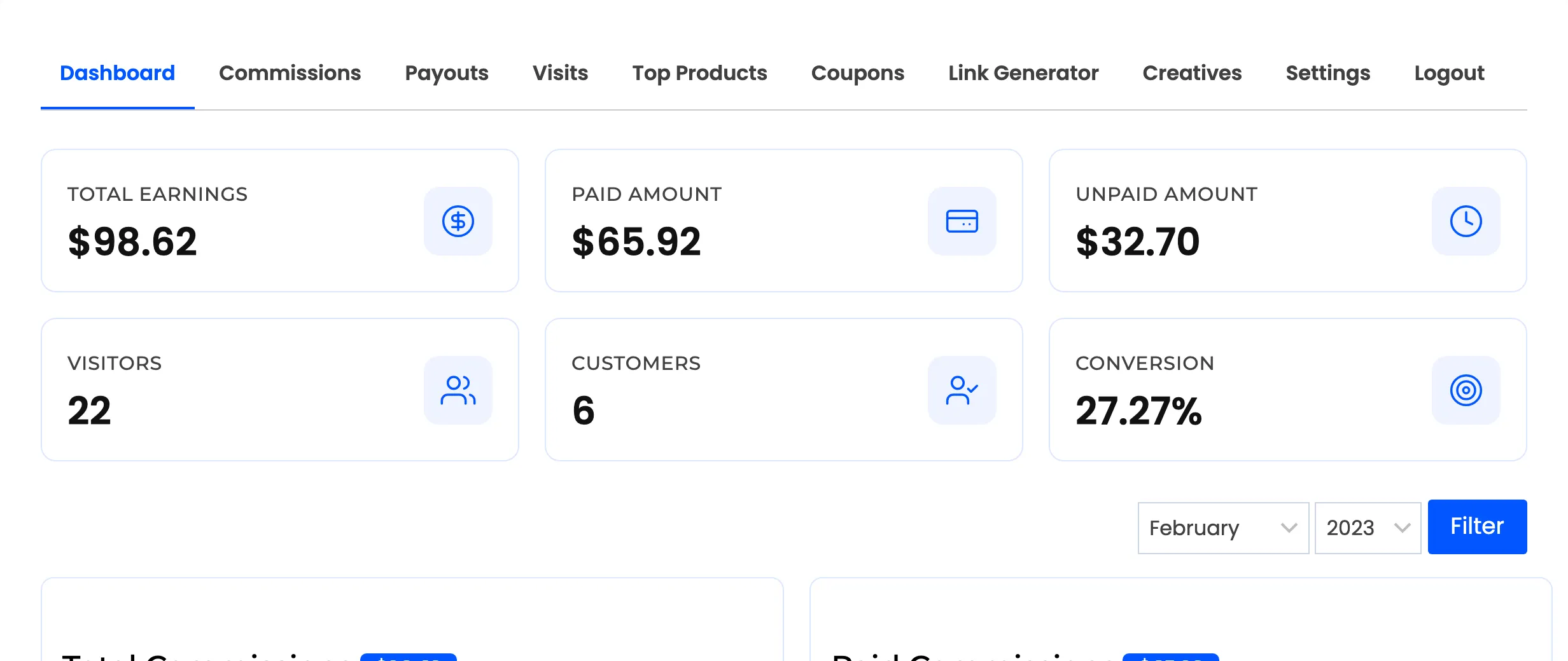
Check three things.
- The cards are readable at a glance.
- Every table header is easy to read.
- The active navigation item is visibly active.
Then load it on a phone. The dashboard is responsive, but a colour pairing that works on a wide screen can lose contrast once the cards stack.
Where to go next
Section titled “Where to go next”- Layout Settings for every field on that tab.
- The Affiliate Experience for the whole journey you are styling.