

Layout Settings
The Layout tab controls how the affiliate dashboard looks. It covers the icons on the statistic cards and every colour on the screen.
Open Layout settings
Section titled “Open Layout settings”Go to DevDiggers Plugins → Affiliates → Configuration → Layout.
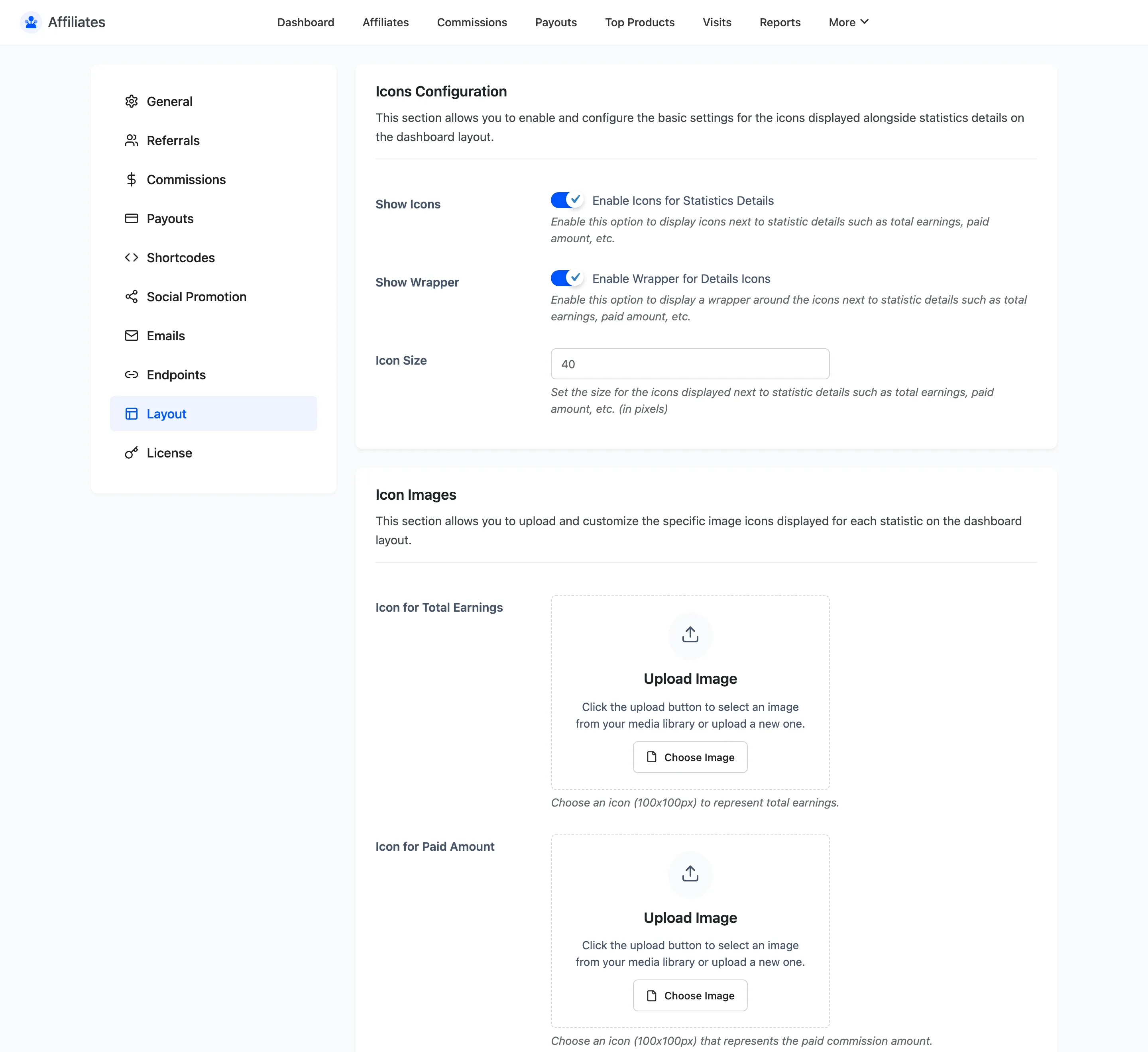
Icons Configuration
Section titled “Icons Configuration”- Show Icons displays an icon on each statistic card: total earnings, paid amount, unpaid amount, visitors, customers and conversion. On by default.
- Show Wrapper draws a tinted rounded square behind each icon. On by default. Turn it off for a flatter dashboard where the icon sits directly on the card.
- Icon Size is the icon size in pixels. The default is 40.
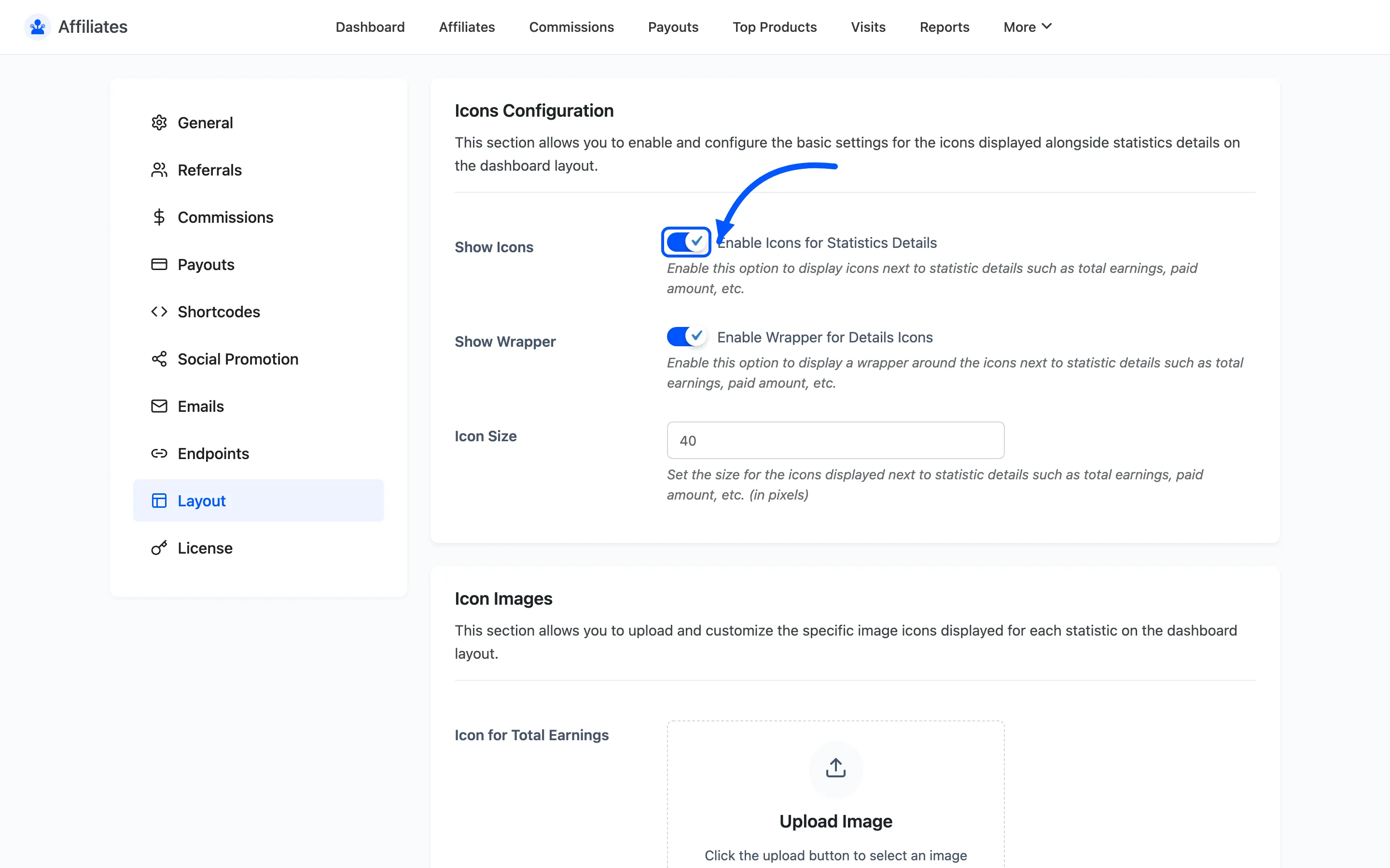
Icon Images
Section titled “Icon Images”Six upload fields replace the built-in icon for each card, one per statistic. The recommended size is 100 by 100 pixels.
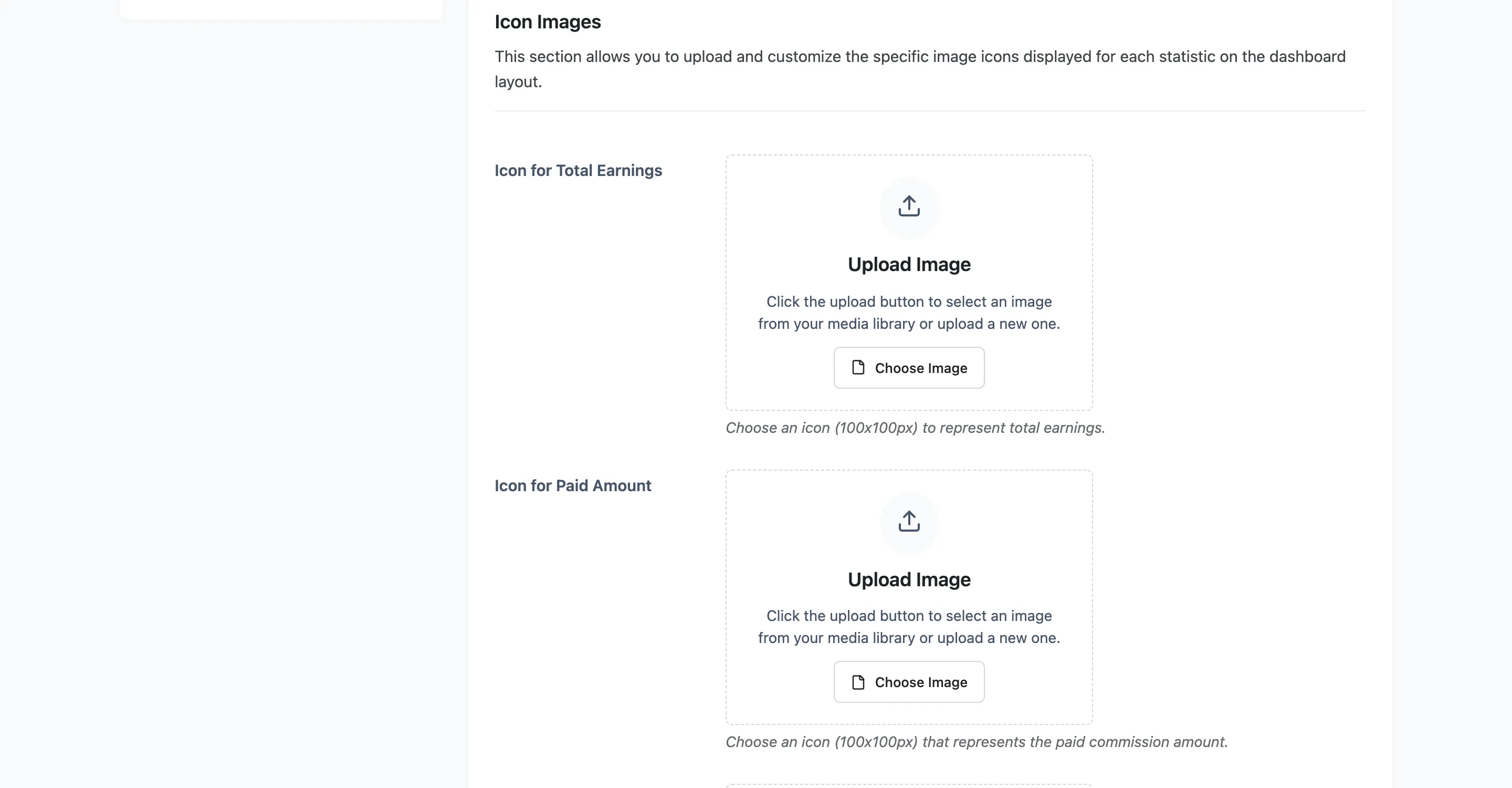
Colour
Section titled “Colour”Nine colour pickers cover the dashboard. Every one is free.
| Field | What it colours | Default |
|---|---|---|
| Brand Primary Color | Primary buttons, active states and highlights | #0256ff |
| Details Icon Color | The statistic card icons | #0256ff |
| Details Icon Wrapper Background Color | The tinted square behind each icon | #EEF3FF |
| Background Color | The statistic card background | #ffffff |
| Border Color | The statistic card border | #dce6ff |
| Text Color | The statistic card title | #121212 |
| Value Color | The statistic card figure | #121212 |
| Table Header Background Color | Table headers across every section | #f5f7f9 |
| Table Header Text Color | Table header text | #121212 |
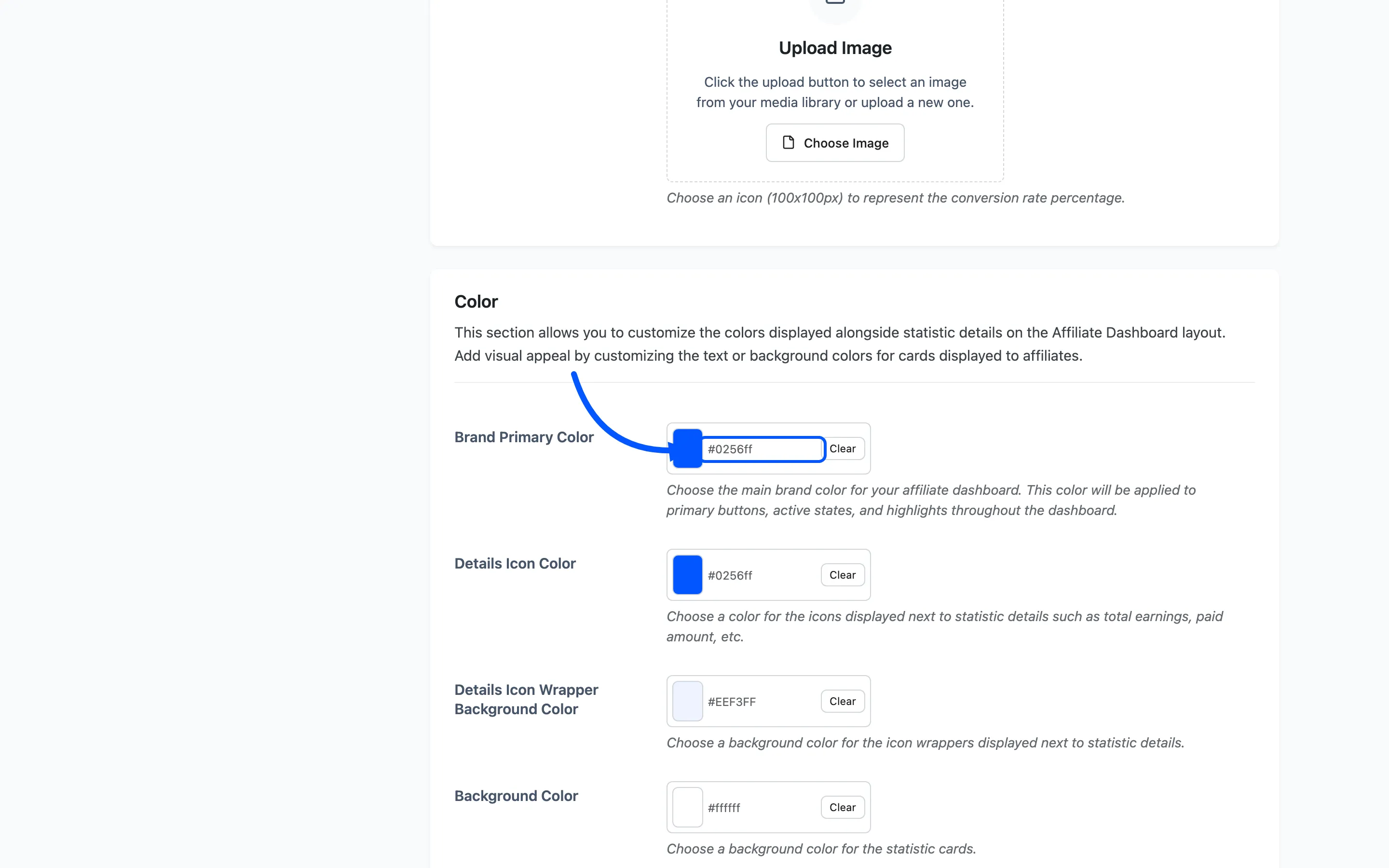
Brand Primary Color is the one that carries the most weight. It sets the Filter button, the active navigation item and every highlight, so changing it alone gets most of the way to a branded dashboard.
Getting the contrast right
Section titled “Getting the contrast right”Two pairs have to stay readable against each other.
- Value Color against Background Color. The figure is the whole point of the card, so it needs the strongest contrast on the screen.
- Table Header Text Color against Table Header Background Color. A dark header background with the default near-black text is unreadable.
Change a background and check its text colour in the same pass.
Where to go next
Section titled “Where to go next”- The Affiliate Experience to see what these colours apply to.
- Dashboard Endpoints to rename the sections as well as restyle them.