

How to Style the Wallet to Match Your Store
The wallet page sits inside My Account, so a customer meets it as part of your store, not as a plugin. One tab decides how much it looks like one.
Everything here styles the customer-facing wallet only. None of it touches the admin screens.
Step 1: Open the Layout tab
Section titled “Step 1: Open the Layout tab”Go to DevDiggers Plugins → Wallet → Configuration → Layout.
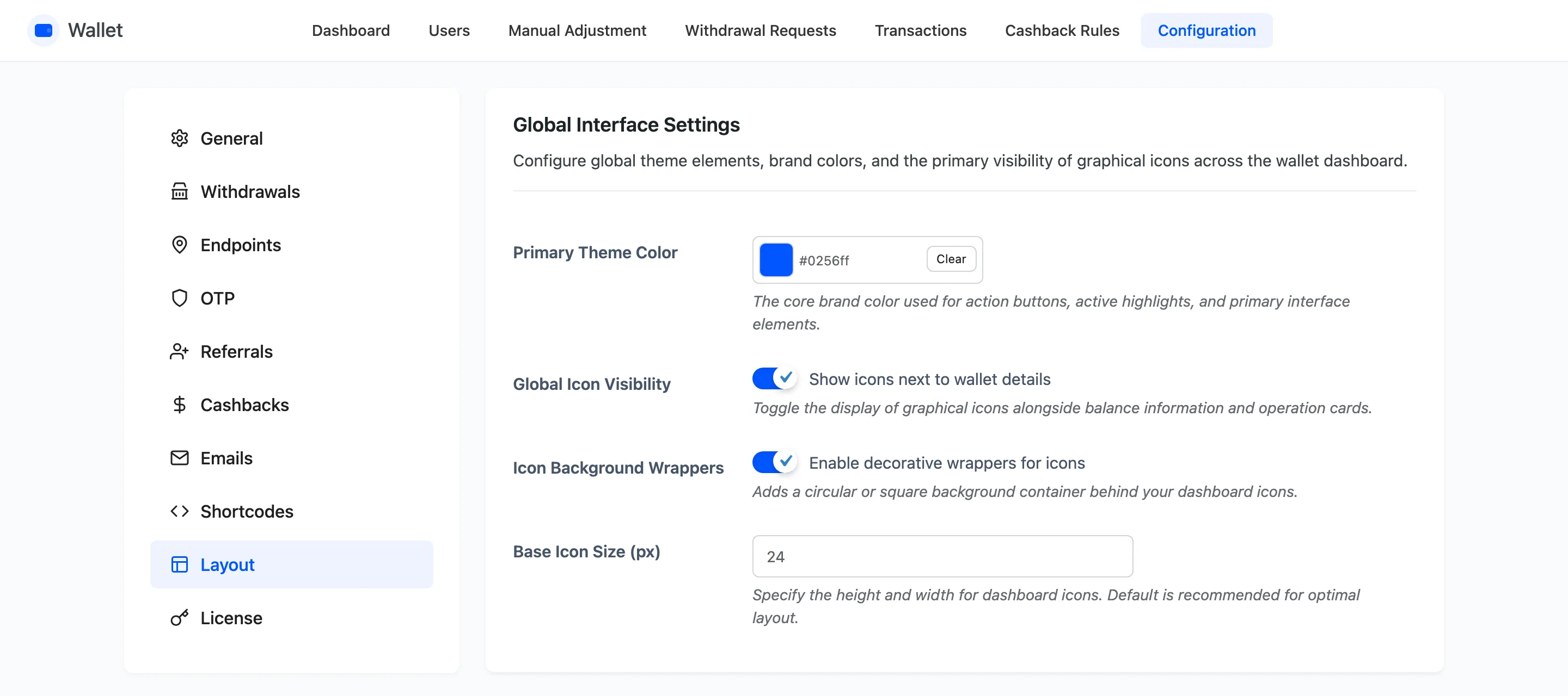
Four sections, working down the page: global interface, dashboard icons, card and table styling, and the notice colours.
Step 2: Set the accent colour
Section titled “Step 2: Set the accent colour”Primary Theme Color is the single field worth changing first. It is the wallet’s accent, default
#0256ff, and it carries the buttons, the active states and the highlights.
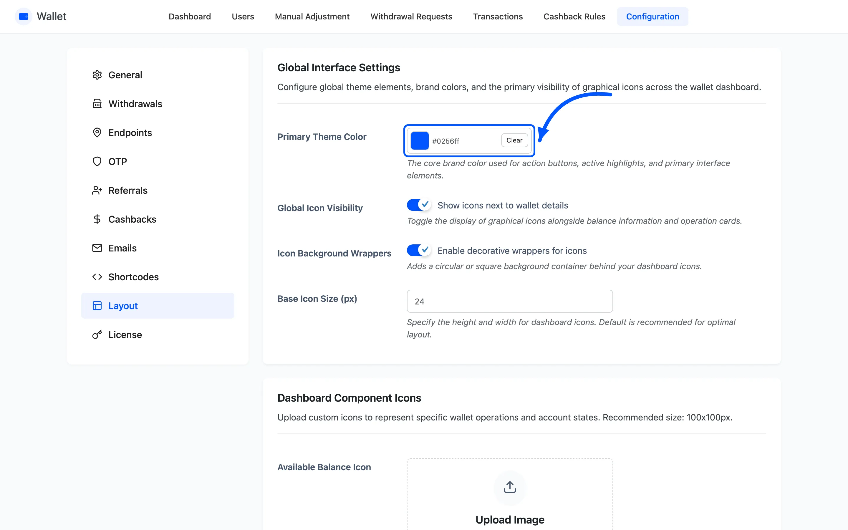
Take the value from your theme rather than picking a blue you like. Most themes expose their primary colour in the customiser, and matching it is the difference between a wallet that belongs on the page and one that was bolted on.
Step 3: Decide what happens to the icons
Section titled “Step 3: Decide what happens to the icons”Three fields in the same section control every icon at once.
- Global Icon Visibility shows or hides all of them.
- Icon Background Wrappers puts each icon in a tinted rounded square.
- Base Icon Size (px) sets the size, default 24.
Turning icons off is worth trying on a text-led theme. The wallet reads perfectly well without them, and six coloured squares can be six things competing with the balance a customer came to check.
If you keep them, you can replace them one at a time.
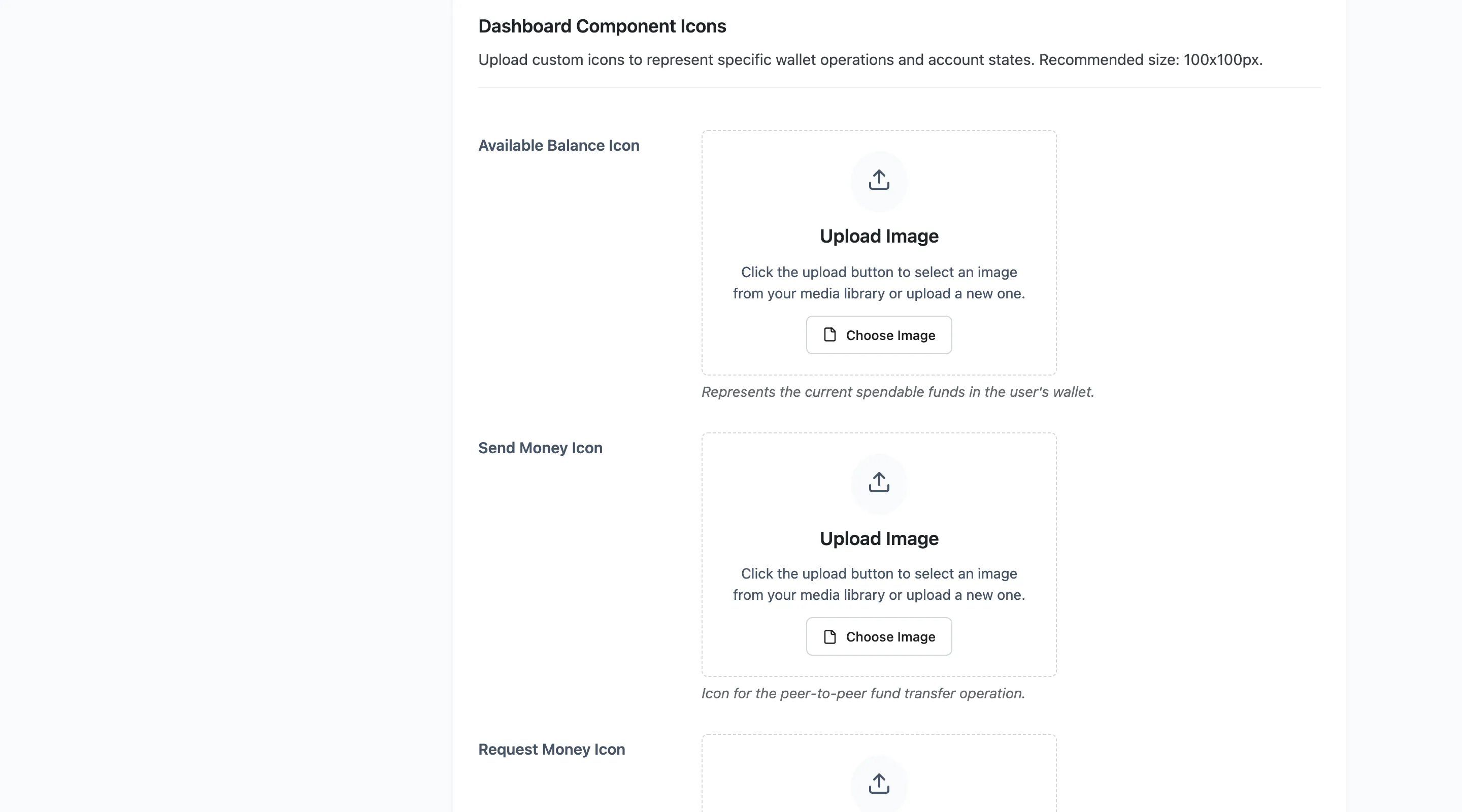
Upload square images. Each one drops into a slot sized by Base Icon Size, so a wide logo comes out squashed rather than cropped. Leave a slot empty and the built-in icon is used, which means you can replace one icon and leave the other five alone.
Step 4: Colour the balance card and the table
Section titled “Step 4: Colour the balance card and the table”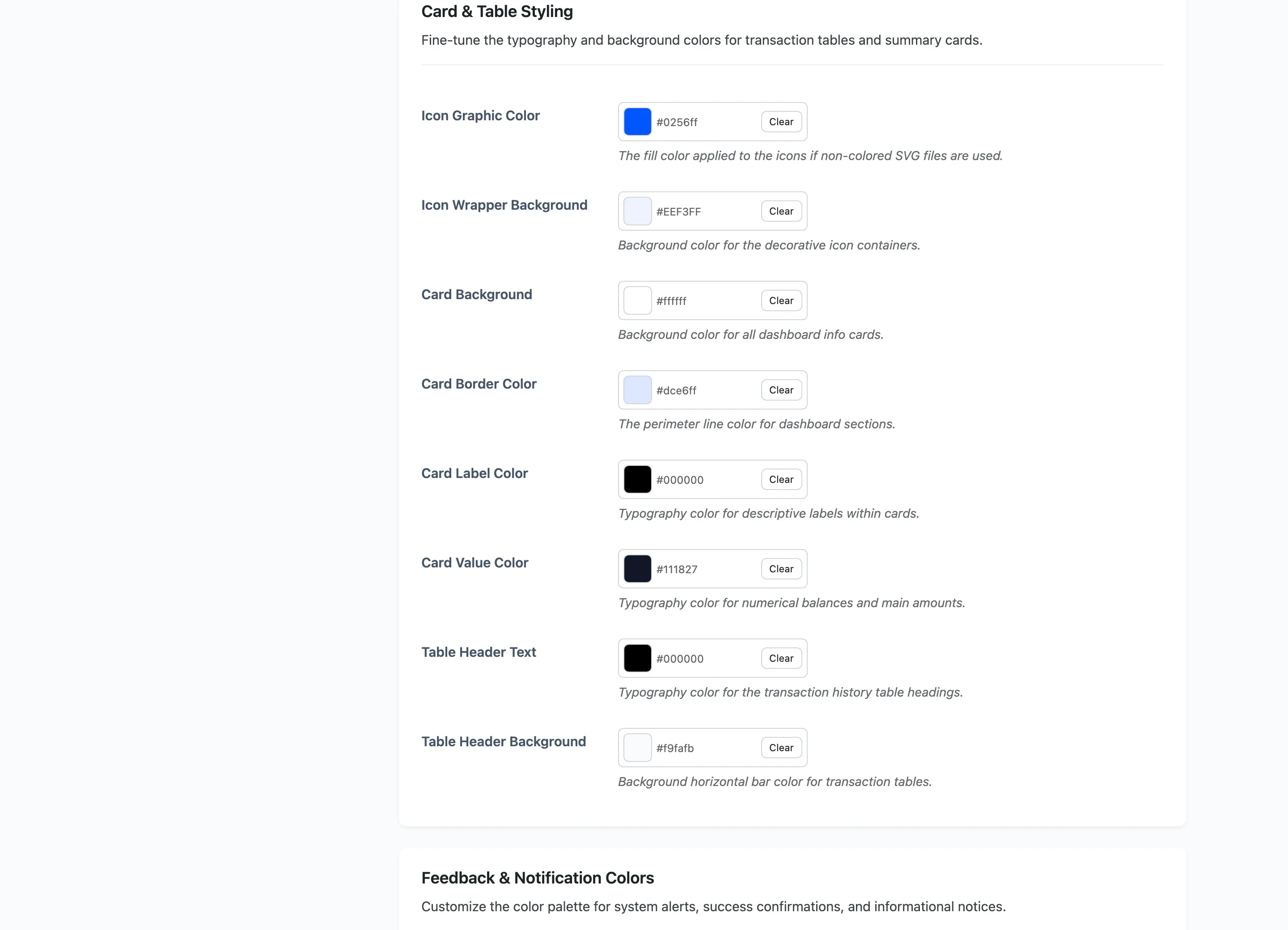
Eight colours, all free. Two style the icons, four style the balance card, and two style the transaction table heading.
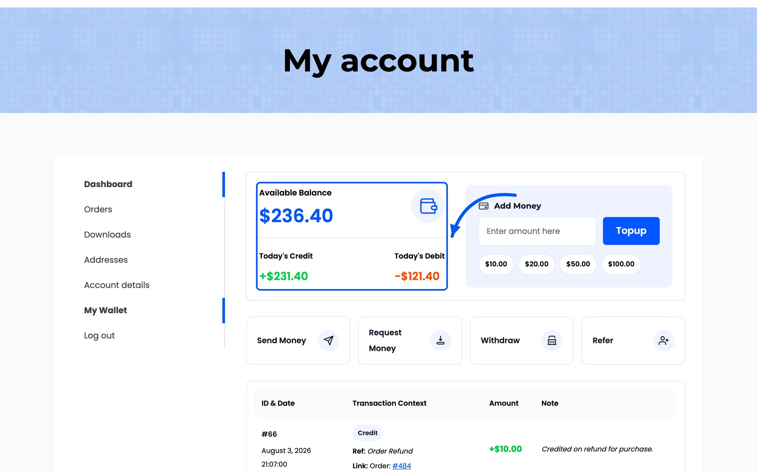
The pair to get right is Card Label Color and Card Value Color. The label is small grey text and the value is the number the customer opened the page to read. Keep real contrast between them, or the balance stops being the first thing the eye lands on.
Step 5: Colour the three notices
Section titled “Step 5: Colour the three notices”
Three pairs, all free: success, error and info, each with a text colour and a background.
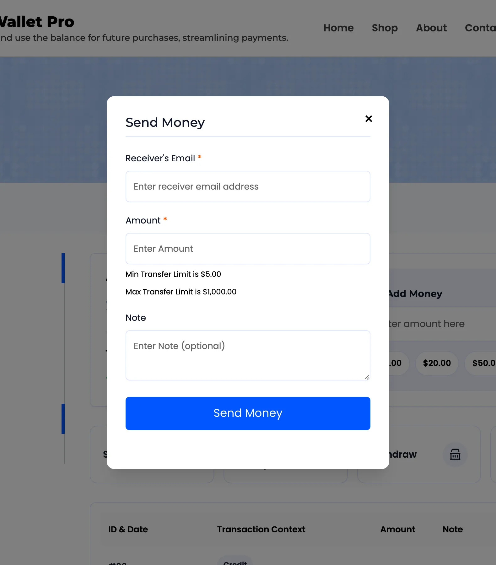
These are the messages inside the operation popups. Money sent, balance too low, amount over the limit. Customers meet them at the moment they are least patient, so keep the error pair unmistakable and do not let it drift towards your brand colour for the sake of matching.
Step 6: Check it on the wallet page
Section titled “Step 6: Check it on the wallet page”Save, then open My Account → My Wallet as a customer.
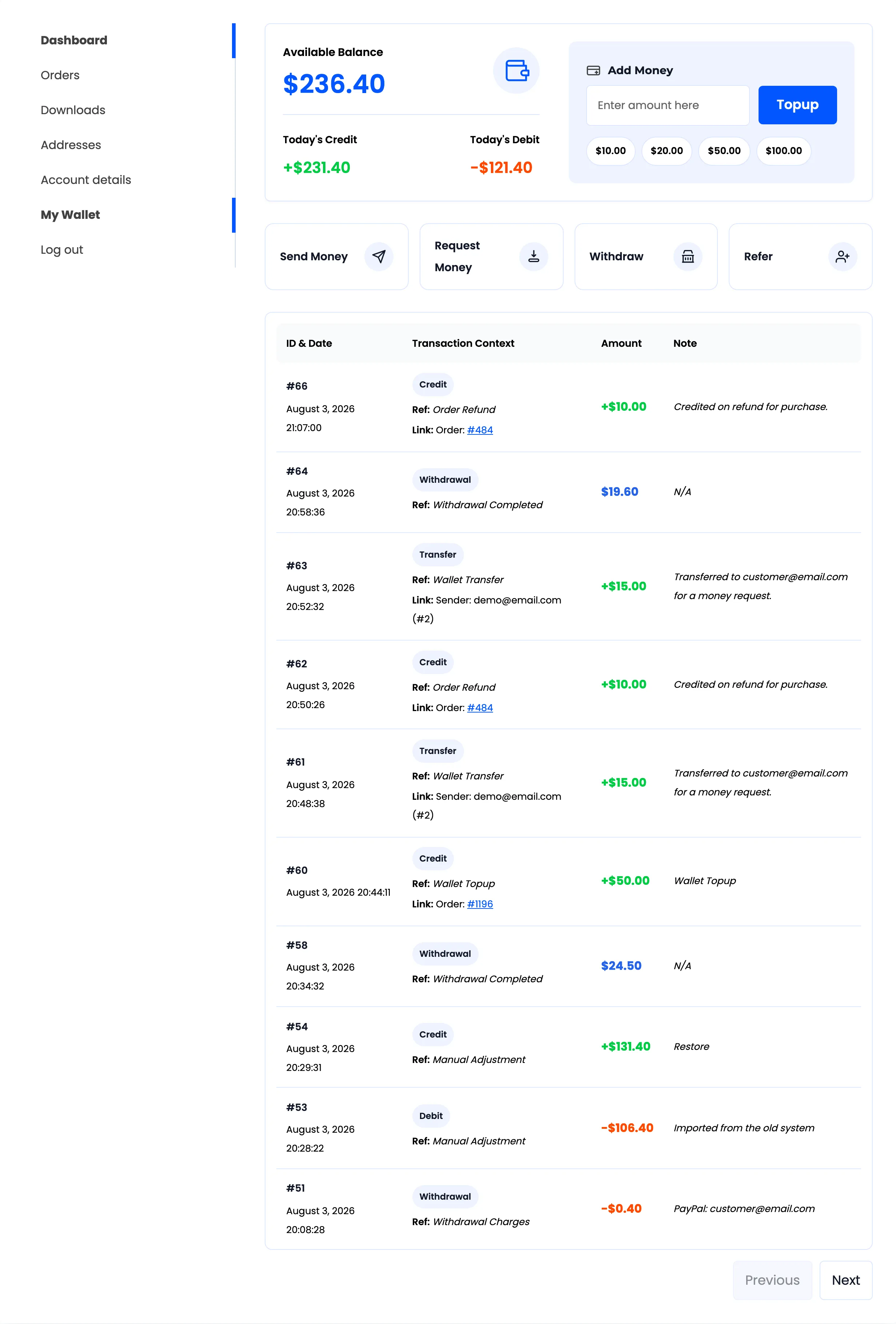
Read it at the size a customer will. The balance card is the thing that has to work first, then the operation buttons, then the history table.
Open one operation popup as well, since the notice colours only show up once something succeeds or fails.
Two things this tab does not style
Section titled “Two things this tab does not style”- The cashback banners have their own colours under Configuration → Cashbacks.
- The emails inherit your WooCommerce email template, not these colours. Style them in WooCommerce → Settings → Emails.