

How to Style the Alert Form
The form takes your theme’s fonts and sits inside your product summary. Four settings make it match the rest of your store.
Step 1: Pick a form style
Section titled “Step 1: Pick a form style”Open Configuration → Alert Form and find Style.
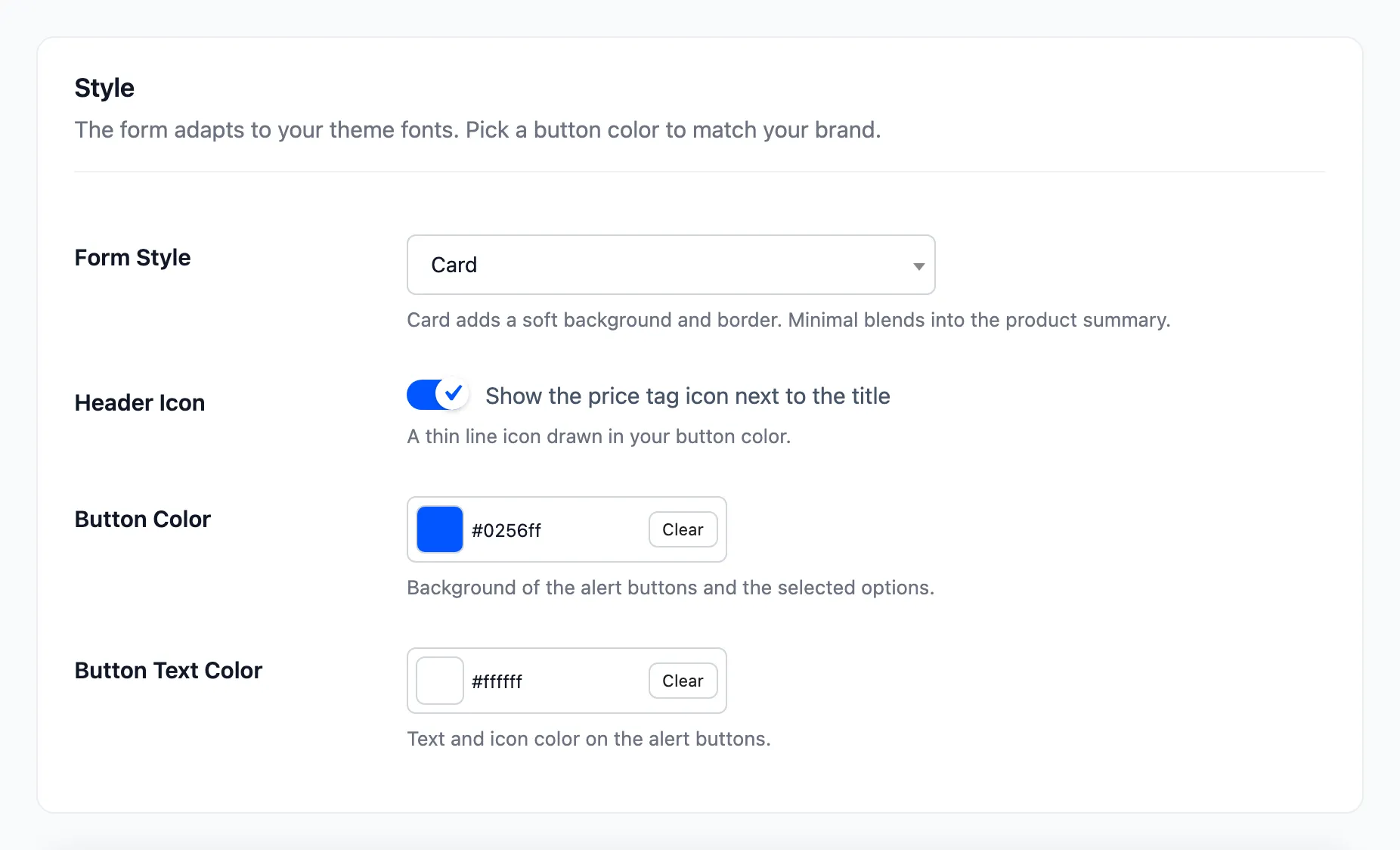
Card gives the form a soft background and a border. Minimal drops both, so the form blends into the product summary:
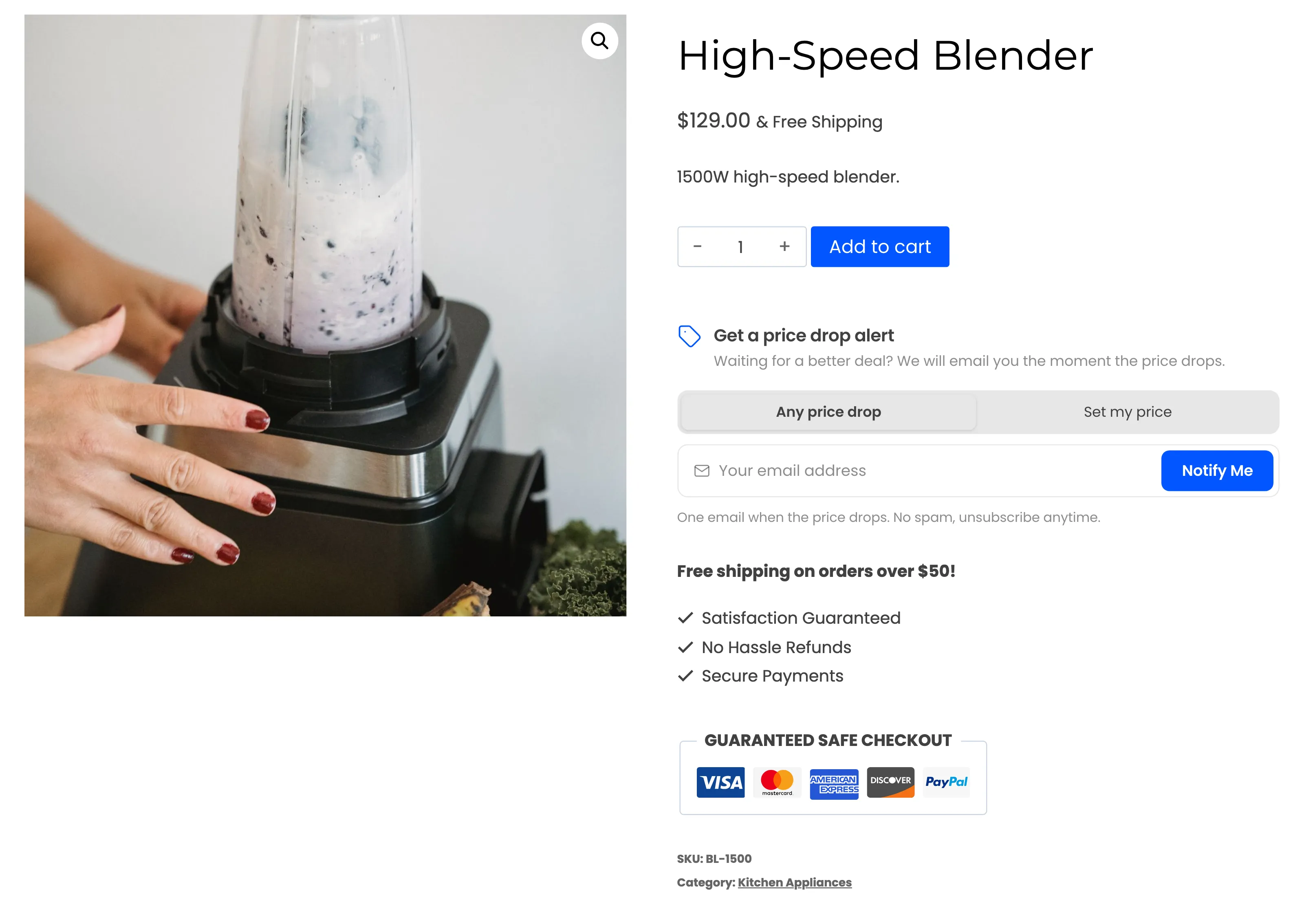
Step 2: Set the button colors
Section titled “Step 2: Set the button colors”Button Color paints the buttons and the selected option, #0256ff by default. Button Text Color is the text and icons on them, #ffffff by default. The demo tried a dark button:
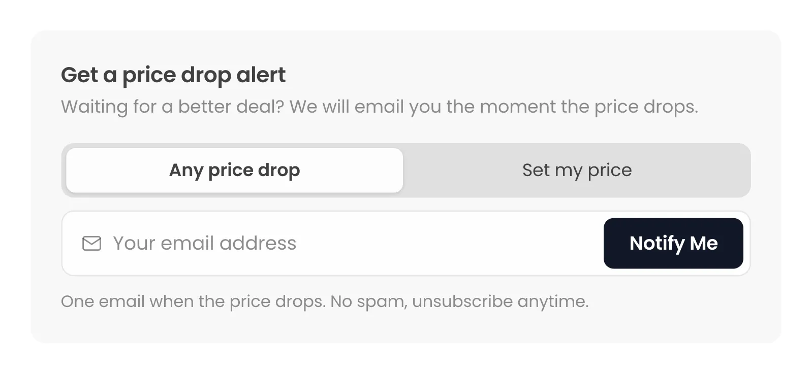
The email button has its own color, under Emails → Email Settings.
Step 3: Hide what you do not need
Section titled “Step 3: Hide what you do not need”- Header Icon: Untick to drop the price tag next to the title.
- Watchers Count: Untick to hide “2 shoppers are watching this price.”
- Description and Reassurance Note: Empty them on the Form Content section to hide them.
- Quick Discounts (%): Empty it to hide the discount buttons.
Step 4: Move the form
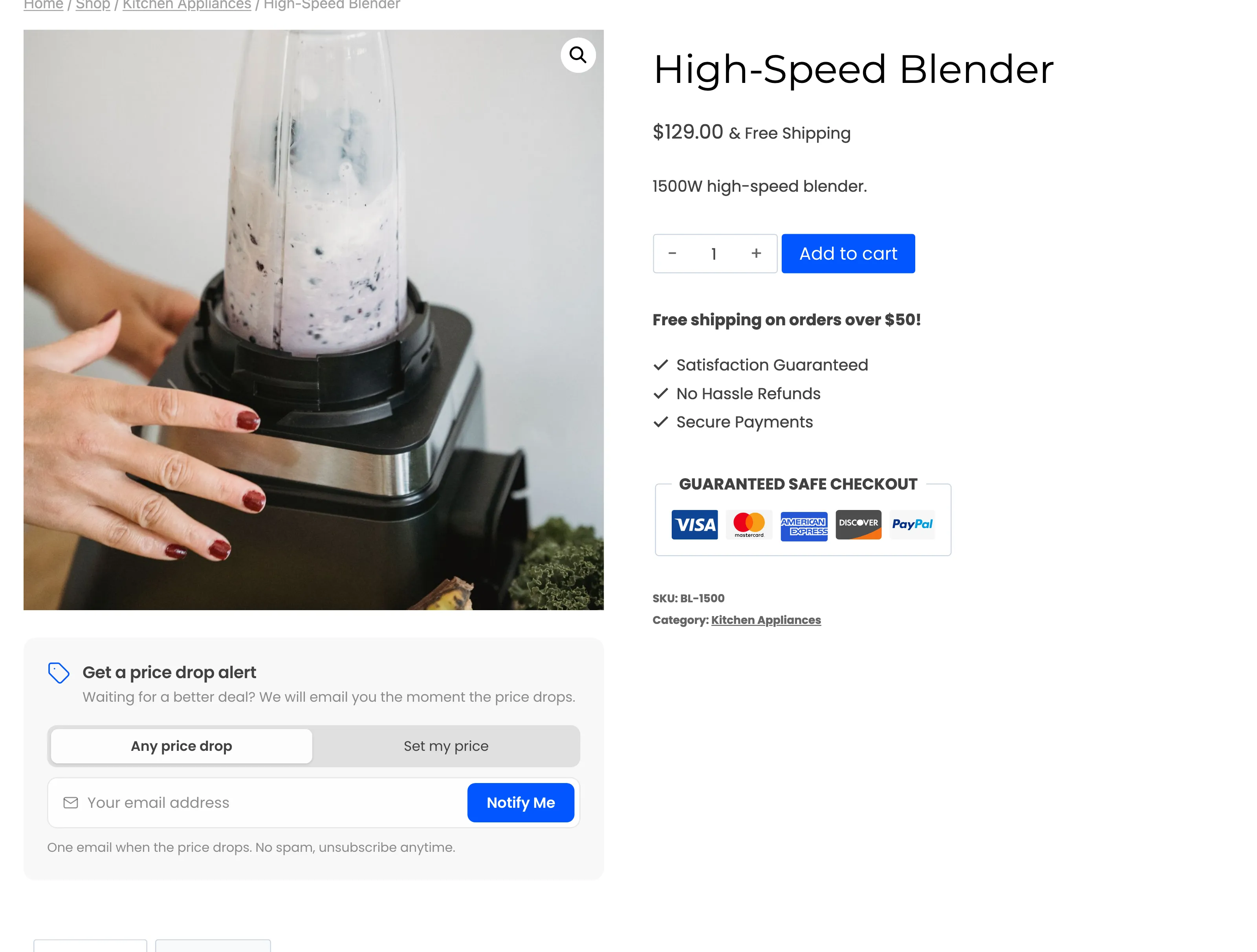
Section titled “Step 4: Move the form”Product Page Position has seven places on a classic product page, from Before product title to Before product tabs. After product images puts it under the gallery:
When the theme gets in the way
Section titled “When the theme gets in the way”A theme’s own CSS can clash with the form, for example by hiding buttons until hover. Fix that once in
Appearance → Customize → Additional CSS, aimed at the .ddwcpdn-alert form or the theme rule. The form’s
own classes all start with ddwcpdn-.