

How to Add a Bottom Tab Bar to Your App (Pro)
The tab bar is the single change that makes an installed site stop feeling like a website in a window. It also only ever appears inside the installed app, so nothing your ordinary visitors see changes at all.
Step 1: Switch the App Experience layer on
Section titled “Step 1: Switch the App Experience layer on”Go to DevDiggers Plugins → Progressive Web App → Configuration → App Experience.
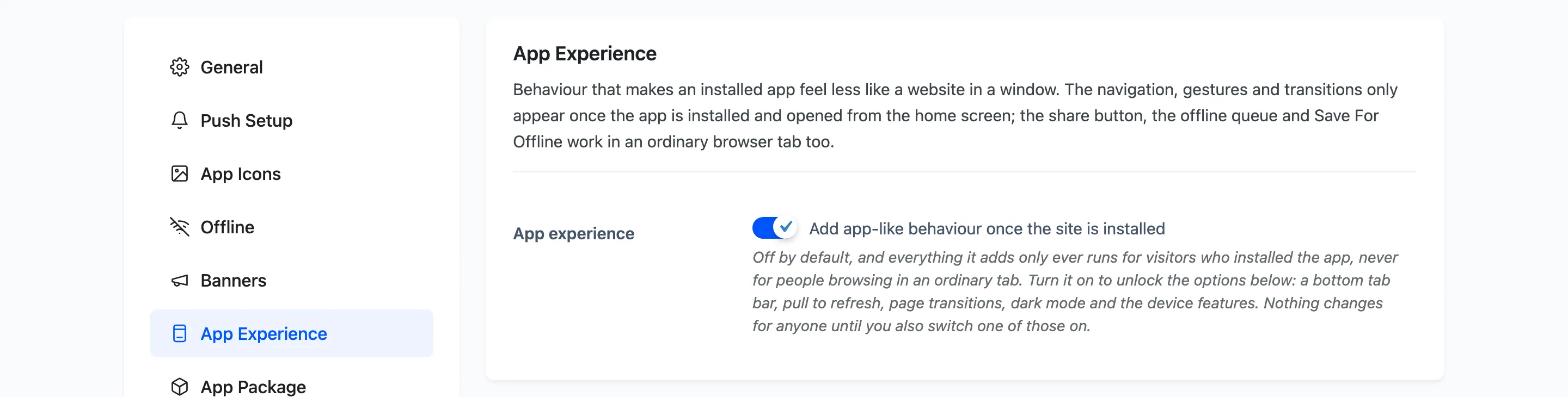
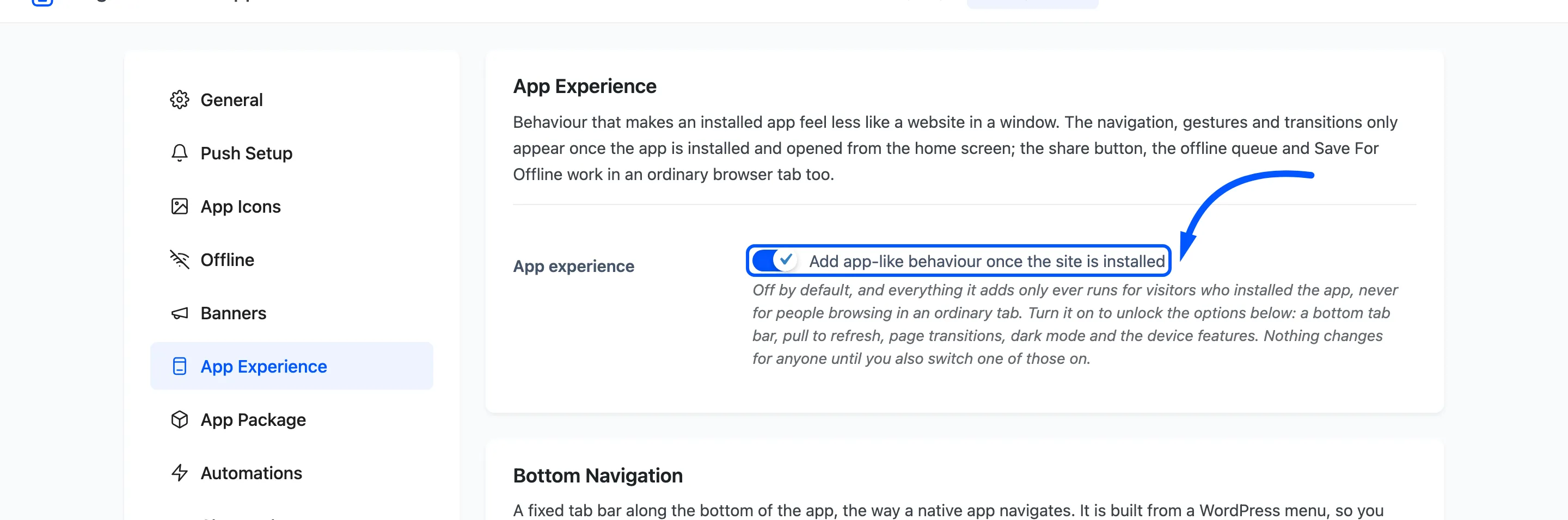
This one is off by default, unlike the other module switches. Turning a new front end layer on for every existing site during an update would be a surprise rather than an upgrade.
It unlocks the options below and changes nothing on its own.
Step 2: Tick the bottom tab bar
Section titled “Step 2: Tick the bottom tab bar”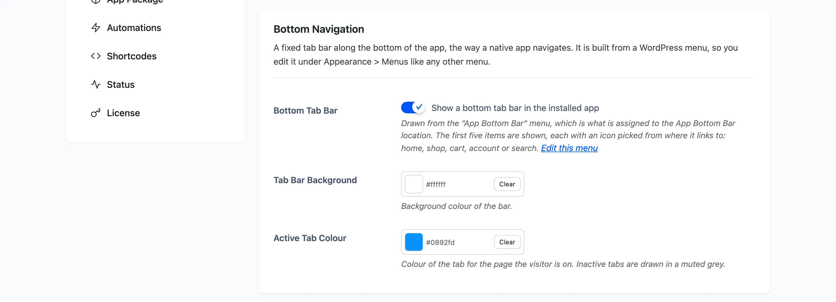
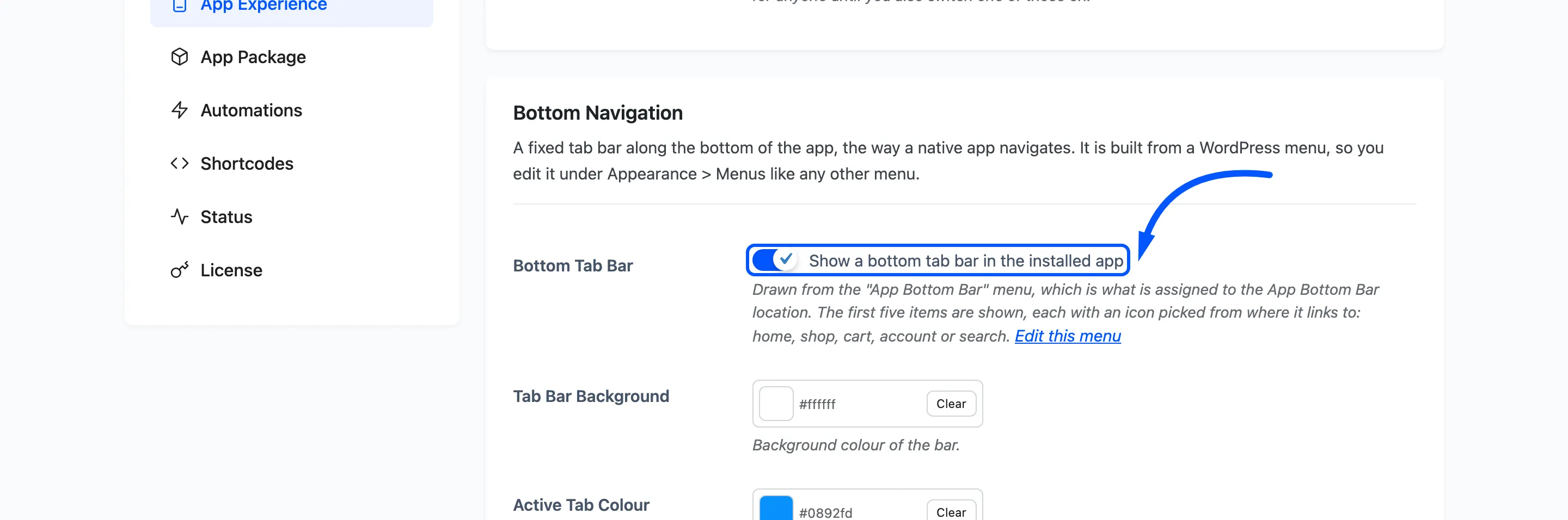
Press Save Changes. Saving with the bar switched on does something worth knowing. It creates an App Bottom Bar menu and assigns it to the matching location, seeded with Home, Shop, Cart and Account on a store.
That is deliberate. Switching the bar on with nothing assigned used to save happily and draw nothing, with no sign from this screen that a separate trip to Appearance was still owed.
The seeding happens once. A menu you have edited is never rewritten, and clearing the assignment on purpose is not undone.
Step 3: Edit the links
Section titled “Step 3: Edit the links”The bar is an ordinary WordPress menu, so you edit it where you edit every other menu.
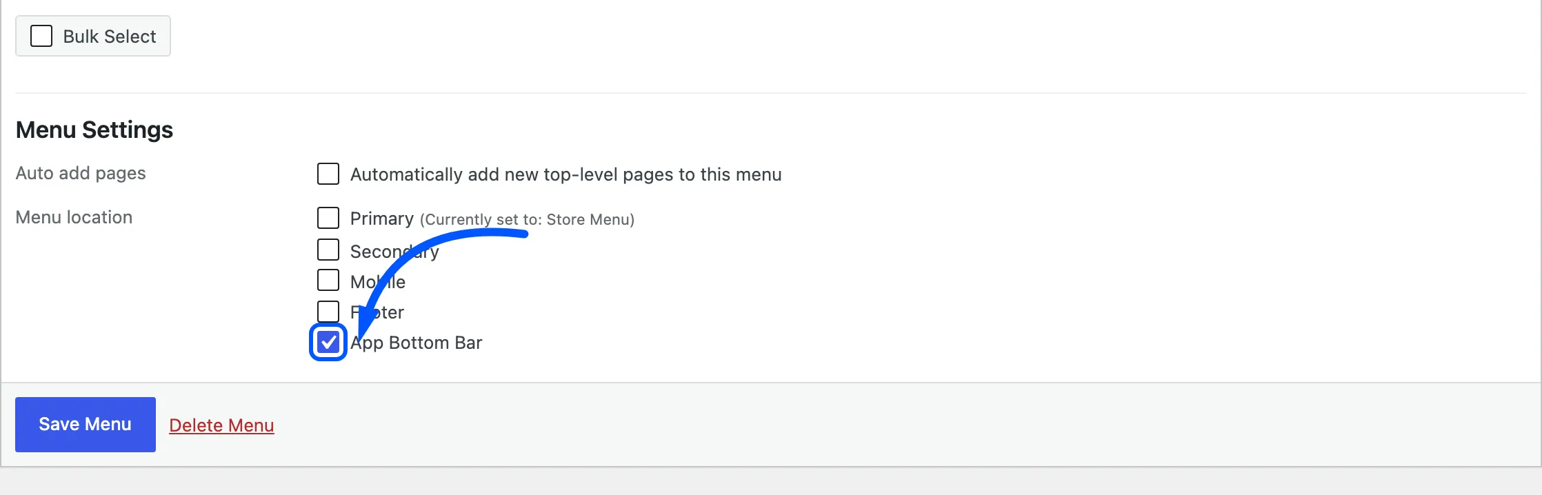
Go to Appearance → Menus, pick the App Bottom Bar location, and change the items. A menu you already have can be assigned here instead.
Two rules the bar imposes.
- The first five items are shown. Anything after that is ignored, because six tabs on a phone are unreadable.
- Each item takes an icon picked from where it links: home, shop, cart, account or search. There is no icon field, and a link to something else gets a generic one.
Four items is the sweet spot on a store, because the dark mode toggle takes a fifth slot.
Step 4: Colour the bar
Section titled “Step 4: Colour the bar”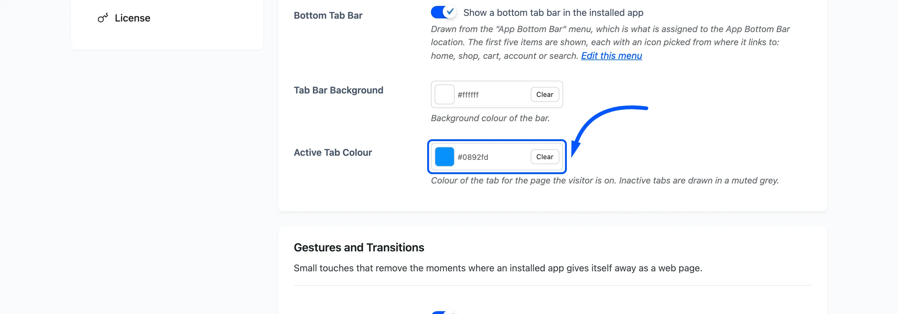
Tab Bar Background defaults to white. Active Tab Colour defaults to your theme colour and marks the tab for the page the visitor is on. Inactive tabs are drawn in a muted grey and are not configurable, which keeps the active one readable whatever you choose.
Step 5: Add the dark mode toggle
Section titled “Step 5: Add the dark mode toggle”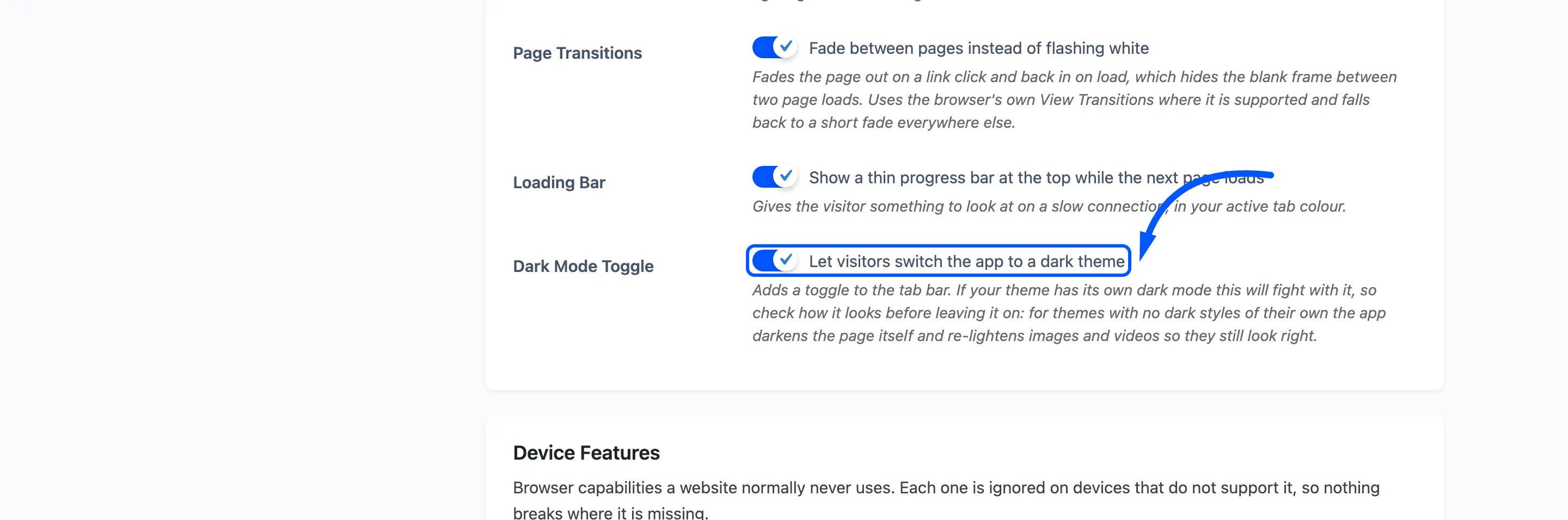
This adds a Theme item to the bar.
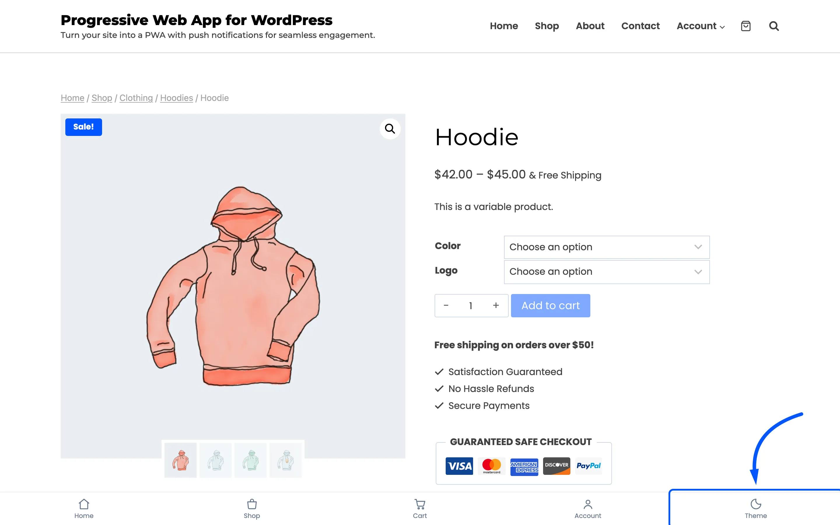
If your theme has its own dark mode, the two will fight. Check how it looks before leaving this on. For a theme with no dark styles, the app darkens the page itself and re-lightens images and video so products still look right.
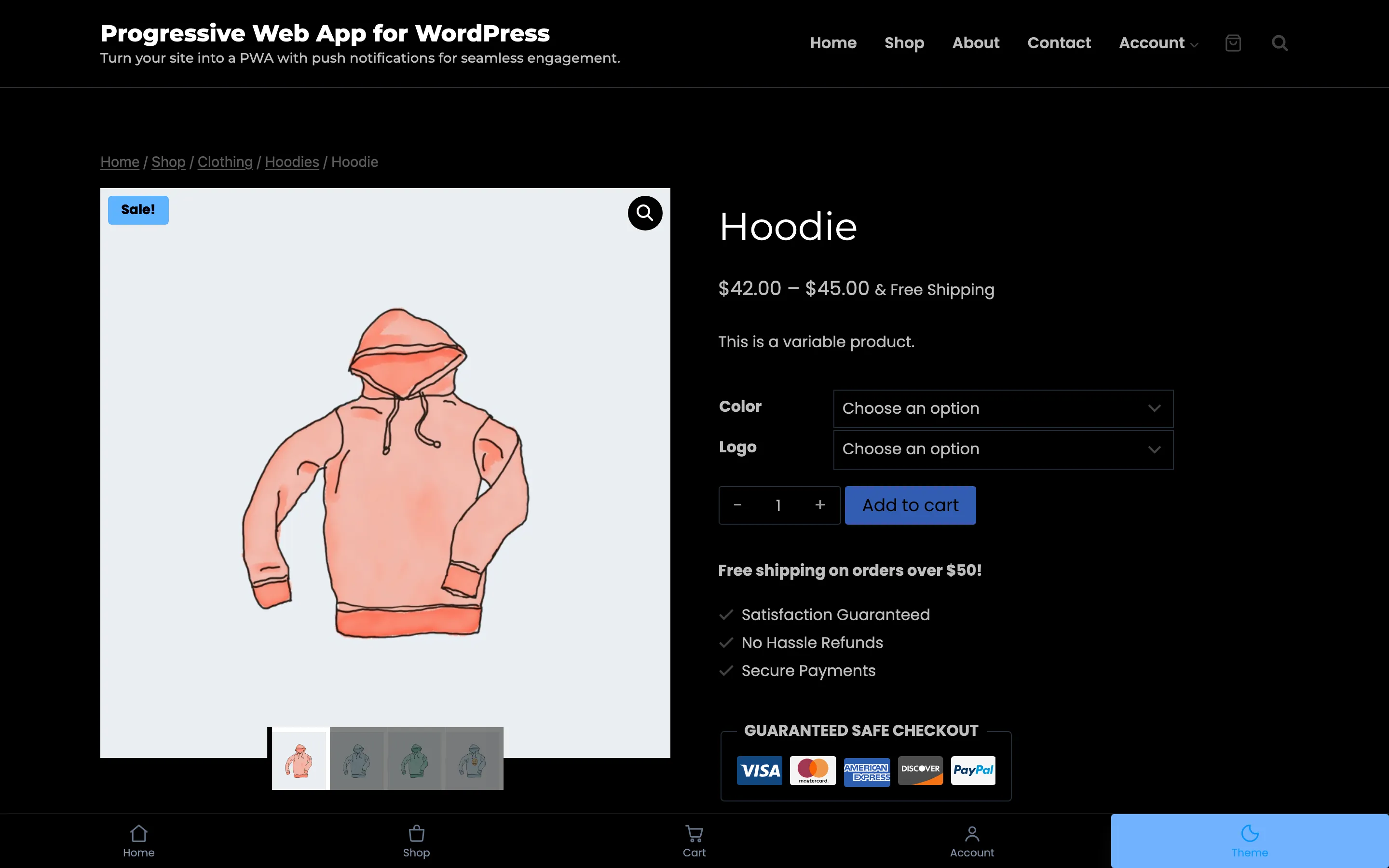
Step 6: Check it in the installed app
Section titled “Step 6: Check it in the installed app”Install the app on a phone and open it from the home screen.
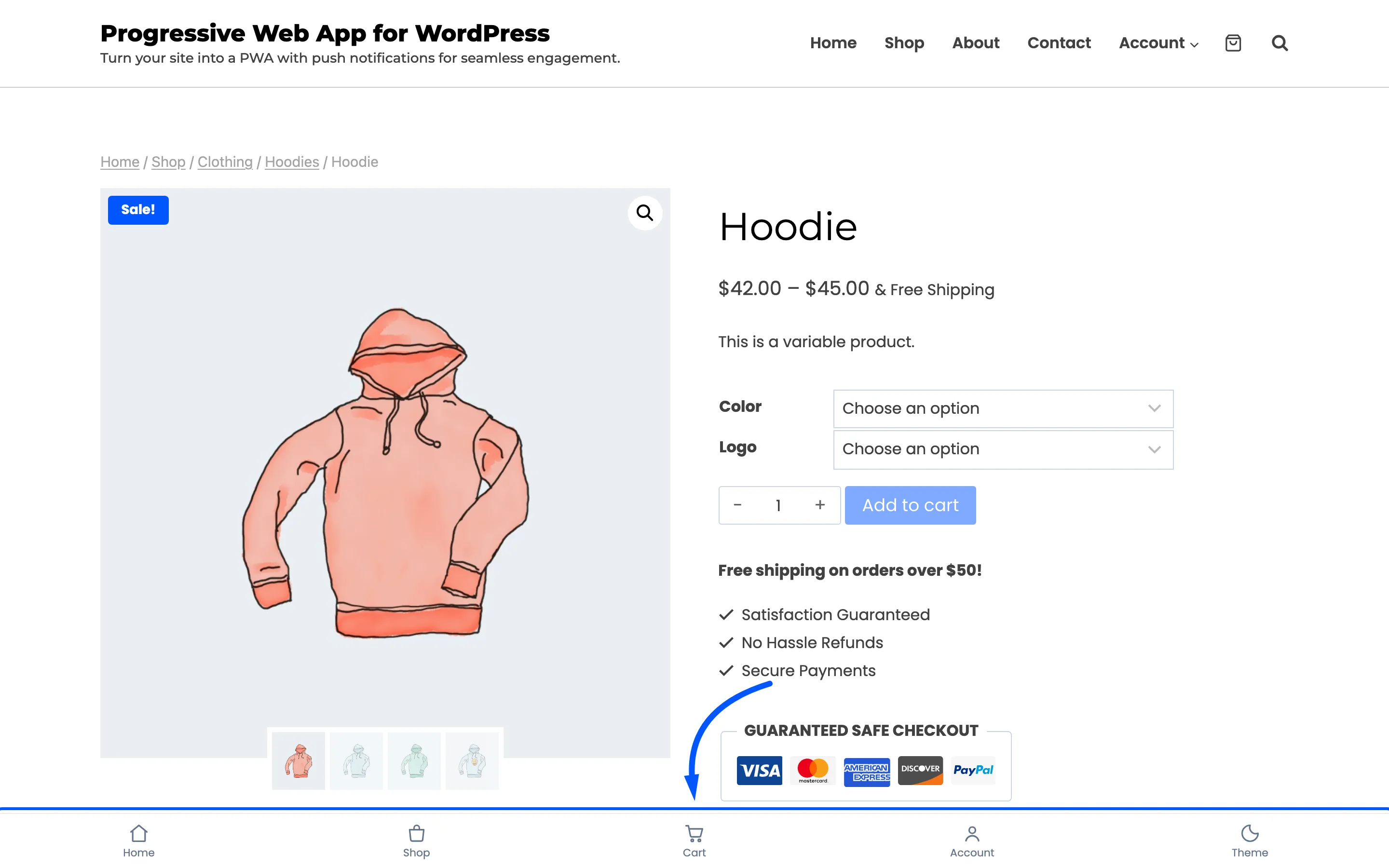
The bar is fixed to the bottom of the viewport, so it stays there while the page scrolls. On a phone it is the whole point of the feature.
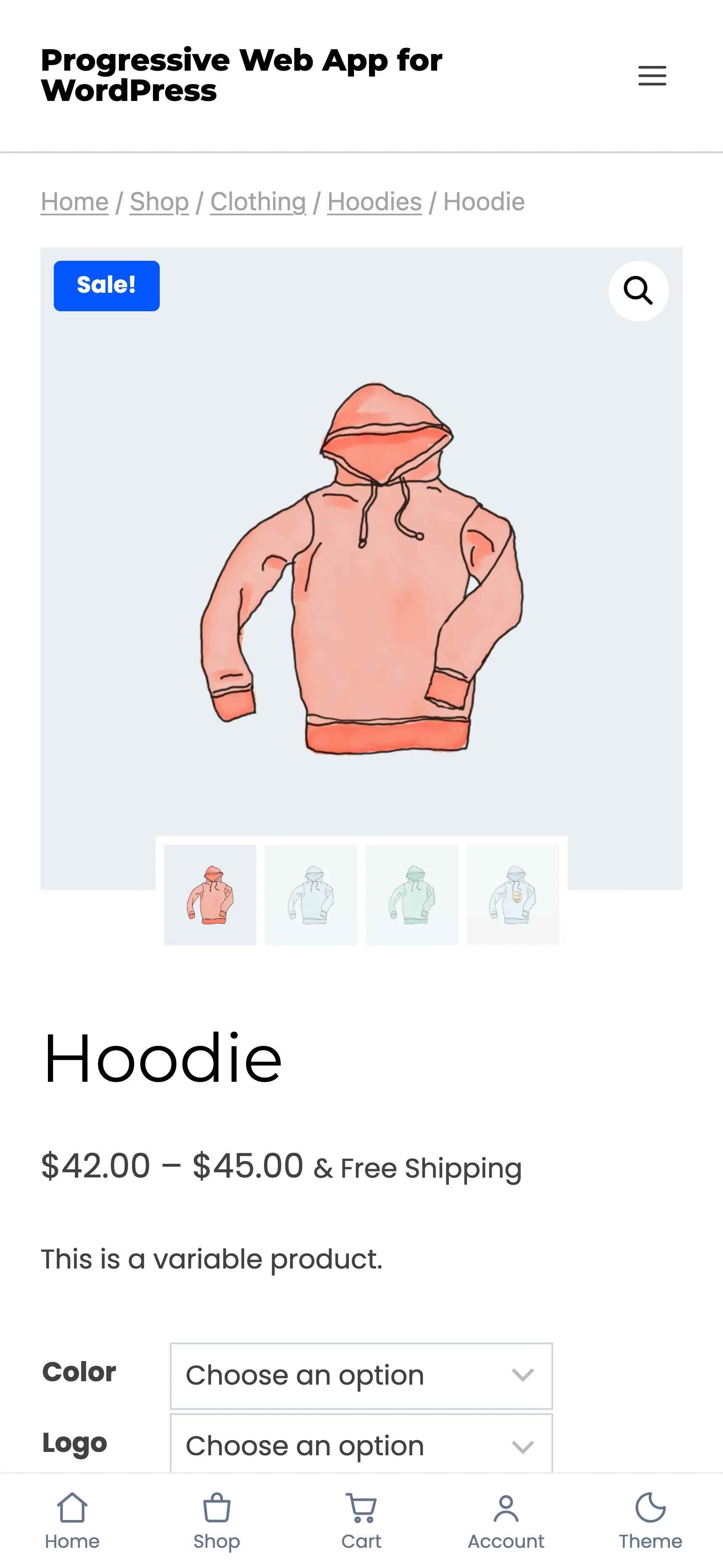
The bar is drawn on the server as real links, so it works before any script has run and it does not pop in a frame late.
It will not appear in an ordinary browser tab, and that is not a fault. The bar is gated on the browser reporting that the page was launched from the home screen. Your theme already has its own navigation in a tab, and two navigation bars on one screen is worse than either.
The rest of the layer
Section titled “The rest of the layer”While you are on the tab, three more switches are worth a look, and all three only run in the installed app.
- Pull to Refresh reloads on a downward pull.
- Page Transitions fades between pages instead of flashing white.
- Loading Bar draws a thin progress bar in your active tab colour.