

How to Style the Passkey Button
The passkey button is the first thing a returning customer sees on the login form. Make it look like the rest of your store.
Step 1: Open Appearance
Section titled “Step 1: Open Appearance”Go to Configuration → Appearance. The Preview at the bottom shows the button as it is now.
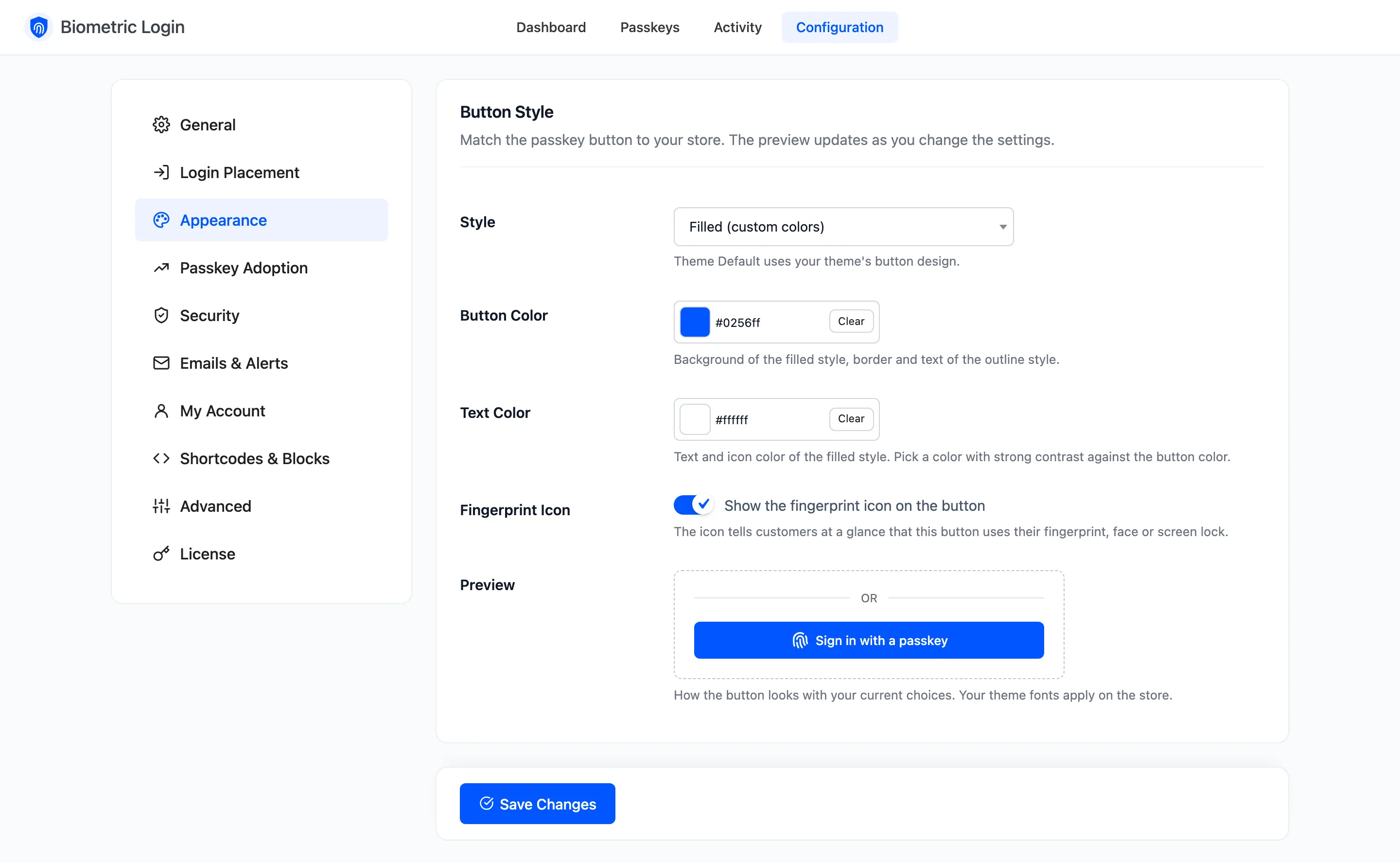
Step 2: Pick a style
Section titled “Step 2: Pick a style”Choose a Style. The preview changes before you save.
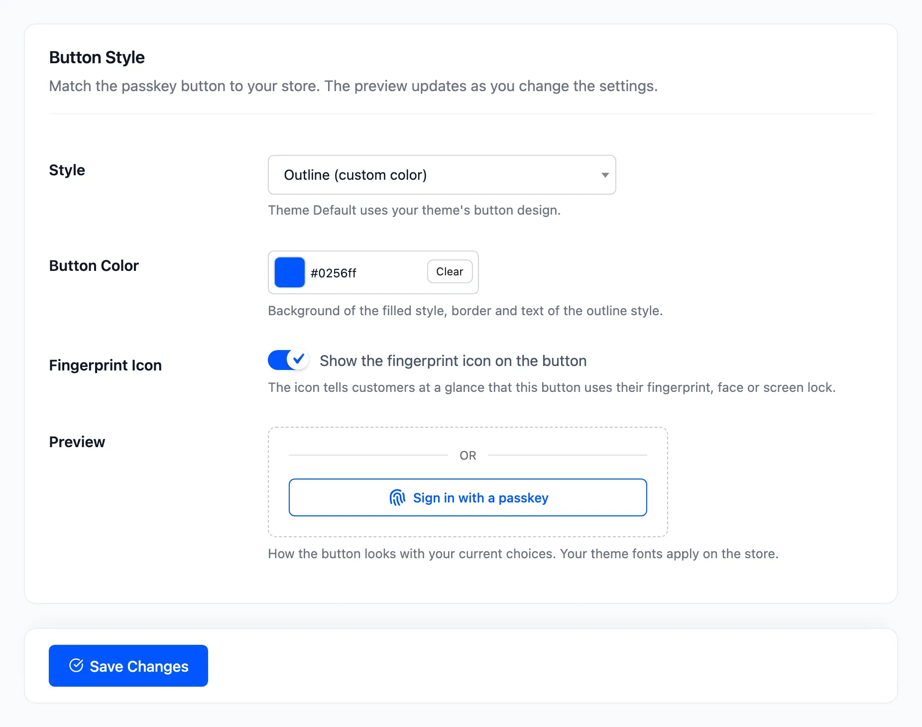
- Filled (custom colors): Your colours, the default. Blue on the demo.
- Outline (custom color): A border and text in your colour on a clear background.
- Dark and Light: Fixed near-black or near-white buttons that suit most stores.
- Theme Default: Your theme’s own button design.
Step 3: Set the colours
Section titled “Step 3: Set the colours”Button Color and Text Color show only for the styles that use them. Pick a text colour with strong contrast against the button. Fingerprint Icon adds or removes the icon.
Step 4: Save and check the store
Section titled “Step 4: Save and check the store”Click Save Changes and open My Account signed out. Here are all five on the demo store:
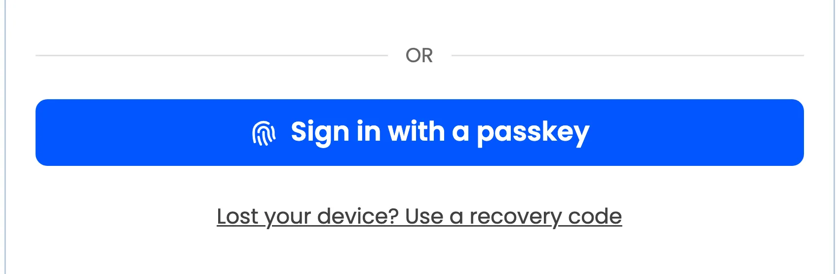
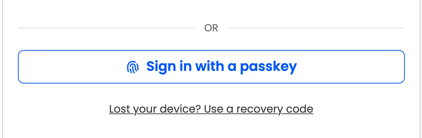
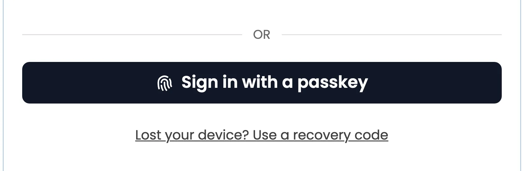
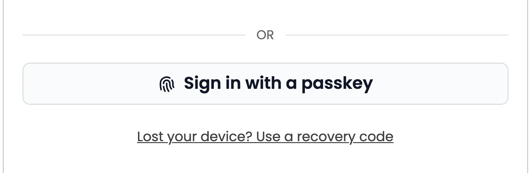
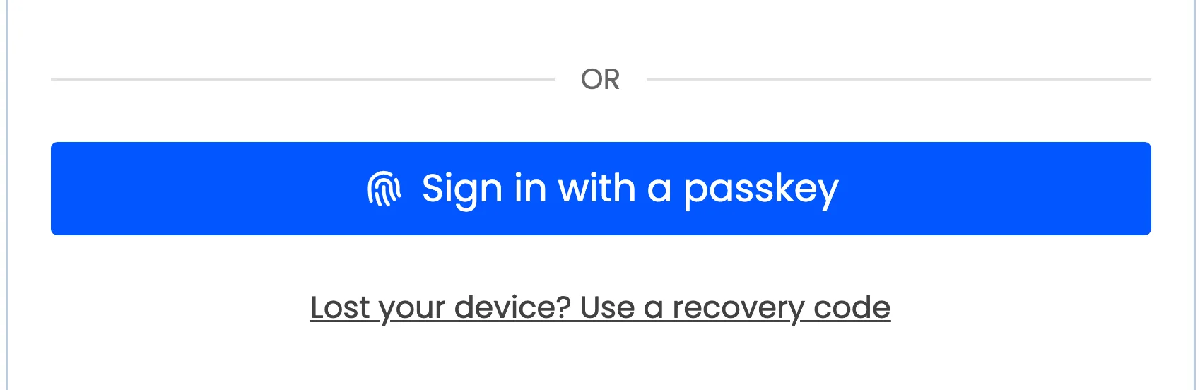
The style applies to every passkey sign in button: My Account, checkout, the WordPress login screen and the block. The Add a passkey buttons follow your theme.
Change the words too
Section titled “Change the words too”The label is Login Button Text under Configuration → General. The divider’s word is Separator Text under Login Placement; empty hides the divider.