

Appearance Settings
The Appearance tab styles the passkey button everywhere it shows. Open Configuration → Appearance.
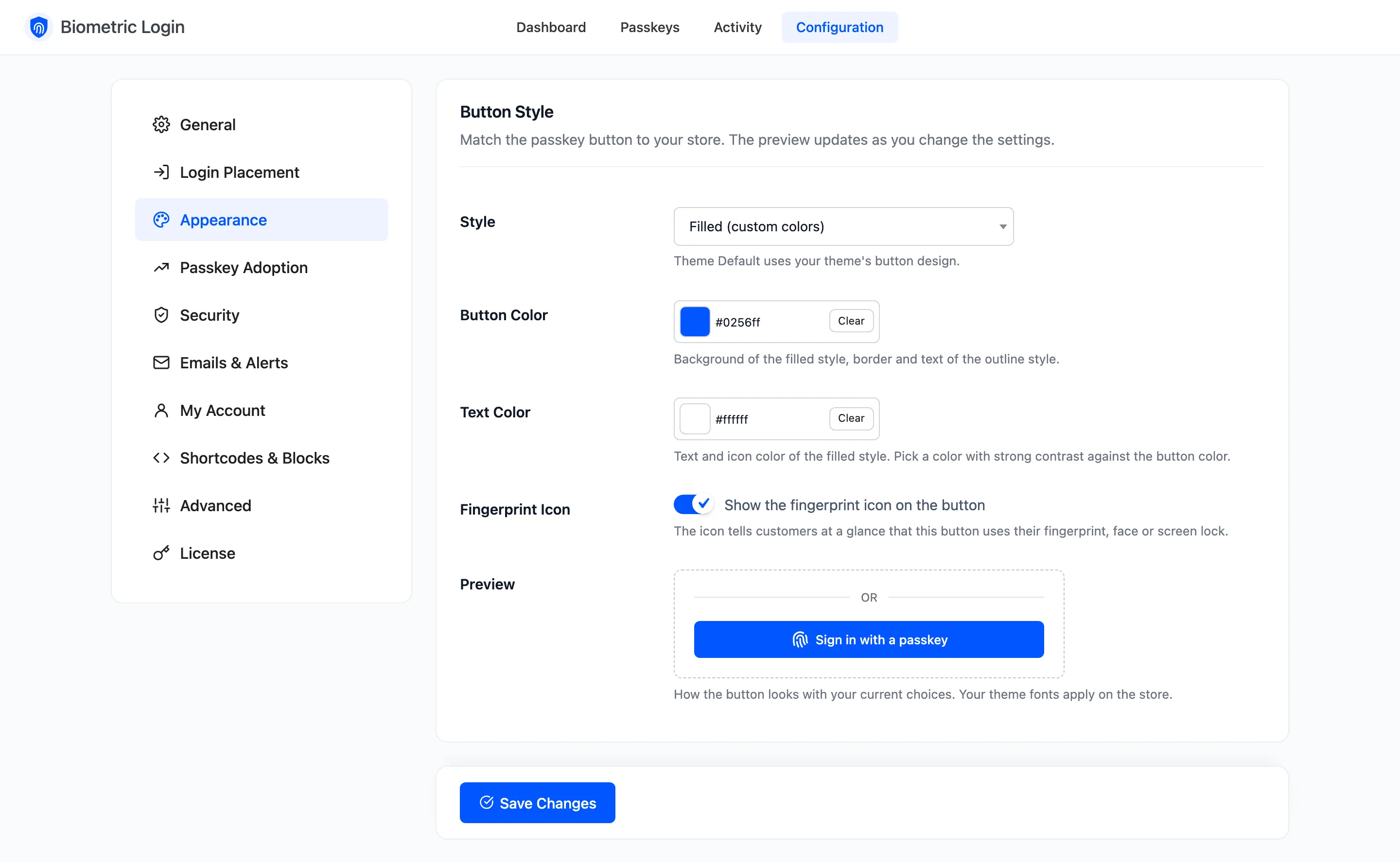
Fields
Section titled “Fields”- Style: Filled (custom colors) (default), Outline (custom color), Dark, Light or Theme Default, which uses your theme’s own button design.
- Button Color: Default #0256ff. The background of the filled style, and the border and text of the outline style. Shown only for those two styles.
- Text Color: Default #ffffff. Text and icon colour of the filled style. Pick one with strong contrast against the button colour.
- Fingerprint Icon: Ticked by default. Shows a fingerprint before the label, so customers know at a glance what the button does.
- Preview: The button with your current choices. It changes as you pick, before you save. Your theme’s fonts apply on the store.
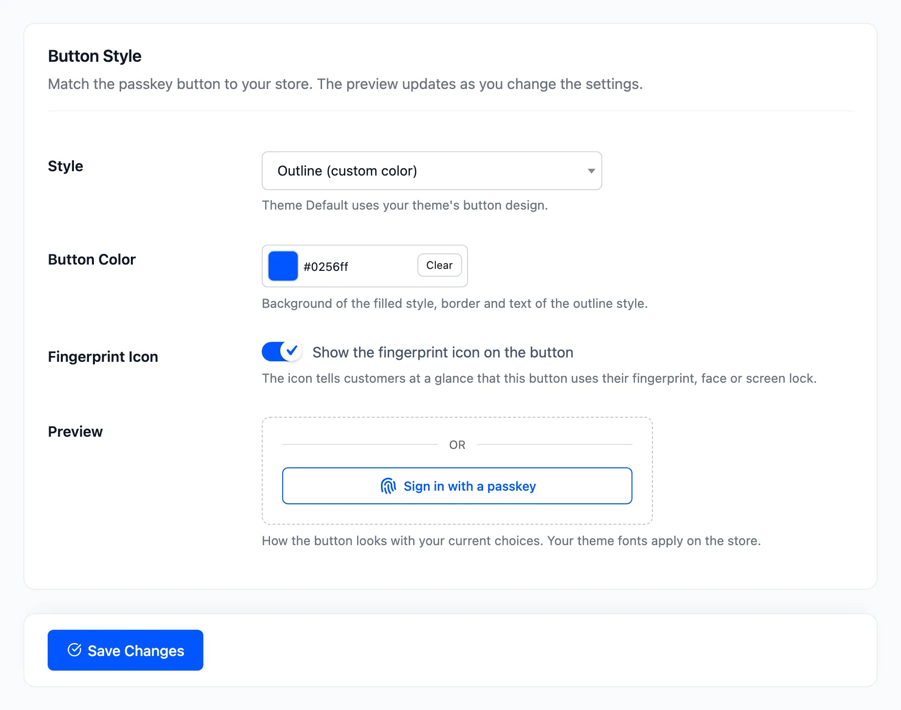
The five styles on the demo store
Section titled “The five styles on the demo store”| Style | On the My Account login form |
|---|---|
| Filled | 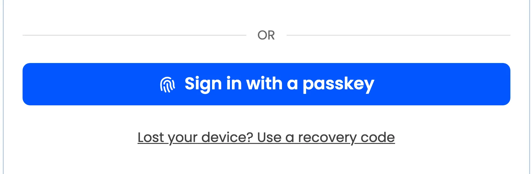 |
| Outline | 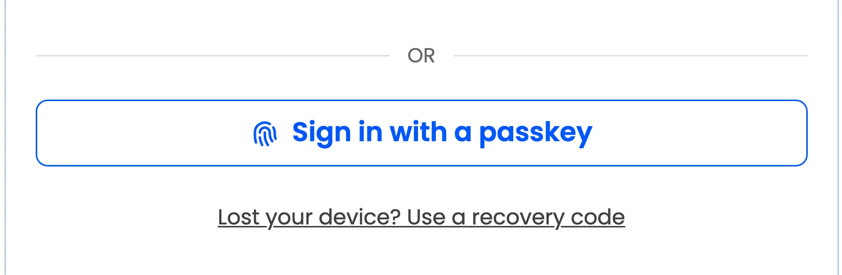 |
| Dark | 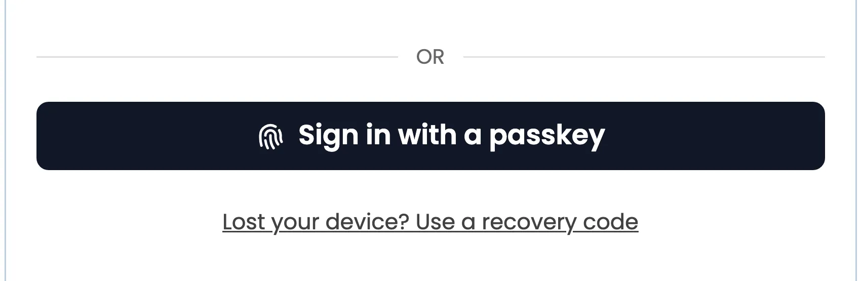 |
| Light | 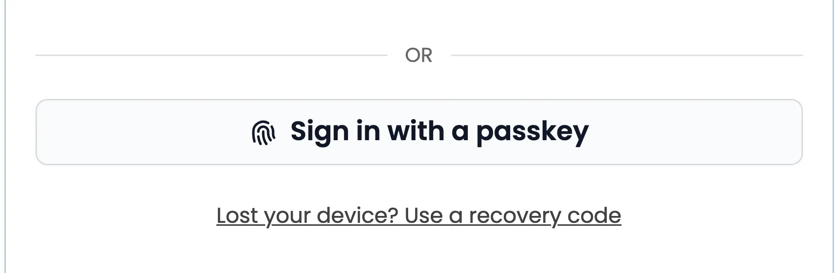 |
| Theme Default | 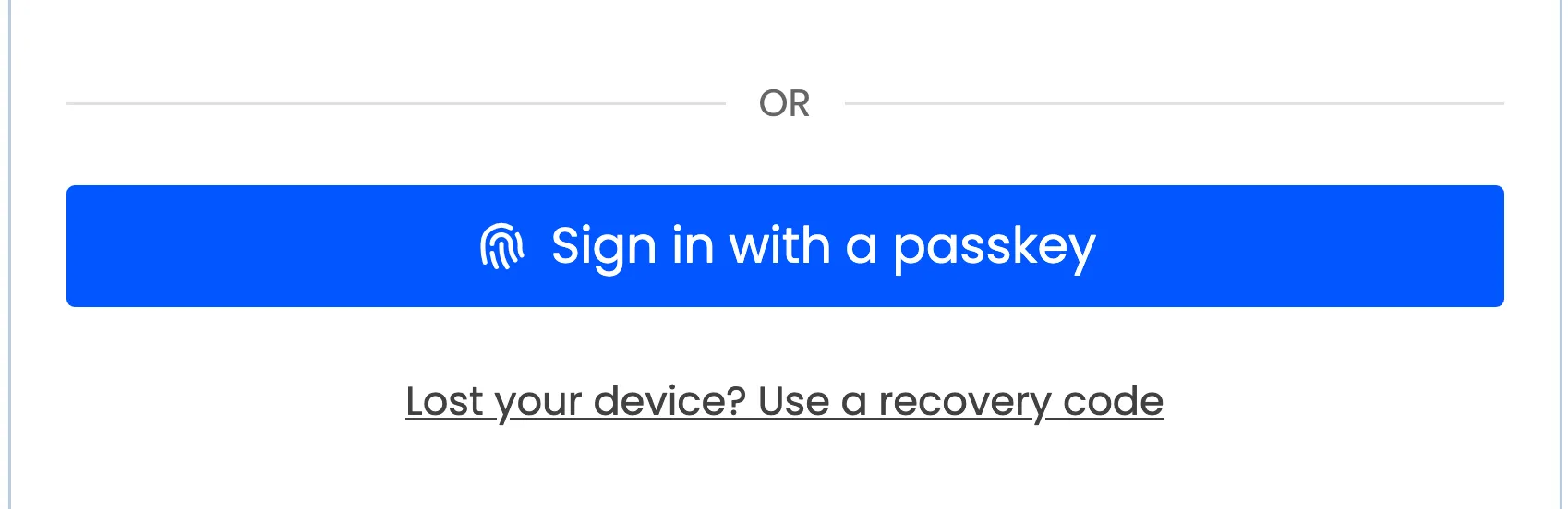 |