

How to Match the Progress Bar to Your Brand
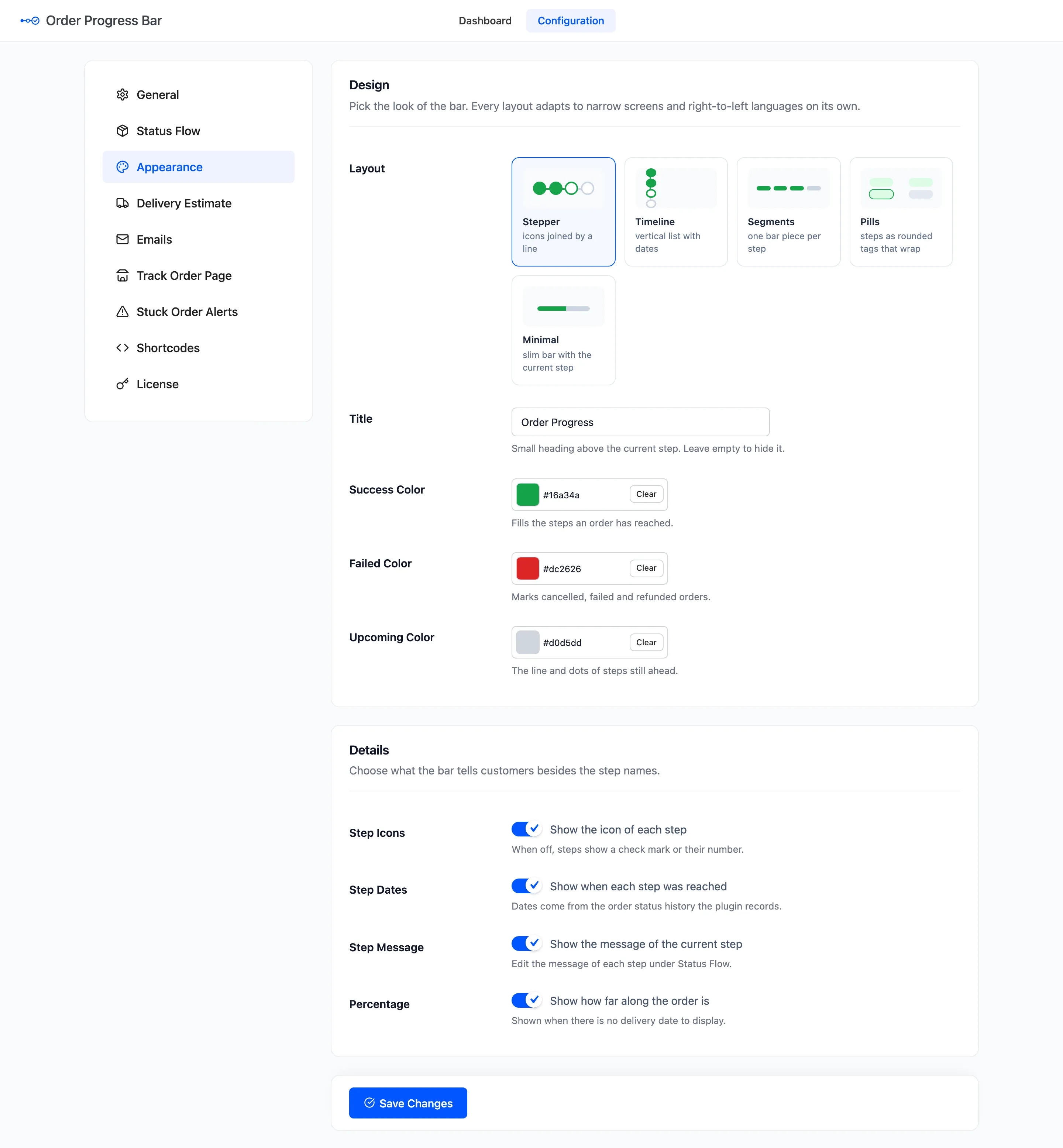
The bar ships in green, red and grey. Three colors and a title are all it takes to make it look like your store.
Step 1: Open Appearance
Section titled “Step 1: Open Appearance”Go to Configuration → Appearance.
Step 2: Set the three colors
Section titled “Step 2: Set the three colors”- Success Color: The steps reached, the line between them and the current step’s ring. Default
#16a34a. - Failed Color: The last step of a cancelled, refunded or failed order. Default
#dc2626. - Upcoming Color: The line and dots still ahead. Default
#d0d5dd.
Keep the success color dark enough for white icons to read on it.
Step 3: Set the title
Section titled “Step 3: Set the title”Title is the small heading above the current step, Order Progress by default. The demo tried “Where is my order?” with the brand blue and a lighter grey:
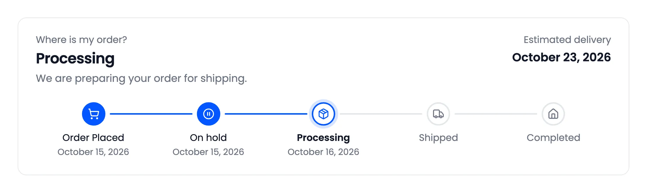
Empty it to show no title at all.
Step 4: Choose the details
Section titled “Step 4: Choose the details”Four switches under Details, all on by default:
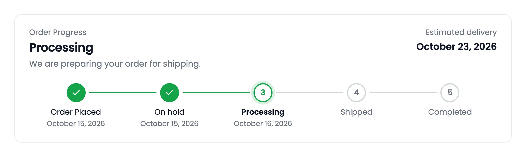
- Step Icons: Off, a reached step shows a check mark and an upcoming one its number.
- Step Dates: The date under each step reached.
- Step Message: The current step’s message, under its name.
- Percentage: How far along the order is. It shows only when there is no delivery date to show.
Step 5: Save and check
Section titled “Step 5: Save and check”Click Save Changes, then open an order on the View Order page. The emails take the three colors too.
Going further with CSS
Section titled “Going further with CSS”The bar takes its font from your theme. For anything the settings do not cover, every part has a class
under .ddwcopb-progress, and each layout adds its own, such as .ddwcopb-layout-timeline. Add your rules
under Appearance → Customize → Additional CSS.