

Appearance Settings
The Appearance tab sets how the bar looks everywhere it appears on the storefront. Open DevDiggers Plugins → Order Progress Bar → Configuration → Appearance.
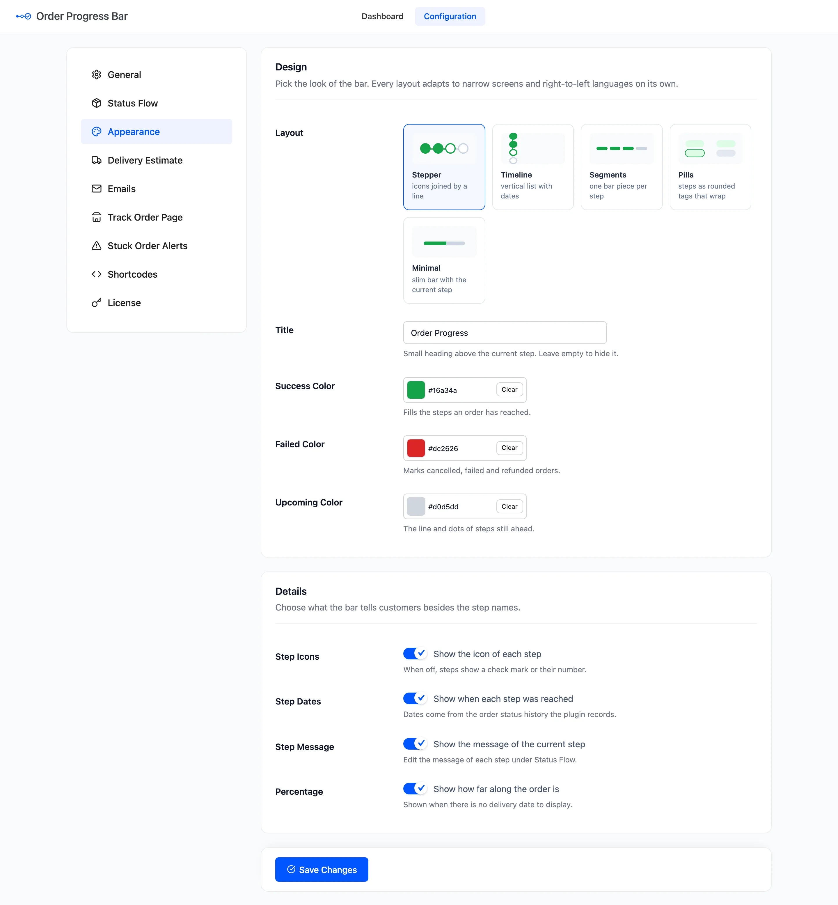
Design
Section titled “Design”- Layout: Five cards to pick from. Default Stepper.
- Title: The small heading above the current step. Default Order Progress. Leave it empty to hide it.
- Success Color: Fills the steps an order has reached. Default
#16a34a. - Failed Color: Marks cancelled, failed and refunded orders. Default
#dc2626. - Upcoming Color: The line and dots of the steps still ahead. Default
#d0d5dd.
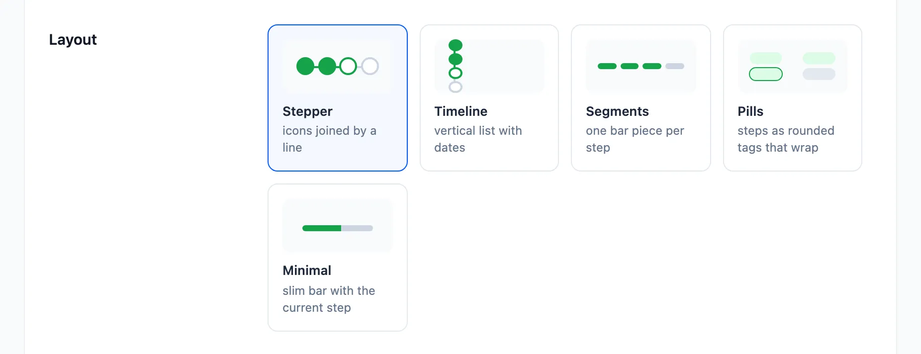
- Stepper: Icons joined by a line, the name and date under each.
- Timeline: A vertical list, with the date and message of every step reached.
- Segments: One bar piece per step.
- Pills: Steps as rounded tags that wrap onto a second line.
- Minimal: One slim bar with the current step and its date.
Every layout narrows to fit a phone and mirrors itself in right-to-left languages. See each one on the same order in How to Choose a Progress Bar Layout.
Details
Section titled “Details”- Step Icons: “Show the icon of each step”. On by default. Off, a reached step shows a check mark and an upcoming one its number.
- Step Dates: “Show when each step was reached”. On by default.
- Step Message: “Show the message of the current step”. On by default.
- Percentage: “Show how far along the order is”. On by default. It shows only where there is no delivery date to display, for example with the delivery estimate off.
What this tab does not change
Section titled “What this tab does not change”- Emails use their own compact bar, with check marks and numbers. It does take your three colors, and it shows the step message when Step Message is on.
- The My Account column is always the slim bar, with the step name and the percentage.
- The
[ddwcopb_progress]shortcode and the Order Progress block can override the layout and title for one page.
Click Save Changes at the bottom of the tab.