

How to Style the Pre-Order Badge and Labels
All of this is free, and all of it is on one tab.
Go to Configuration → Display.
Step 1: Decide where the badge appears
Section titled “Step 1: Decide where the badge appears”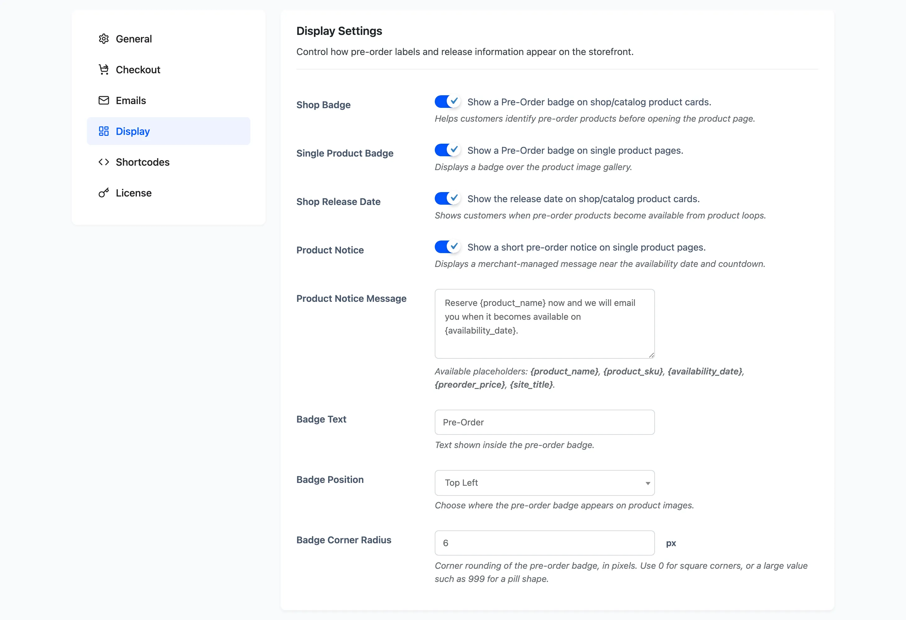
Three switches, all on by default.
- Shop Badge on product cards in the shop and in categories.
- Single Product Badge over the gallery on a product page.
- Shop Release Date under the title in listings.
Turn a badge off where your theme already crowds the product image. The release date under the title often carries more information for less noise.
Step 2: Write the badge text
Section titled “Step 2: Write the badge text”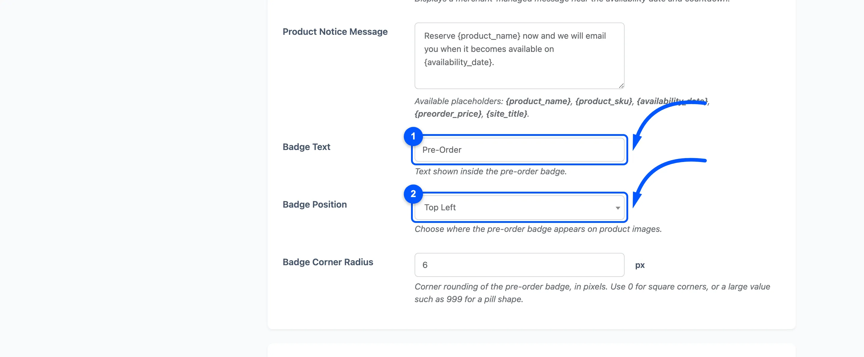
Badge Text, default Pre-Order.
This is separate from the button wording on the General tab, so the badge can say Coming soon while the button says Reserve yours. Keep it to one or two words: the badge sits over a product image and does not wrap gracefully.
Step 3: Set the position and shape
Section titled “Step 3: Set the position and shape”Badge Position puts it in one of the four corners of the product image. Default Top Left.
Check it against your theme’s own badges. A sale flash in the same corner means one covers the other, and moving the pre-order badge is easier than moving the theme’s.
Badge Corner Radius, default 6 pixels. Use 0 for a square badge or 999 for a pill.
Step 4: Set the colours
Section titled “Step 4: Set the colours”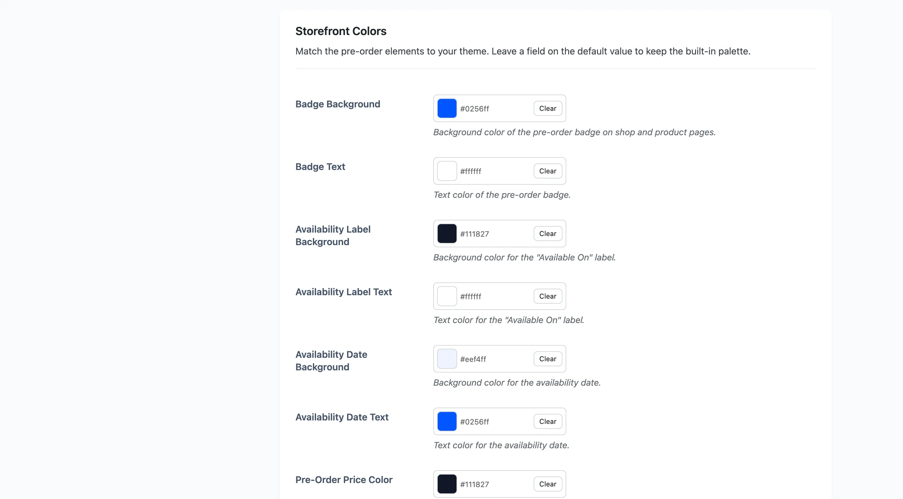
Twelve pickers. The first two are the badge itself.
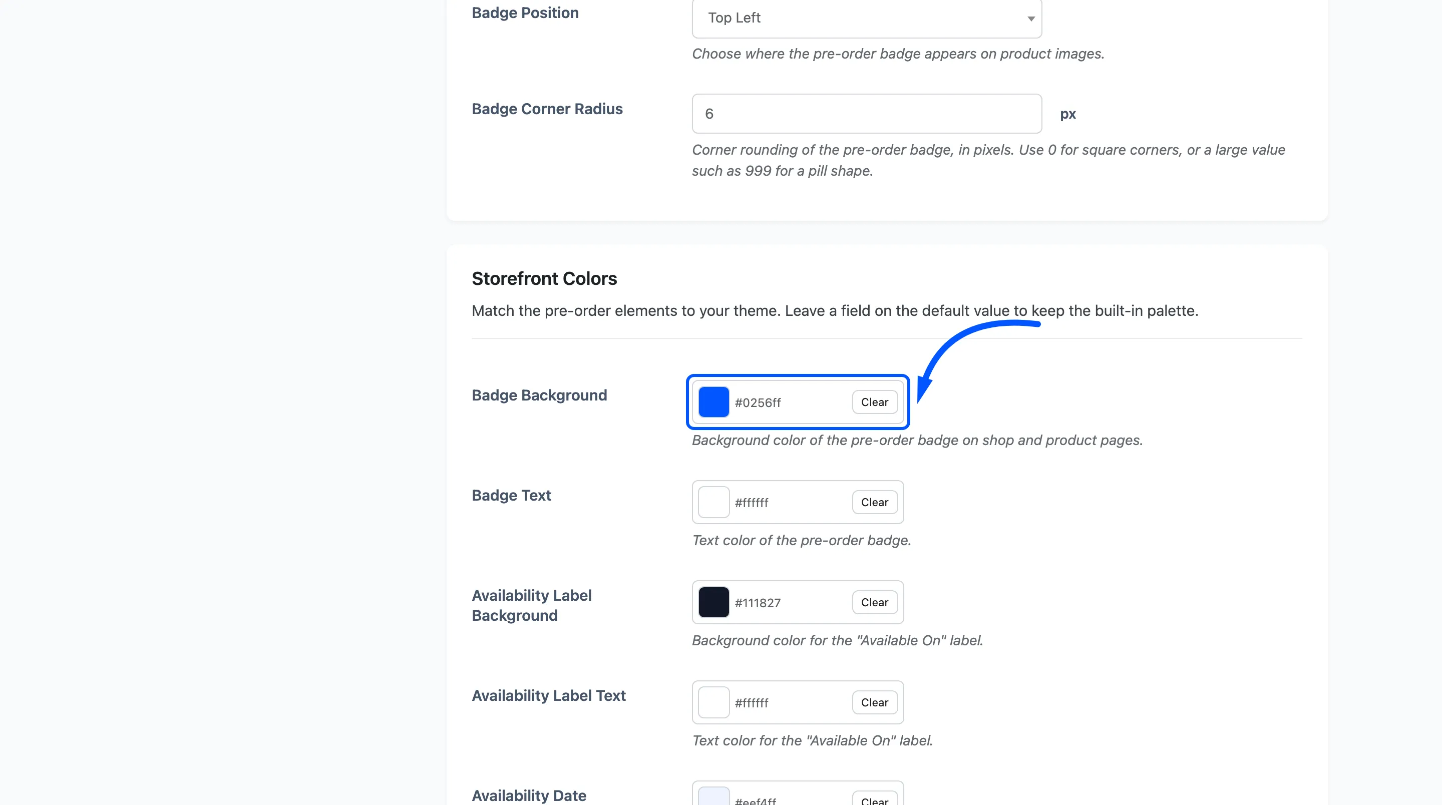
Badge Background #0256ff and Badge Text #ffffff.
Then the product page block:
- Availability Label Background
#111827and Availability Label Text#ffffff, for the “Available On” label. - Availability Date Background
#eef4ffand Availability Date Text#0256ff, for the date beside it. - Pre-Order Price Color
#111827. - Stock Status Color
#10b981. - Countdown Accent Color
#0256ff, used by the Minimal and Boxed countdown styles.
And the customer’s pre-order table:
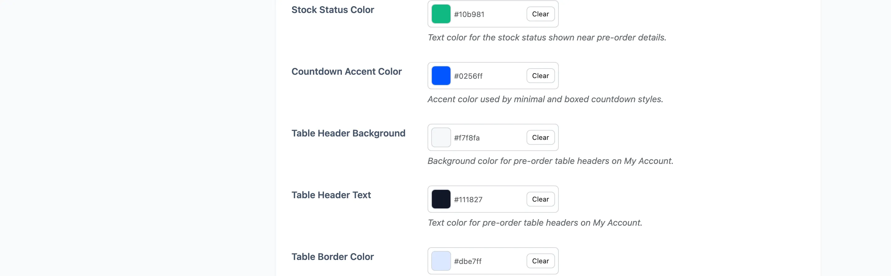
- Table Header Background
#f7f8fa, Table Header Text#111827, Table Border Color#dbe7ff.
Keep the label and its date readable against each other. They sit side by side as one control, so a dark label with a dark date reads as a single block rather than as a date you can pick out.
Press Save Changes. The colours are written as CSS variables, so the change is live at once with no cache to clear.
Step 5: Check both places
Section titled “Step 5: Check both places”The shop grid first.
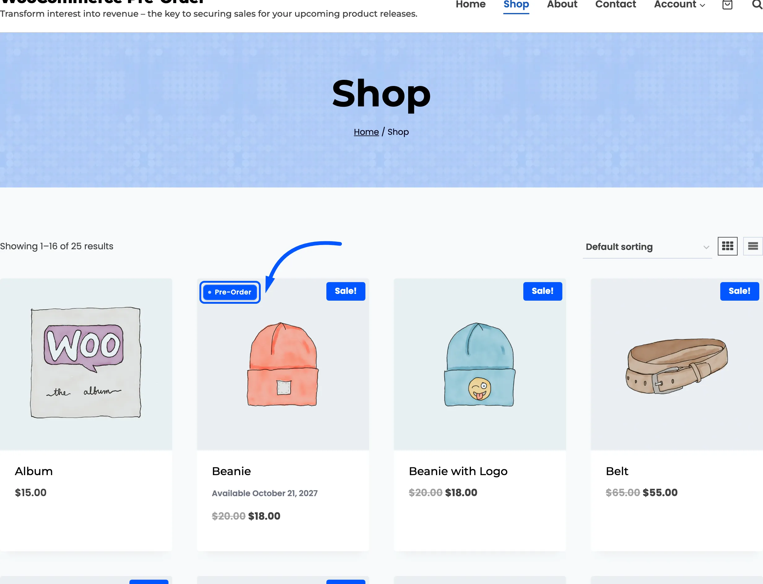
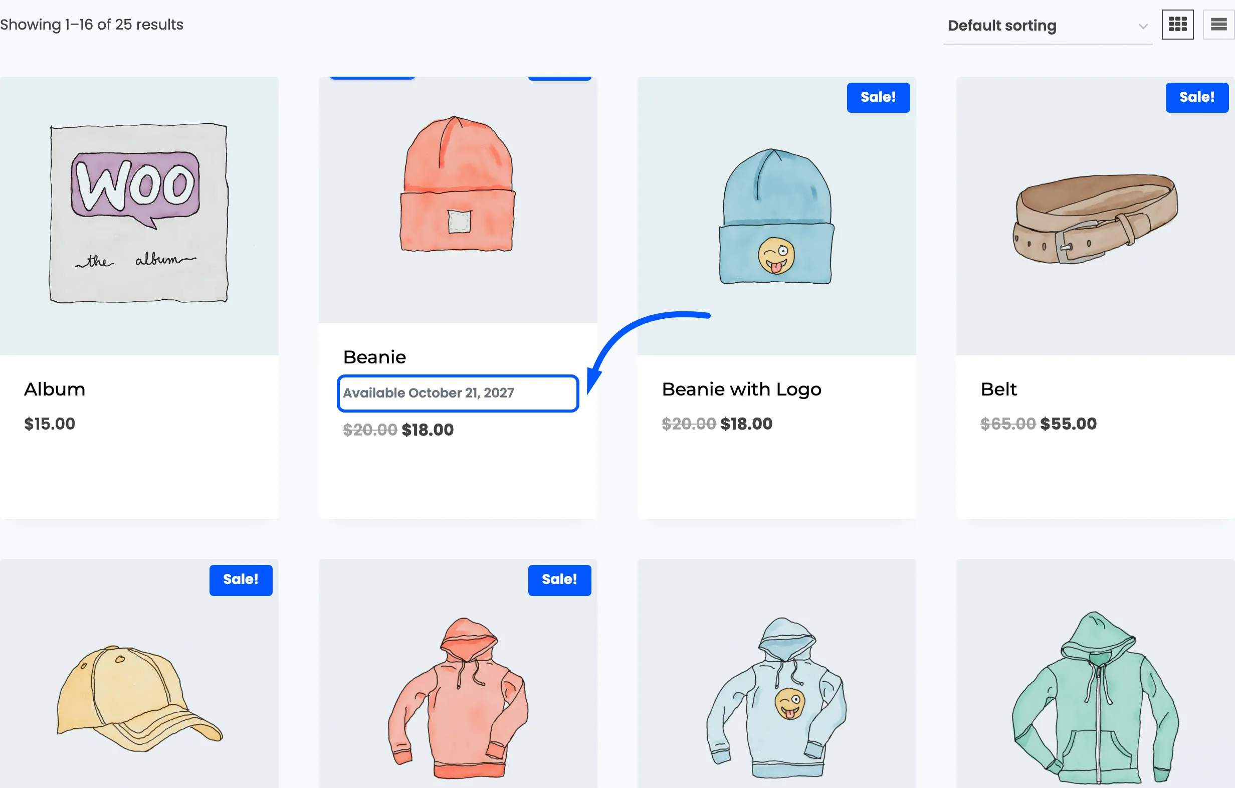
Then a product page, where the badge sits over the gallery.
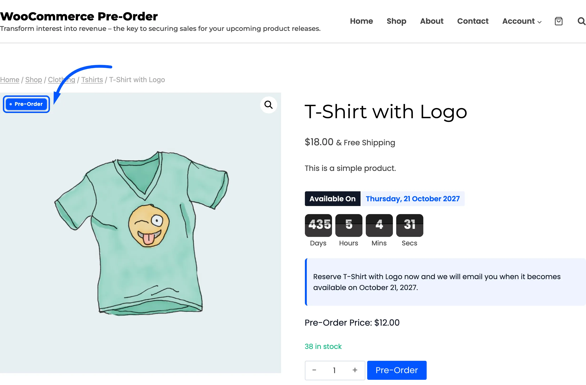
And the block under it.
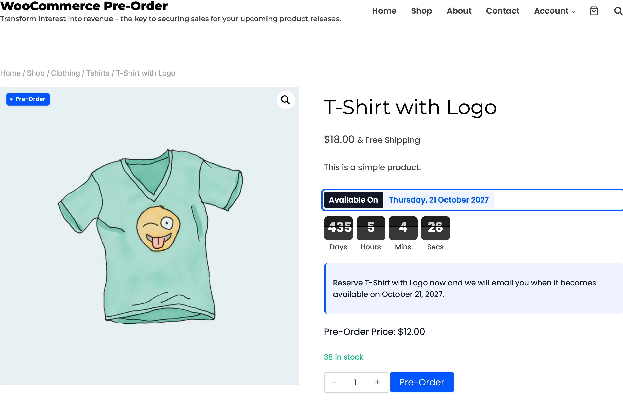
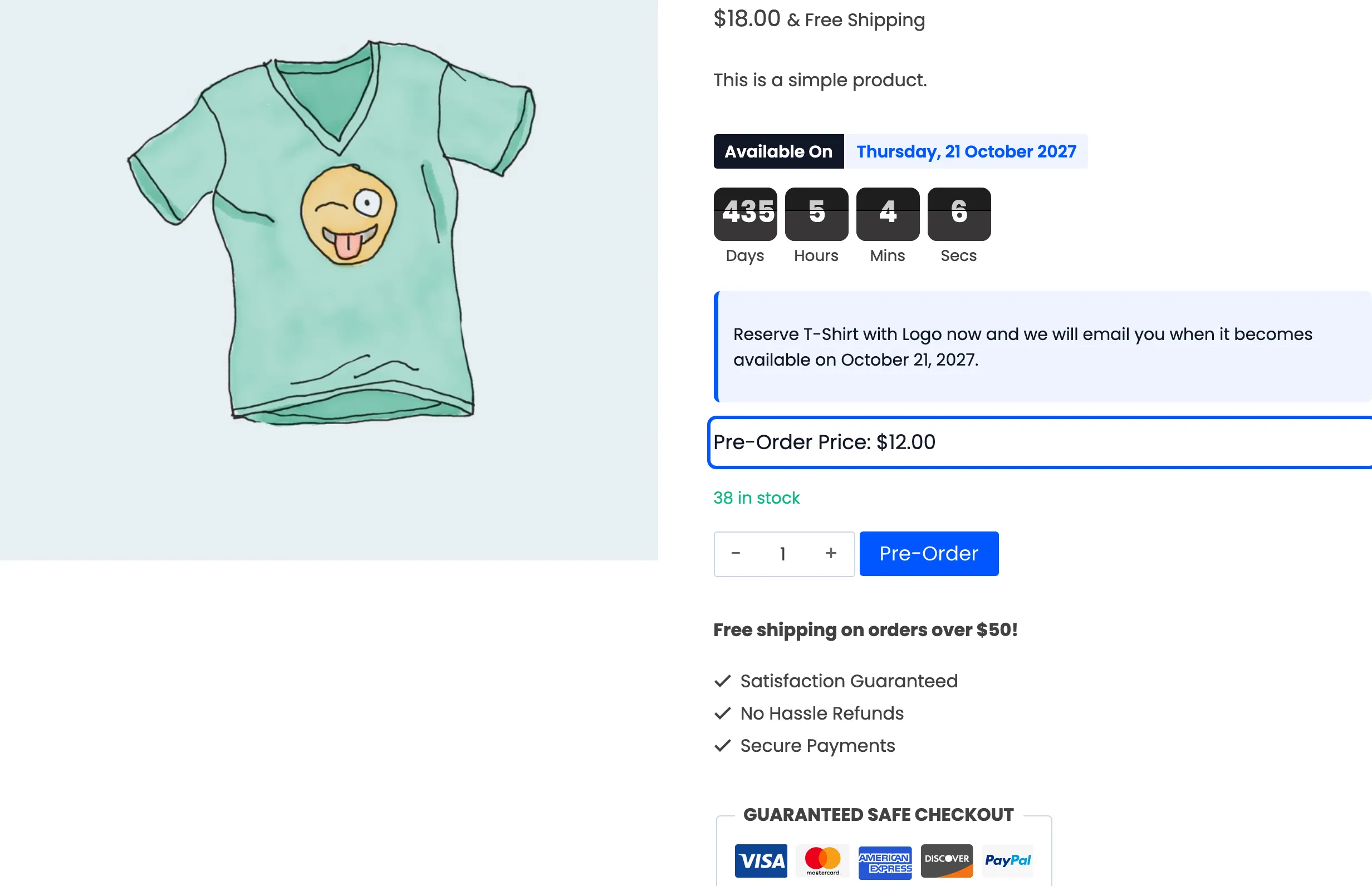
Check the two separately. A badge that reads well on a white product card can disappear on a dark product photograph.
The notice
Section titled “The notice”While you are here, the notice under the countdown is set on the same tab.
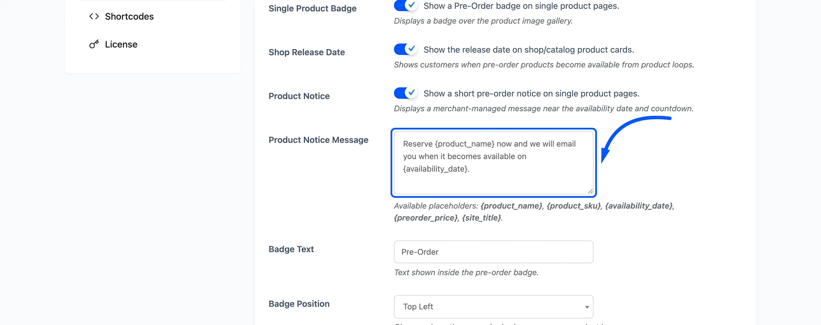
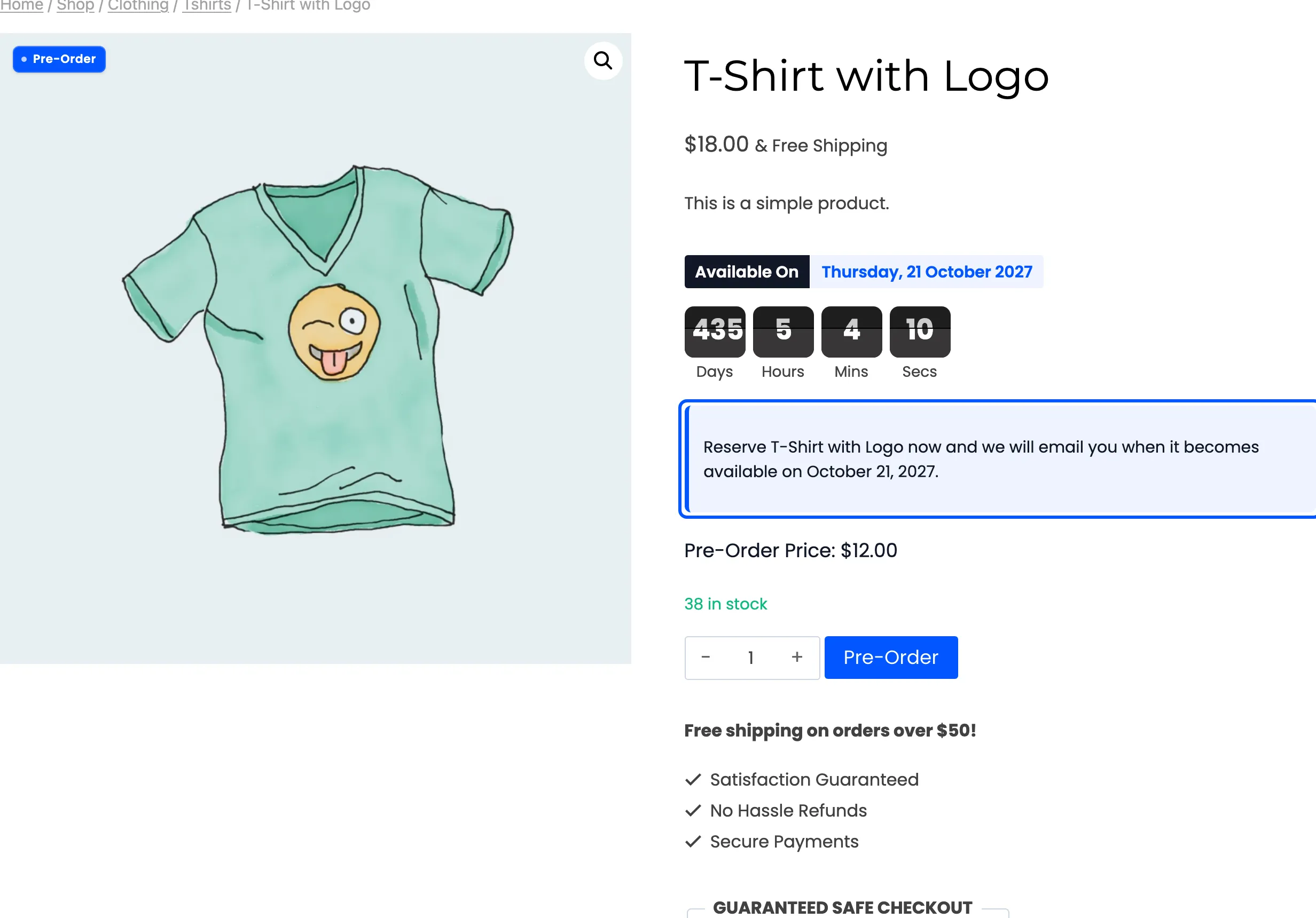
It takes {product_name}, {product_sku}, {availability_date}, {preorder_price} and
{site_title}, so one message covers the whole catalogue. A single product can override it from its
own pre-order form.