

Display Settings
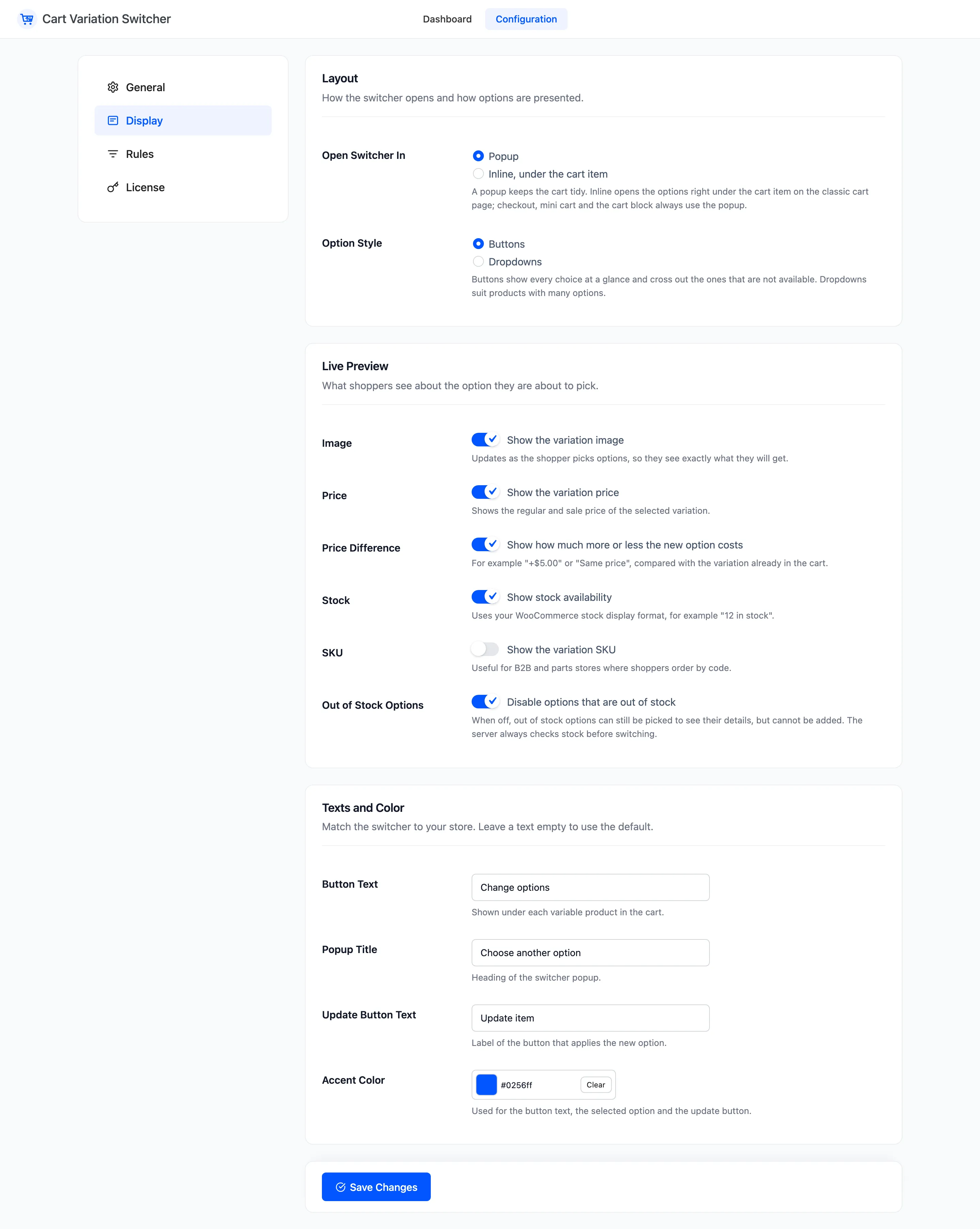
The Display tab decides how the switcher looks and what it tells shoppers. Open DevDiggers Plugins → Cart Variation Switcher → Configuration → Display. It has three sections.
Layout
Section titled “Layout”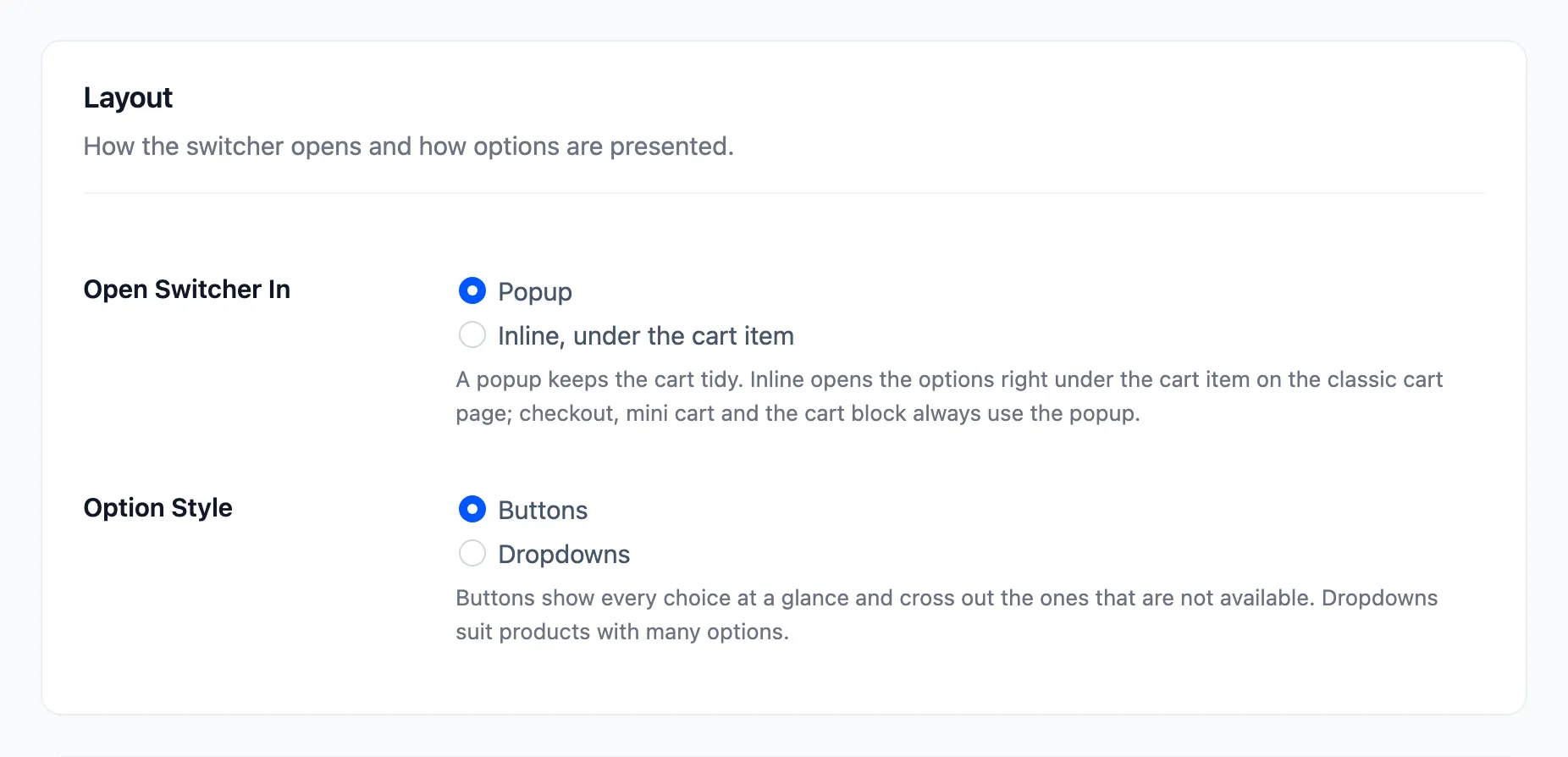
- Open Switcher In: Popup (default) or Inline, under the cart item. Inline works on the classic cart page. The checkout, the mini cart and the Cart block always use the popup.
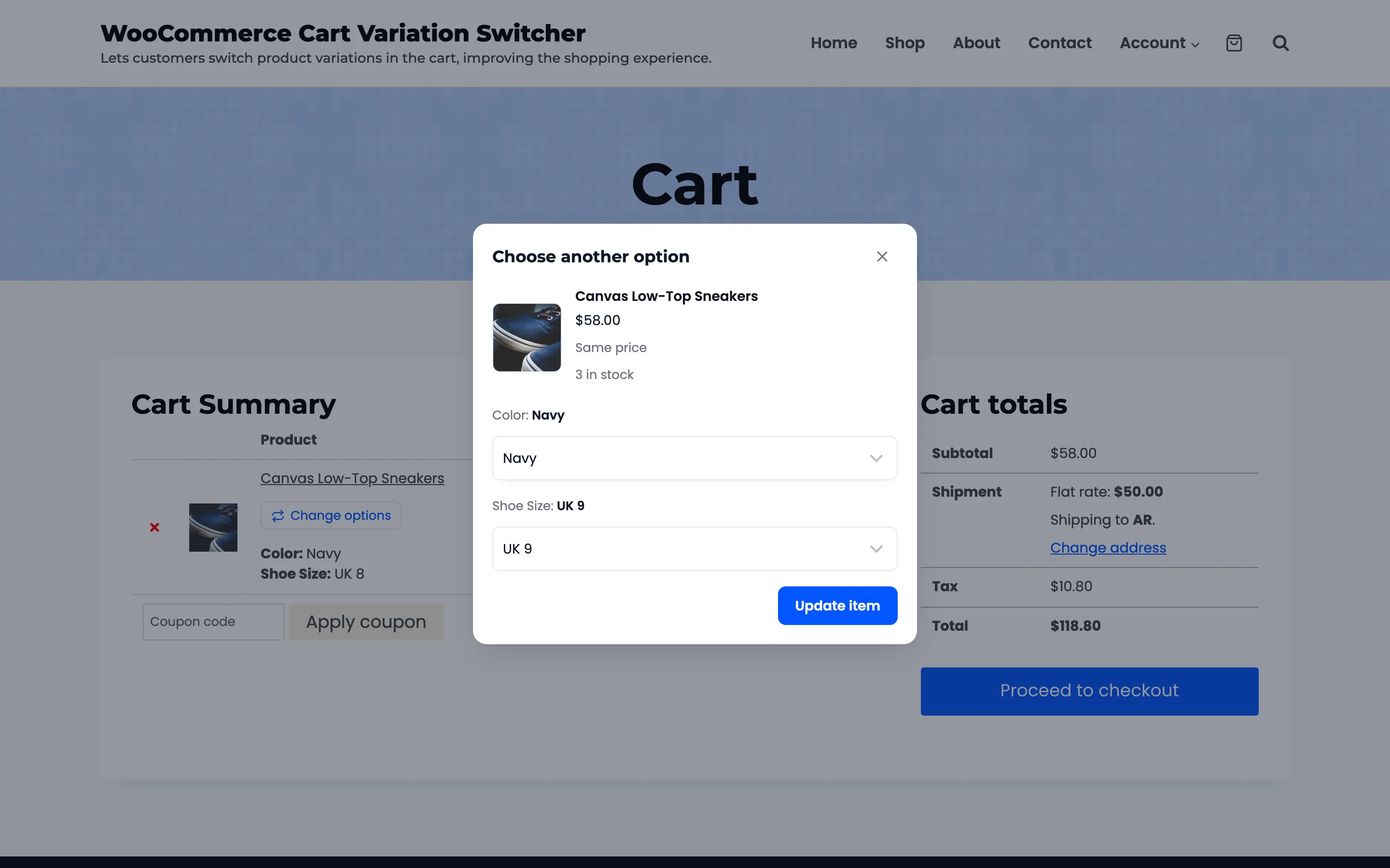
- Option Style: Buttons (default) or Dropdowns. Buttons show every choice at once and cross out the ones that cannot be picked. Dropdowns grey those out instead, and suit products with long option lists.
Live Preview
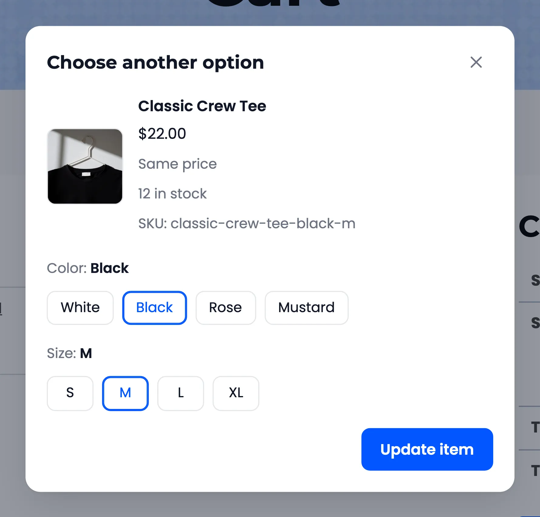
Section titled “Live Preview”The preview is the top of the popup. Here it shows a pair of sneakers in White, UK 10: the image, the price, +$4.00 and the stock.
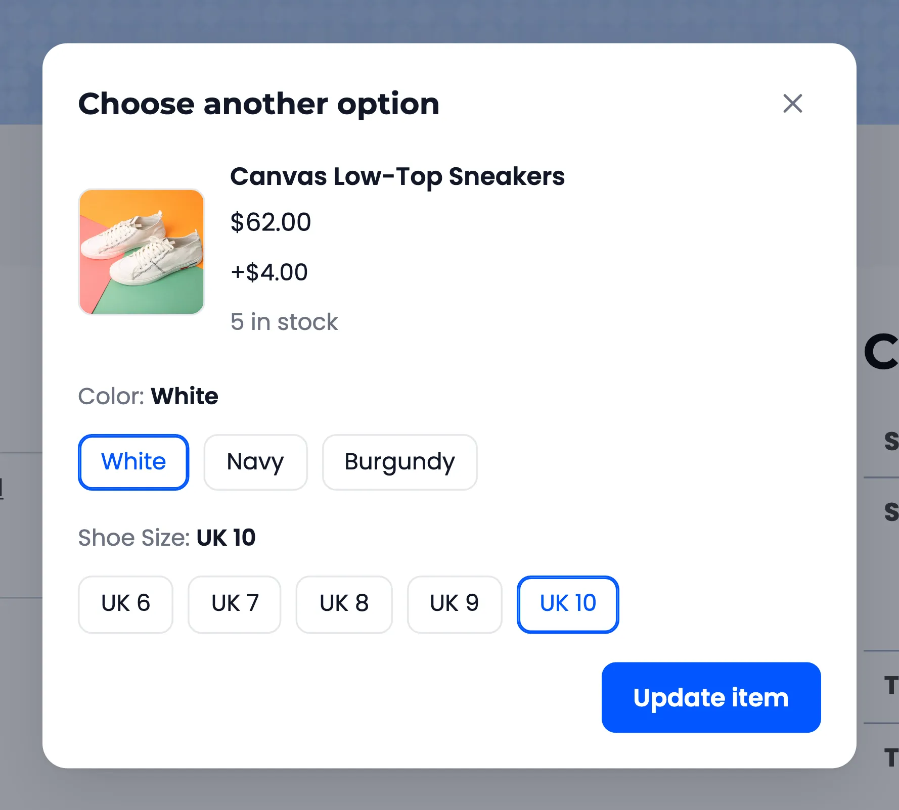
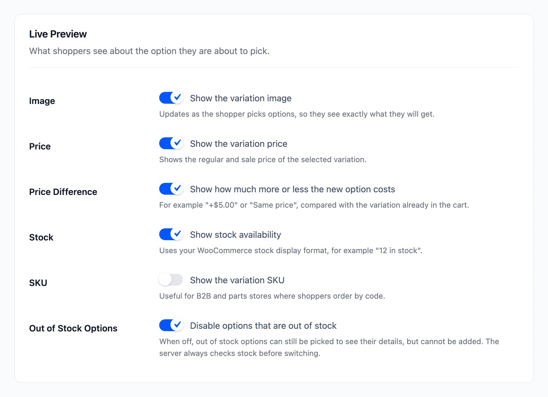
- Image: “Show the variation image”. On. The picture changes with each pick. A variation with no image of its own shows the product image.
- Price: “Show the variation price”. On. A sale shows the regular price struck through.
- Price Difference: “Show how much more or less the new option costs”. On. Reads +$4.00, −$4.00 or Same price, compared with the option in the cart. With more than one in the cart it adds each.
- Stock: “Show stock availability”. On. Uses your WooCommerce stock display format, such as “12 in stock”.
- SKU: “Show the variation SKU”. Off.
- Out of Stock Options: “Disable options that are out of stock”. On.
With Out of Stock Options off, an out of stock option can be picked to see its details, but Update item stays greyed out. The store checks stock again on every switch either way.
Texts and Color
Section titled “Texts and Color”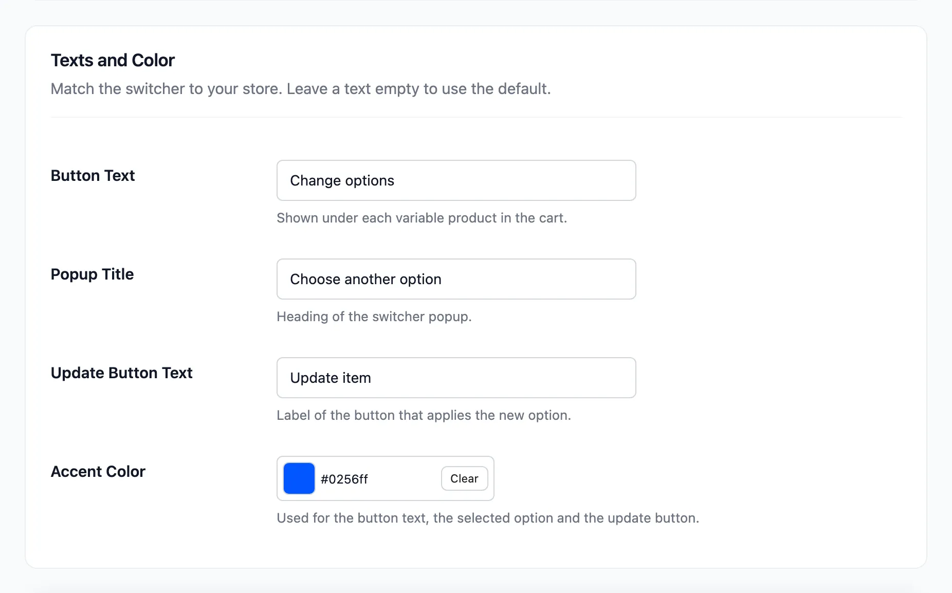
- Button Text: Default Change options. Shown under each item.
- Popup Title: Default Choose another option.
- Update Button Text: Default Update item.
- Accent Color: Default #0256ff. Used for the button text, the selected option and the update button.
Leave a text empty to go back to its default. See How to Change the Switcher Texts and Color.
Click Save Changes at the bottom of the tab.