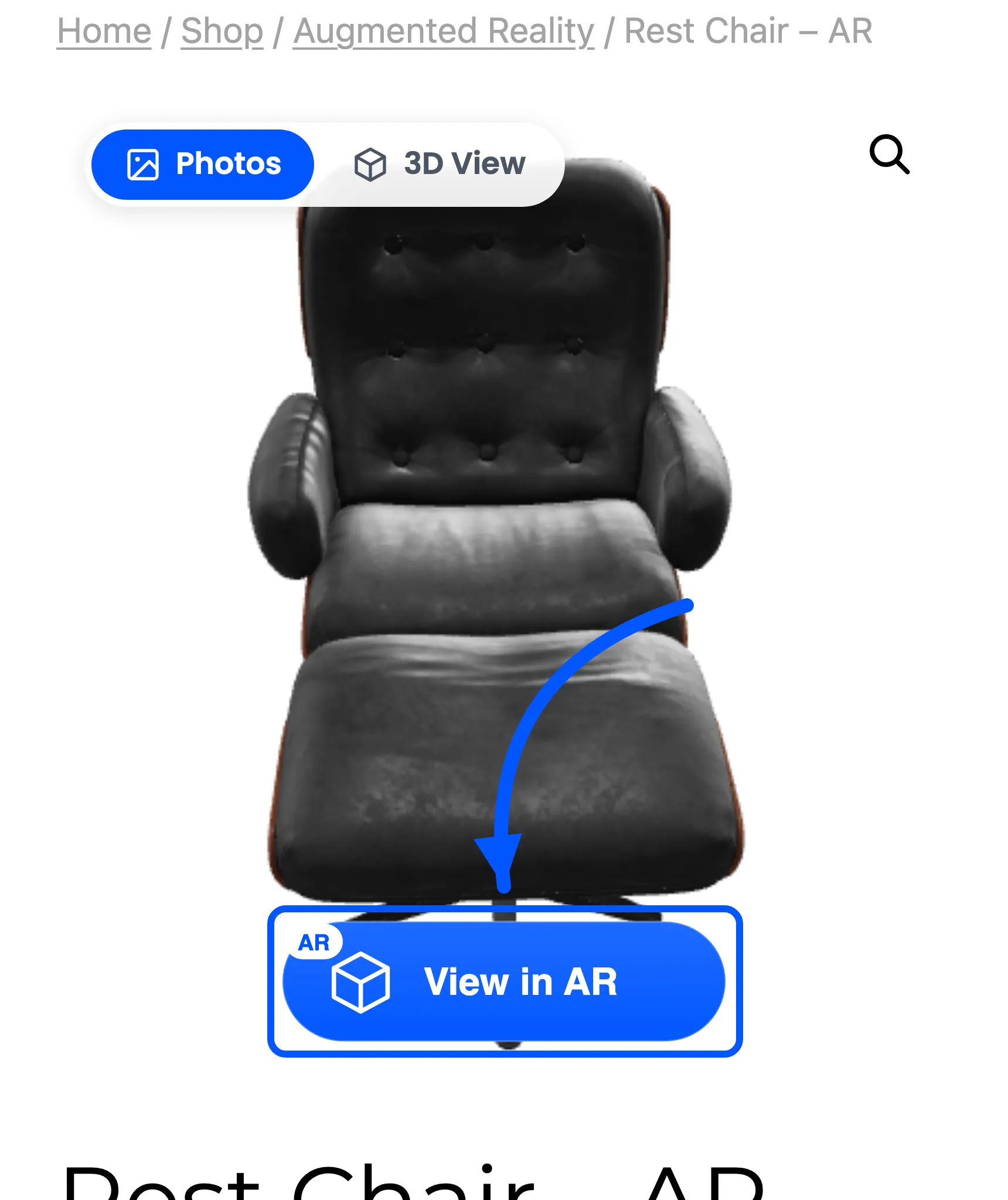

How to Style the Photos and 3D Toggle
The toggle is the control that tells a shopper a 3D model exists at all. It has one job: be noticed without covering the product. Two colours and a corner.
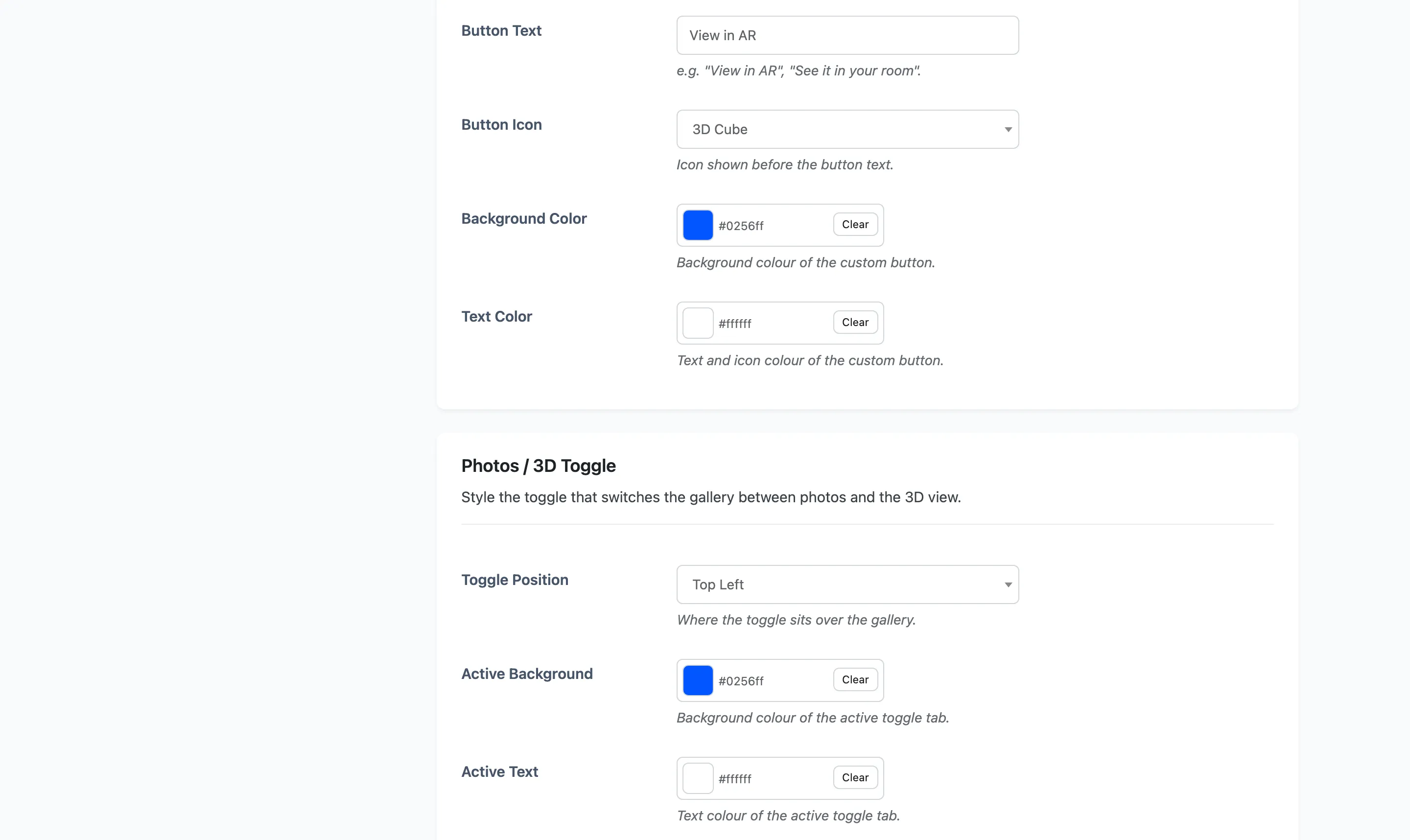
Go to DevDiggers Plugins → Product View in AR → Configuration → AR Button and scroll to the Photos / 3D Toggle section.
Step 1: Choose a corner
Section titled “Step 1: Choose a corner”Toggle Position offers Top Left, Top Right, Bottom Left and Bottom Right. Default is Top Left.
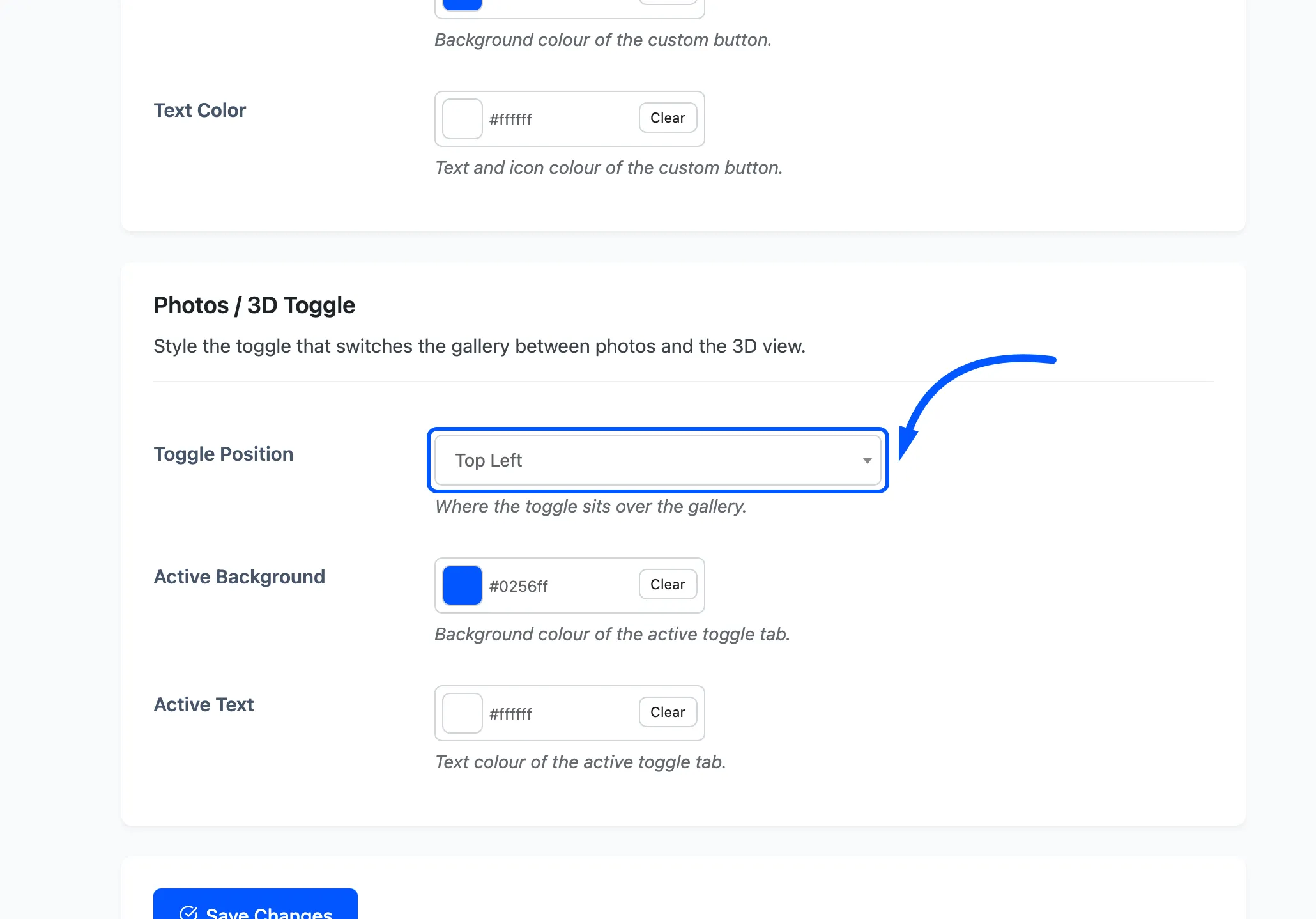
Pick against your photography, not by taste. Product shots are usually lightest at the top and busiest at the bottom, which is why the default is a top corner.
Check it against the AR button’s position. The launcher defaults to Bottom Center. A toggle at Bottom Left or Bottom Right can crowd it on narrow screens. To keep the toggle at the bottom, move the launcher to a top position or to Below Gallery.
Step 2: Set the active colours
Section titled “Step 2: Set the active colours”Two pickers, and they colour whichever tab is currently selected. The other tab stays neutral, so these two are the whole styling of the control.
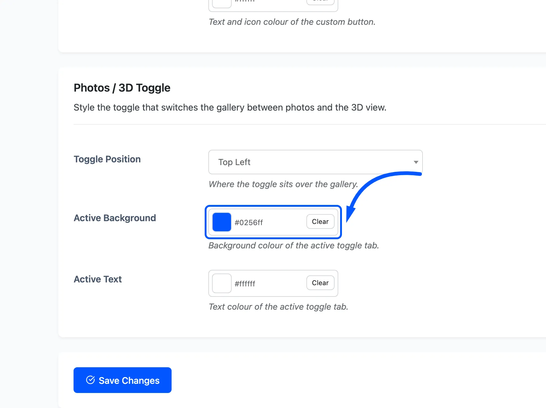
- Active Background is the fill behind the selected tab. Default
#0256ff. - Active Text is the label and icon on it. Default
#ffffff.
Keep the contrast between the two high. This is a small control over a photograph, and a mid-grey on mid-blue is unreadable at the size it actually renders.
Step 3: Save and check both states
Section titled “Step 3: Save and check both states”Press Save Changes, then open a product that has a model.
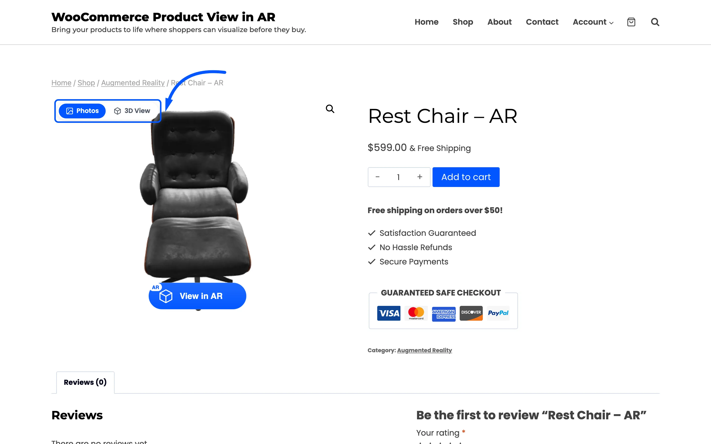
The gallery opens with Photos selected, so that is the tab wearing your colours first. Press 3D View and check the other state, because that is the one a shopper looks at while the model loads.
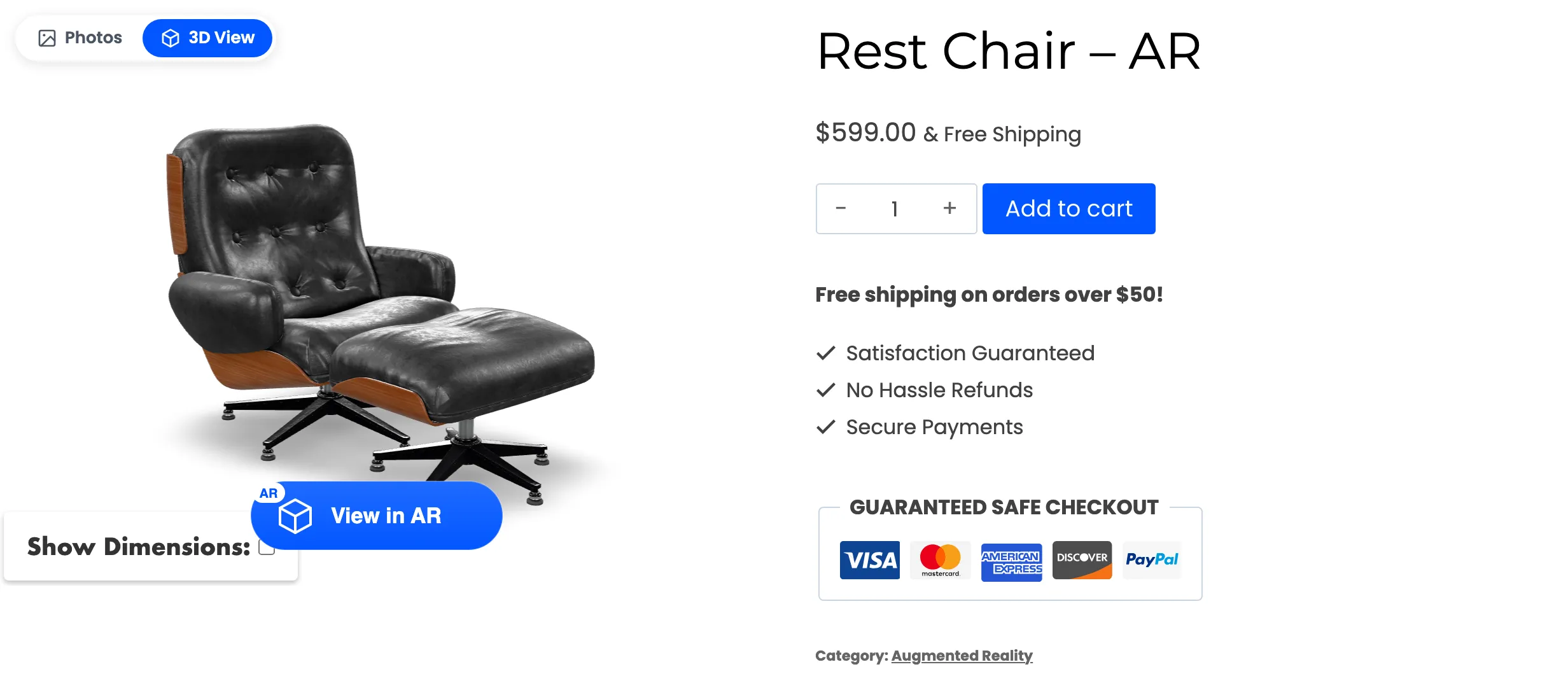
Then look at it on a phone. The toggle sits over a much smaller image there, and a corner that was clear at desktop width can land on the product.