
AR Button Settings (Pro)
This tab is three sections: the launcher, the custom text button that one of the launcher styles uses, and the Photos / 3D toggle.
Go to DevDiggers Plugins → Product View in AR → Configuration → AR Button.
AR Launch Button
Section titled “AR Launch Button”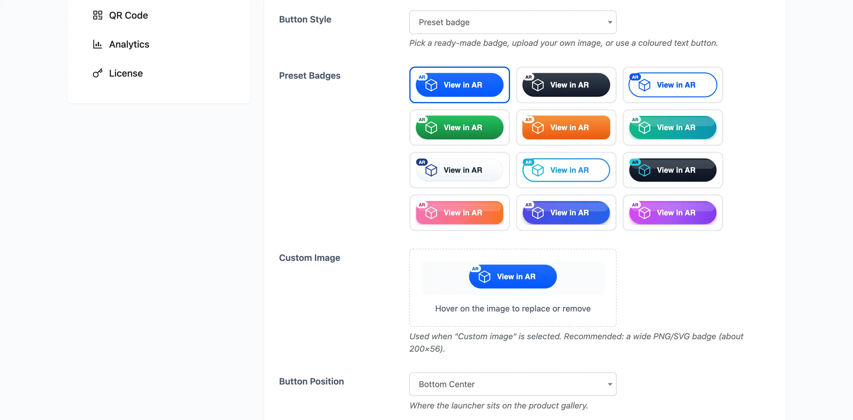
Button Style
Section titled “Button Style”Which of three kinds of launcher to draw. Default Preset badge.
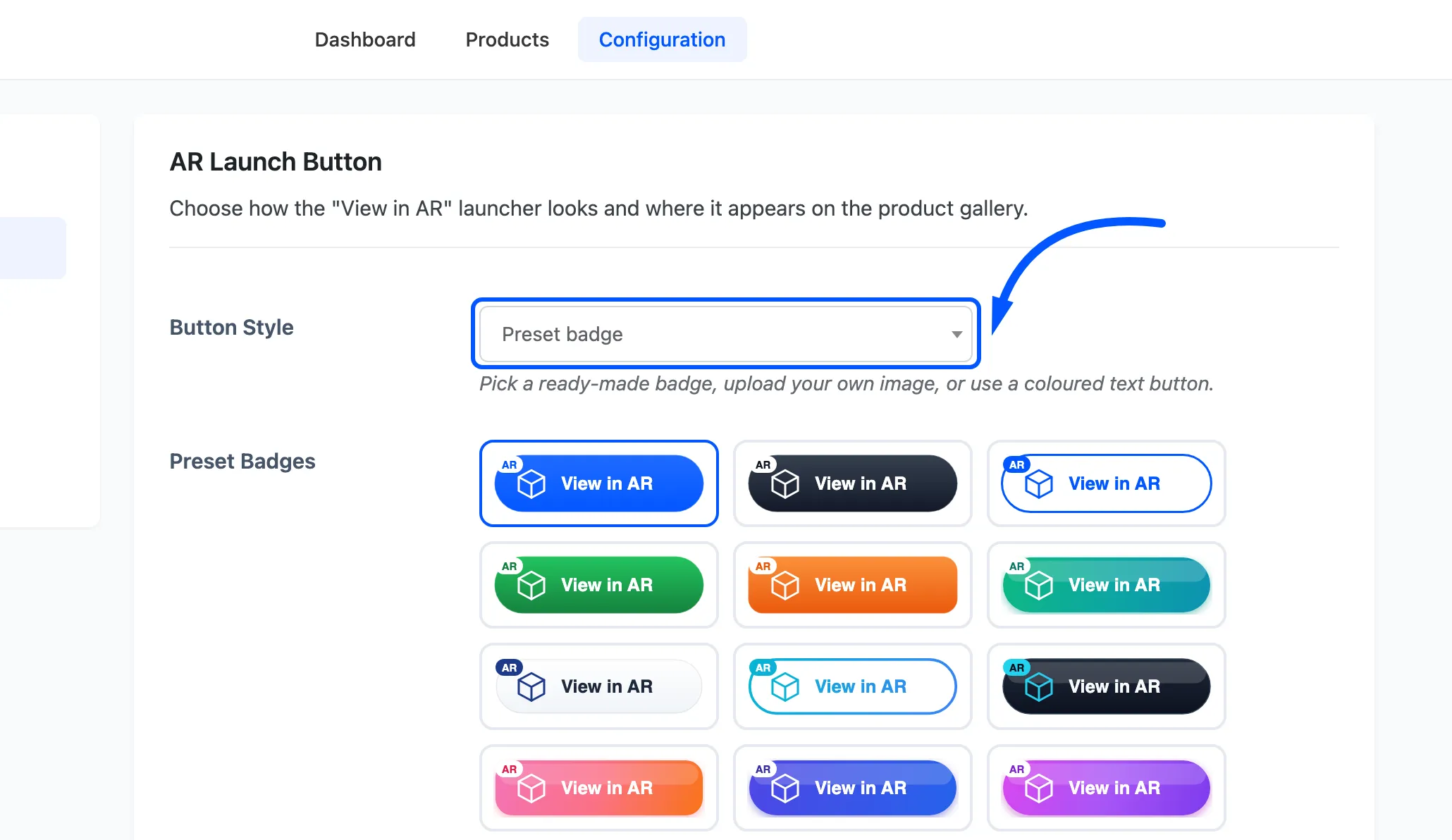
- Preset badge uses one of the twelve badges below.
- Custom image (upload) uses an image you upload.
- Custom button uses a coloured button with your own text and an icon.
On iPhone and iPad the launcher is always an image, whichever of these you pick. Apple’s AR Quick Look only opens from a link containing an image. So a custom text button is swapped back to your chosen preset badge on iOS by itself. Choose a preset you are happy with even if you plan to use the text button.
Preset Badges
Section titled “Preset Badges”Twelve ready-made “View in AR” badges. Default is the first.
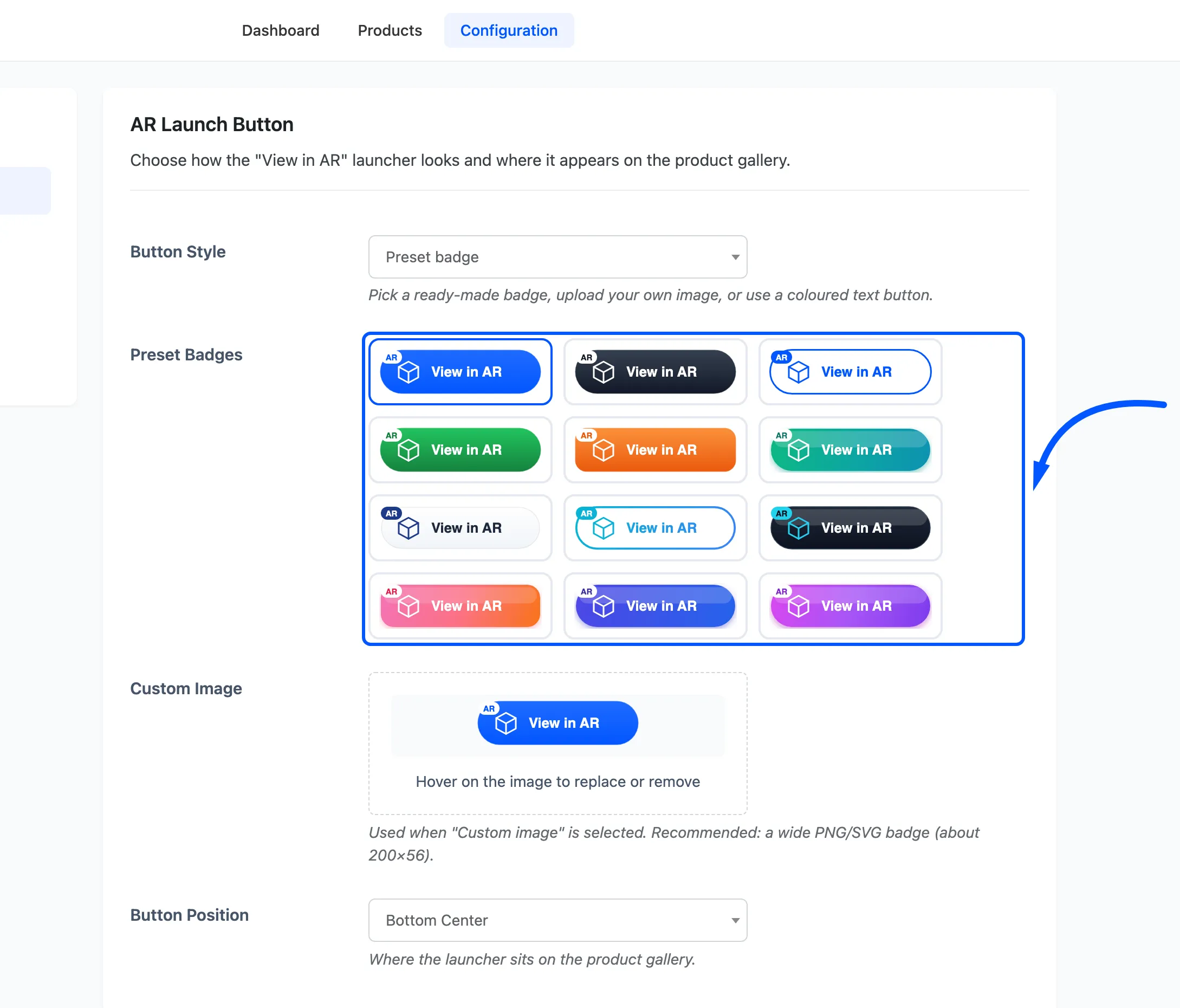
Click one to select it. The selection is only used when Button Style is Preset badge, and as the iOS fallback described above.
Custom Image
Section titled “Custom Image”Your own badge, used when Button Style is Custom image. A wide PNG or SVG of roughly 200 by 56 pixels is the shape the layout expects.
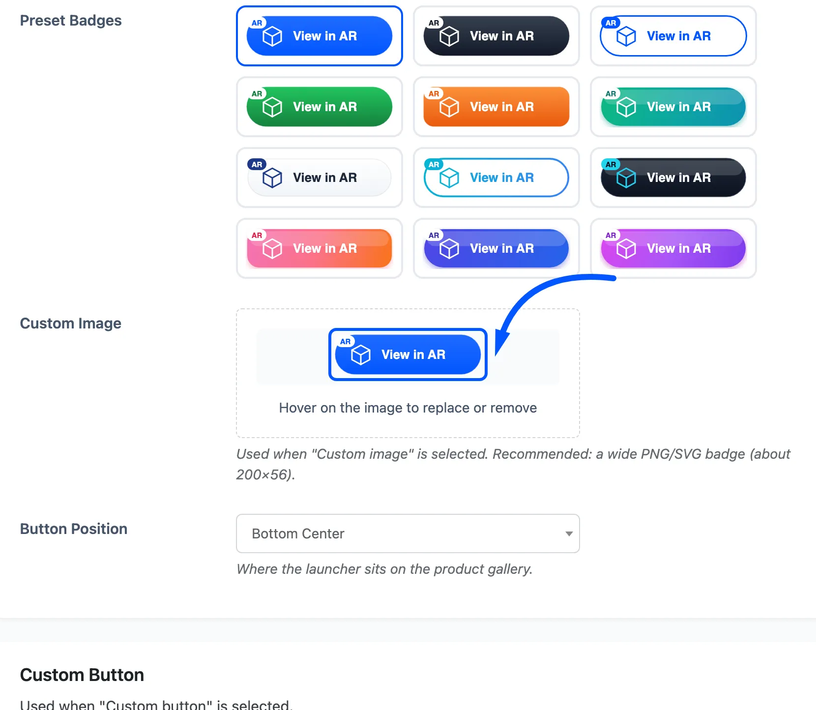
Hover the preview to replace or remove it. With no image uploaded the plugin falls back to its own default badge rather than rendering nothing.
Button Position
Section titled “Button Position”Where the launcher sits on the gallery. Default Bottom Center.
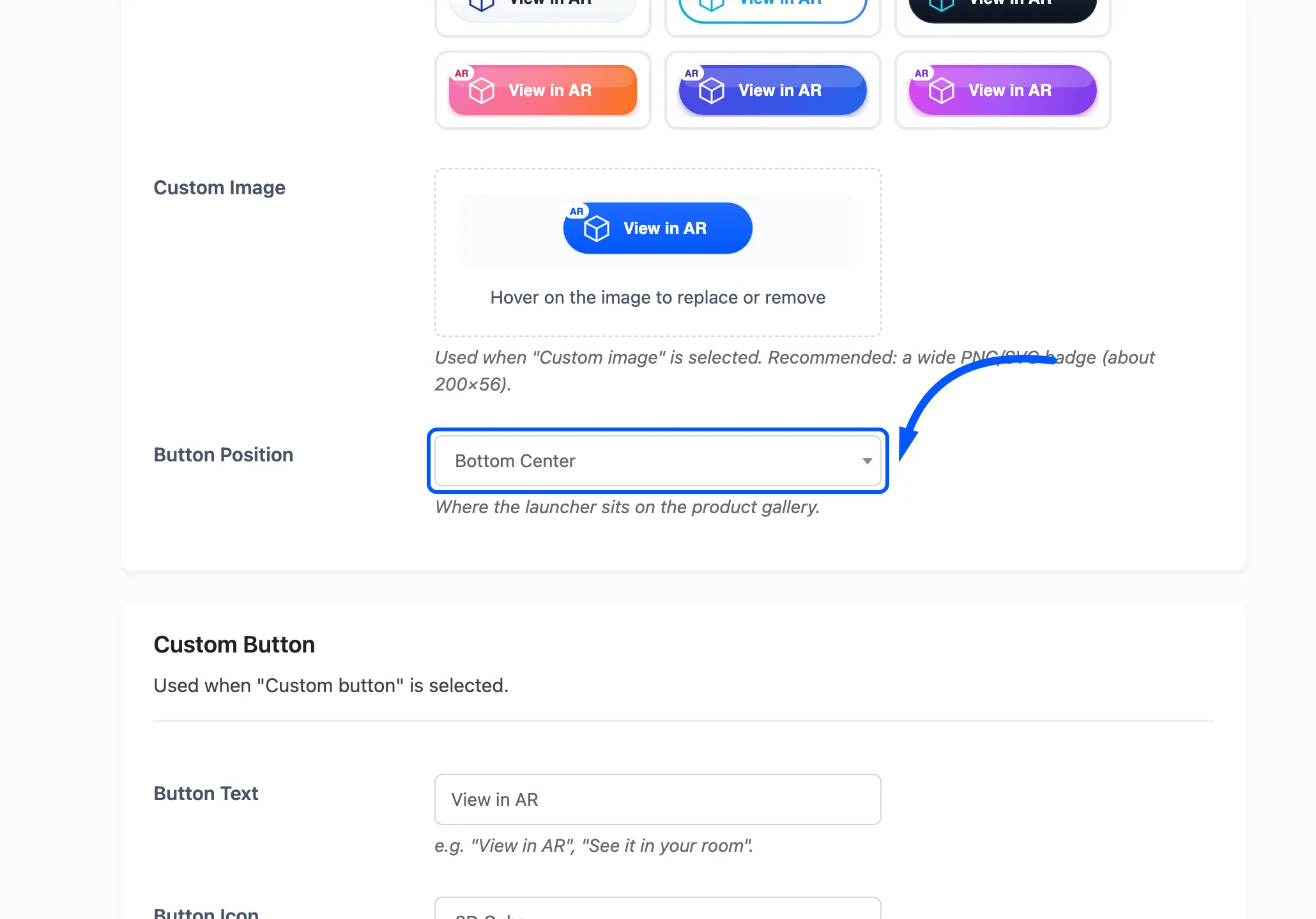
Five choices: Bottom Center, Bottom Left, Bottom Right, Top Center and Below Gallery. The first four overlay the image. Below Gallery puts the launcher underneath as a normal block, which is the one to pick when your product photography has detail in every corner.
The launcher always stays inside the gallery column, so it never drifts into the price and Add to cart area whichever position you choose.
Custom Button
Section titled “Custom Button”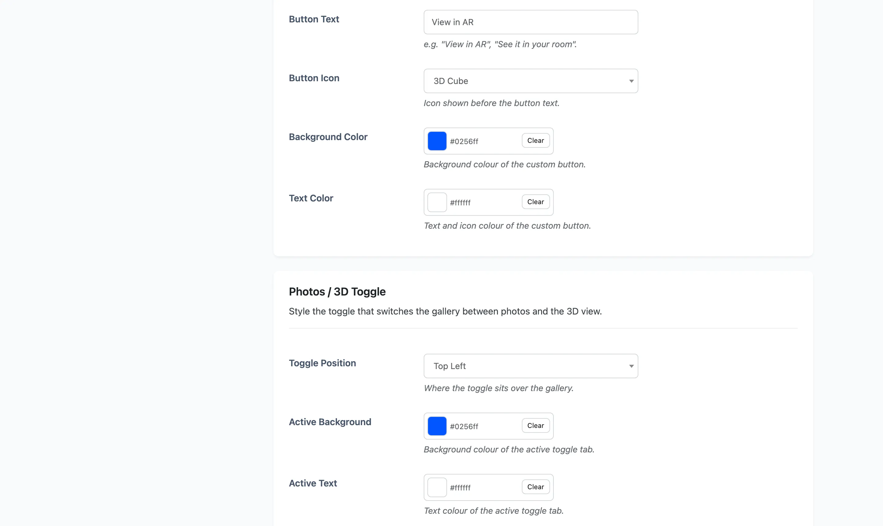
These four fields are used only when Button Style is Custom button.
Button Text
Section titled “Button Text”The label. Default View in AR.
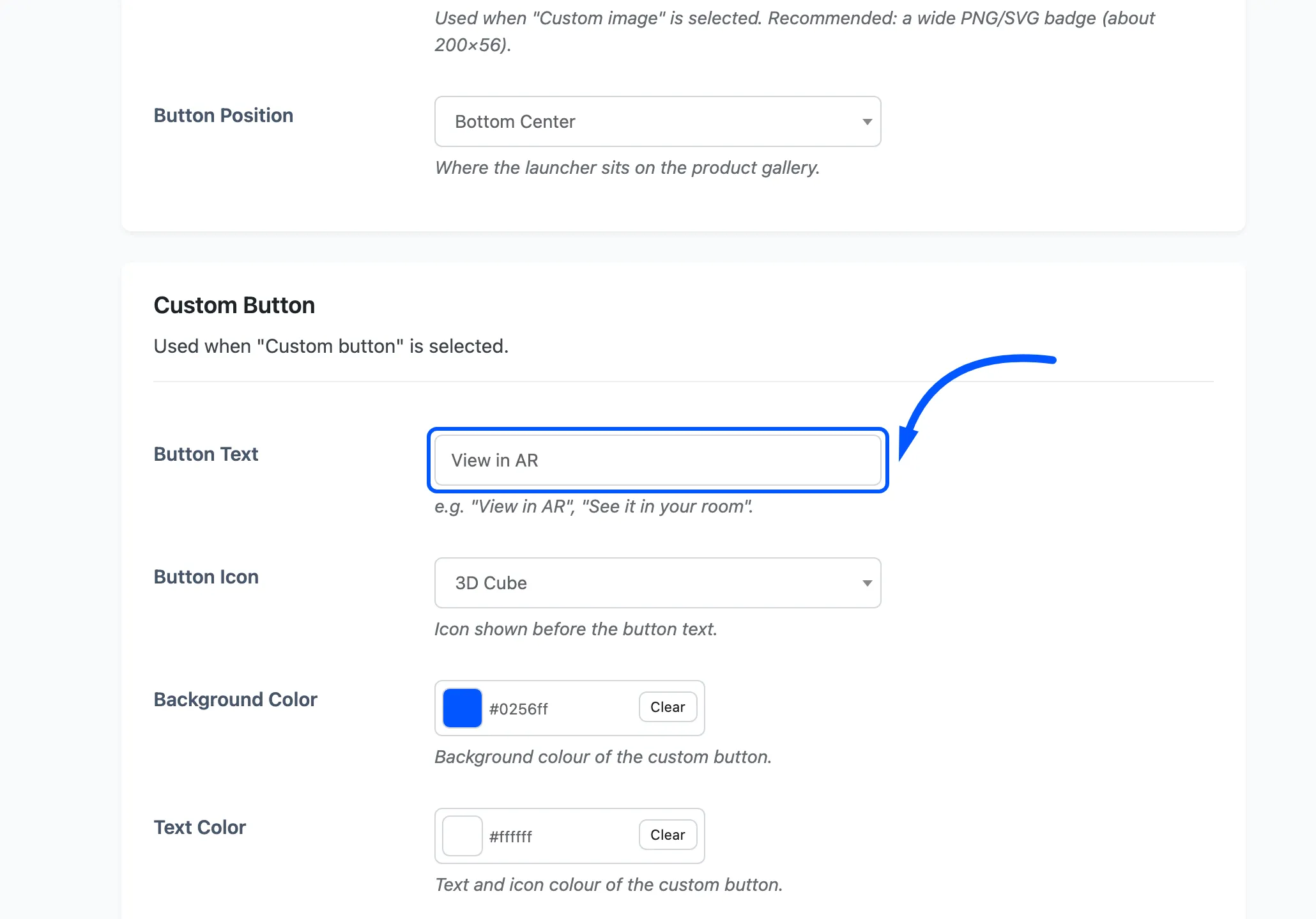
Short wins here, because the button sits over a photo. “See it in your room” is about the limit.
Button Icon
Section titled “Button Icon”The icon before the text. Default 3D Cube.
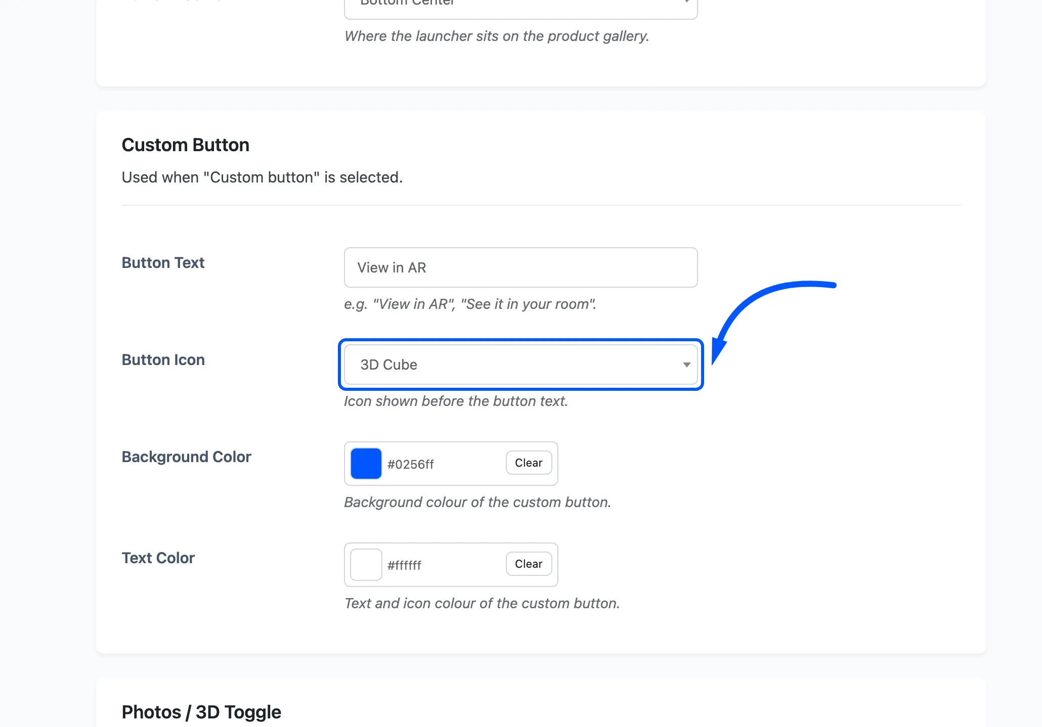
Four choices: 3D Cube, AR Frame, Eye and No icon.
Background Color and Text Color
Section titled “Background Color and Text Color”The button’s fill and its text and icon colour. Defaults #0256ff and #ffffff.
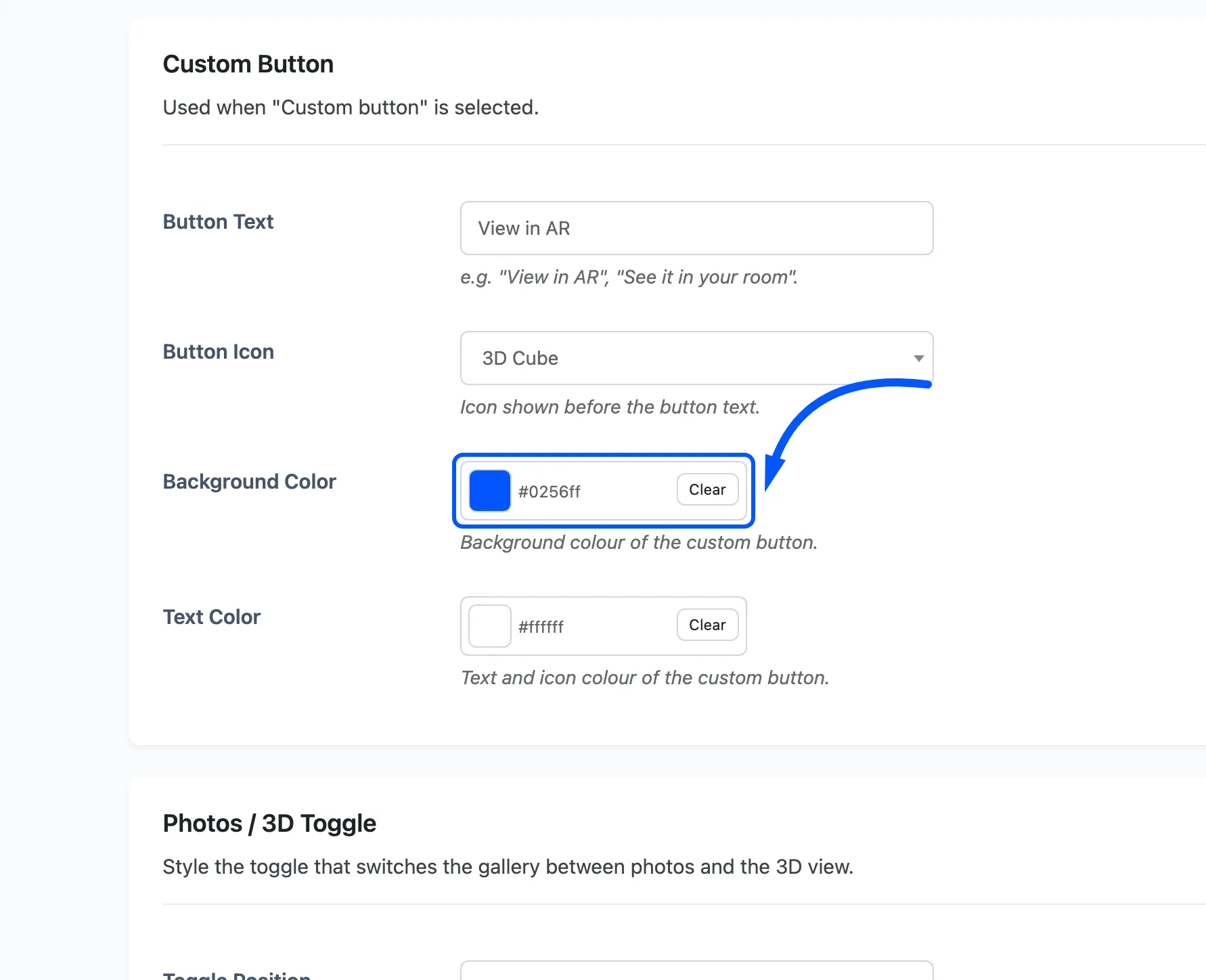
The button sits over product photography, so contrast matters more than brand match. A pale fill on a pale product photo disappears.
Photos / 3D Toggle
Section titled “Photos / 3D Toggle”The toggle that swaps the gallery between photos and the model.
Toggle Position
Section titled “Toggle Position”Which corner of the gallery it sits in. Default Top Left.
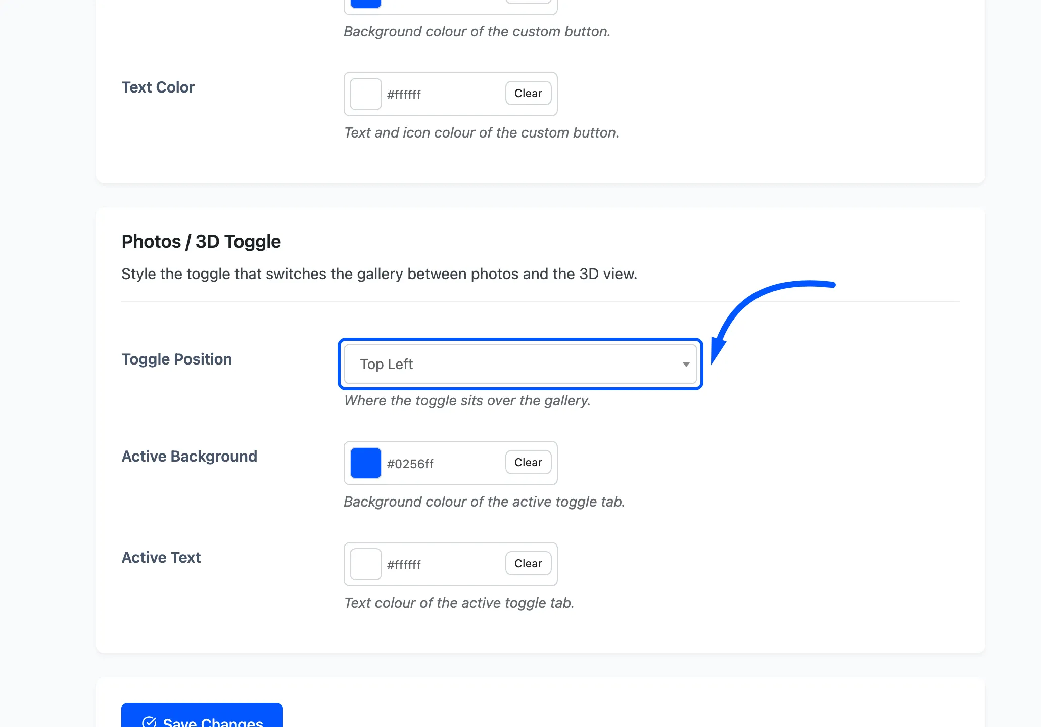
Four choices: Top Left, Top Right, Bottom Left and Bottom Right. A bottom position can collide with the launcher when that is also at the bottom. Move one of the two if they overlap on your theme.
Active Background and Active Text
Section titled “Active Background and Active Text”The colours of whichever tab is selected. Defaults #0256ff and #ffffff. The inactive tab stays
neutral, so these two are the whole styling of the control.
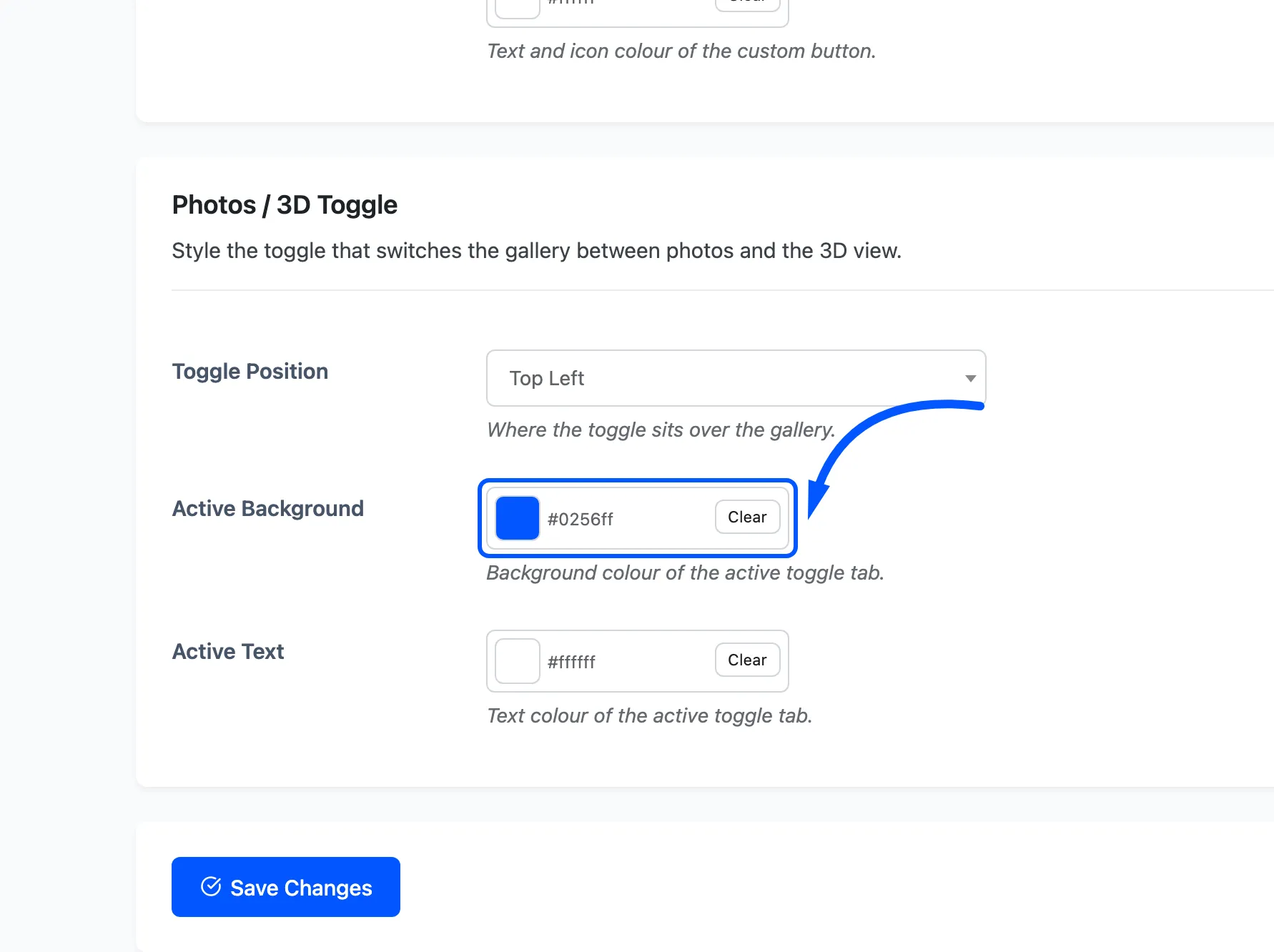
These two fields are free, on the General tab, because the free version has a toggle but no AR Button tab to hold them.