

Display Settings
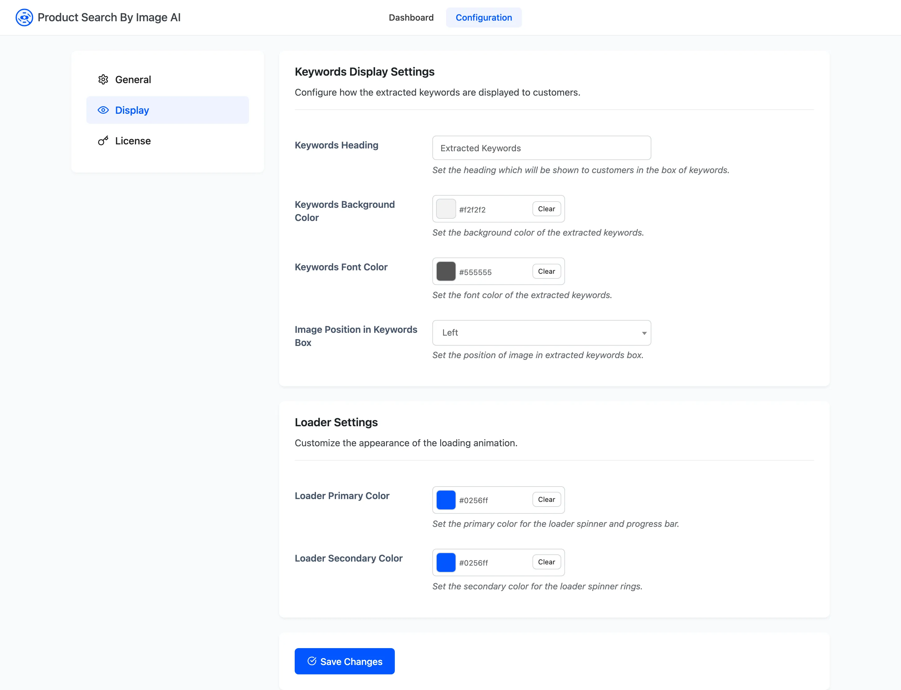
The Display tab styles the two things a shopper actually looks at: the loader while the photo is being read, and the keywords box on the results page.
Go to DevDiggers Plugins → Product Search By Image AI → Configuration → Display.
Nothing here changes what is found. It changes how the result is presented.
Keywords Display Settings
Section titled “Keywords Display Settings”Keywords Heading
Section titled “Keywords Heading”The line printed above the chips: Default Extracted Keywords.
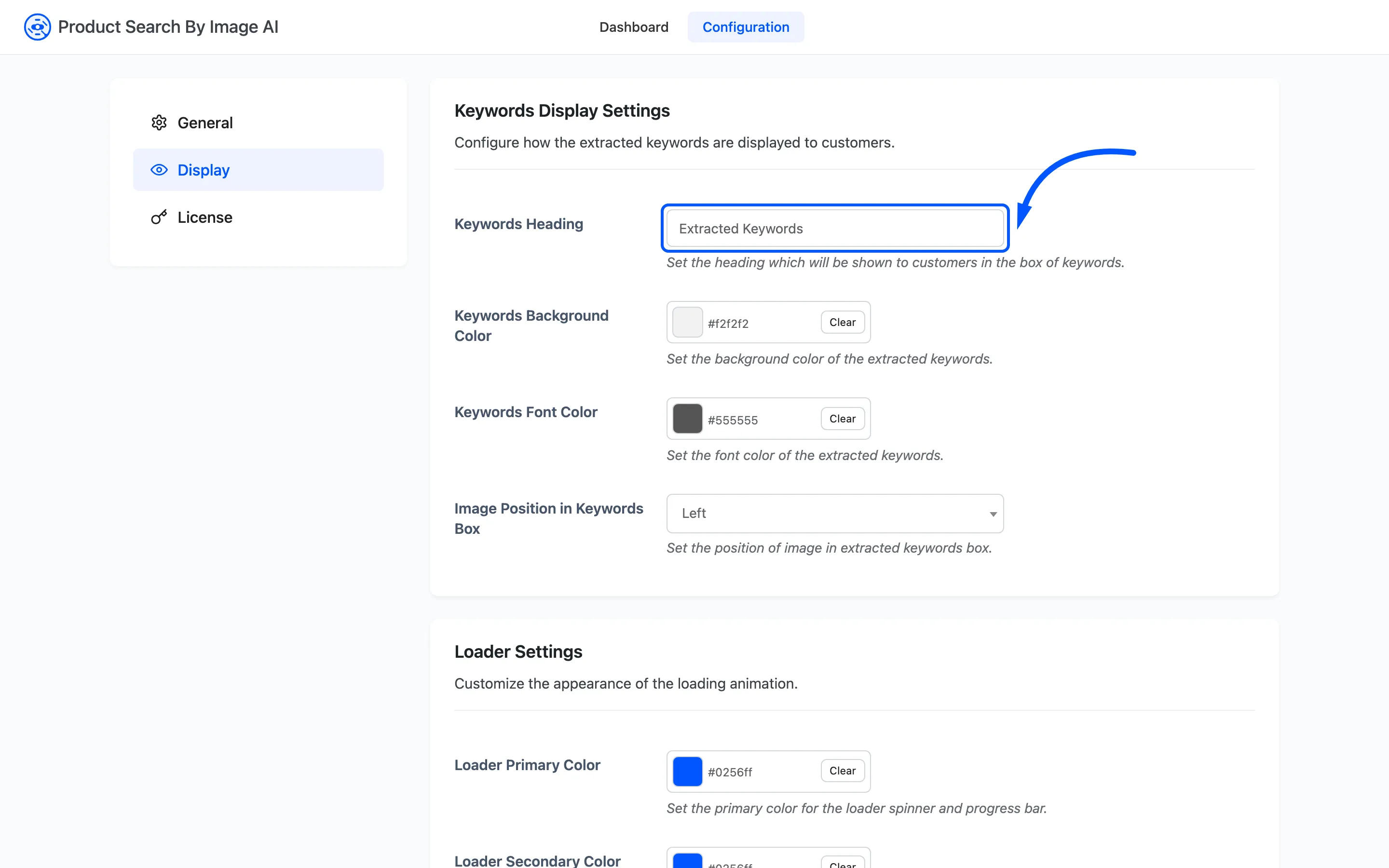
It is plain text, and it takes the place of the page title on that search. It is the first thing a shopper reads after the search runs. Something that explains the chips beats a label: “We found these in your photo” tells a shopper the chips are clickable in a way “Extracted Keywords” does not.
Keywords Background Color
Section titled “Keywords Background Color”The chip background: Default #f2f2f2.
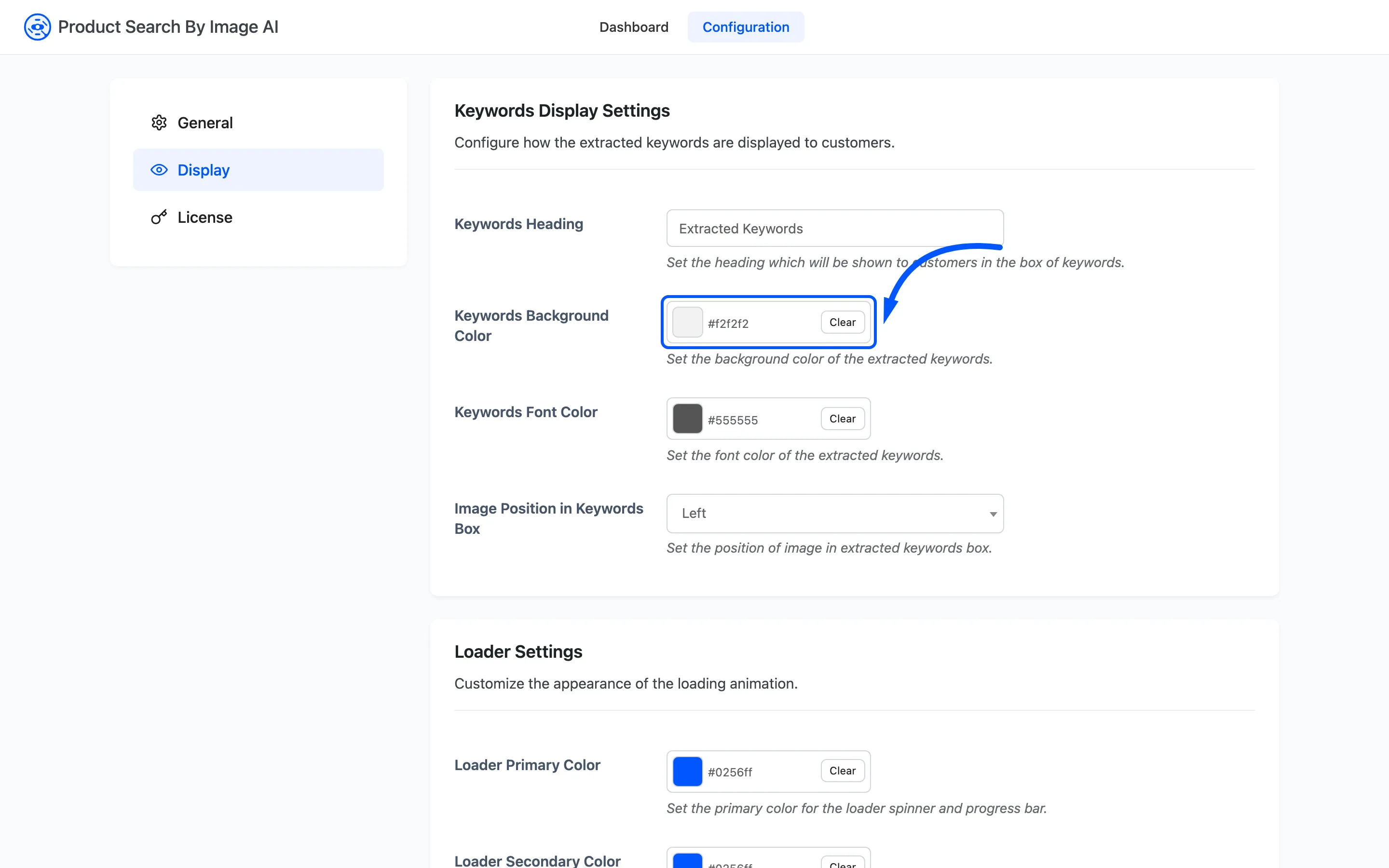
Keep it quiet. There can be up to fifty chips on that row, sitting above the products. A strong colour there competes with the thing the shopper came to see.
Keywords Font Color
Section titled “Keywords Font Color”The chip text colour: Default #555555.
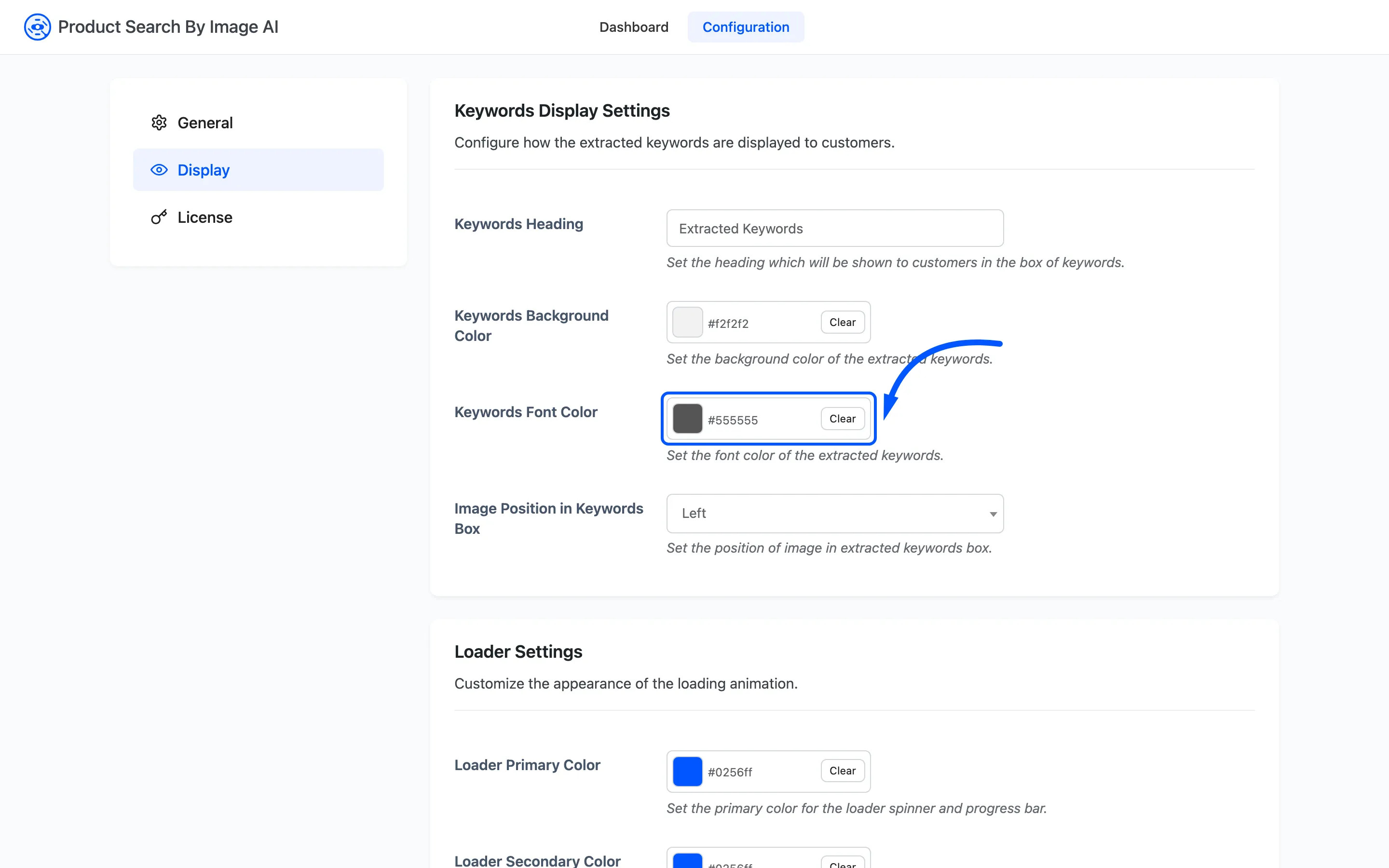
This field also sets the chip border. The plugin lightens whatever you pick and draws the chip outline in it, so the outline follows the text colour and there is no separate border field. Pick a text colour that reads on your background and the border takes care of itself.
Image Position in Keywords Box
Section titled “Image Position in Keywords Box”Which side of the chips the shopper’s photo sits on. Left or Right, default Left.
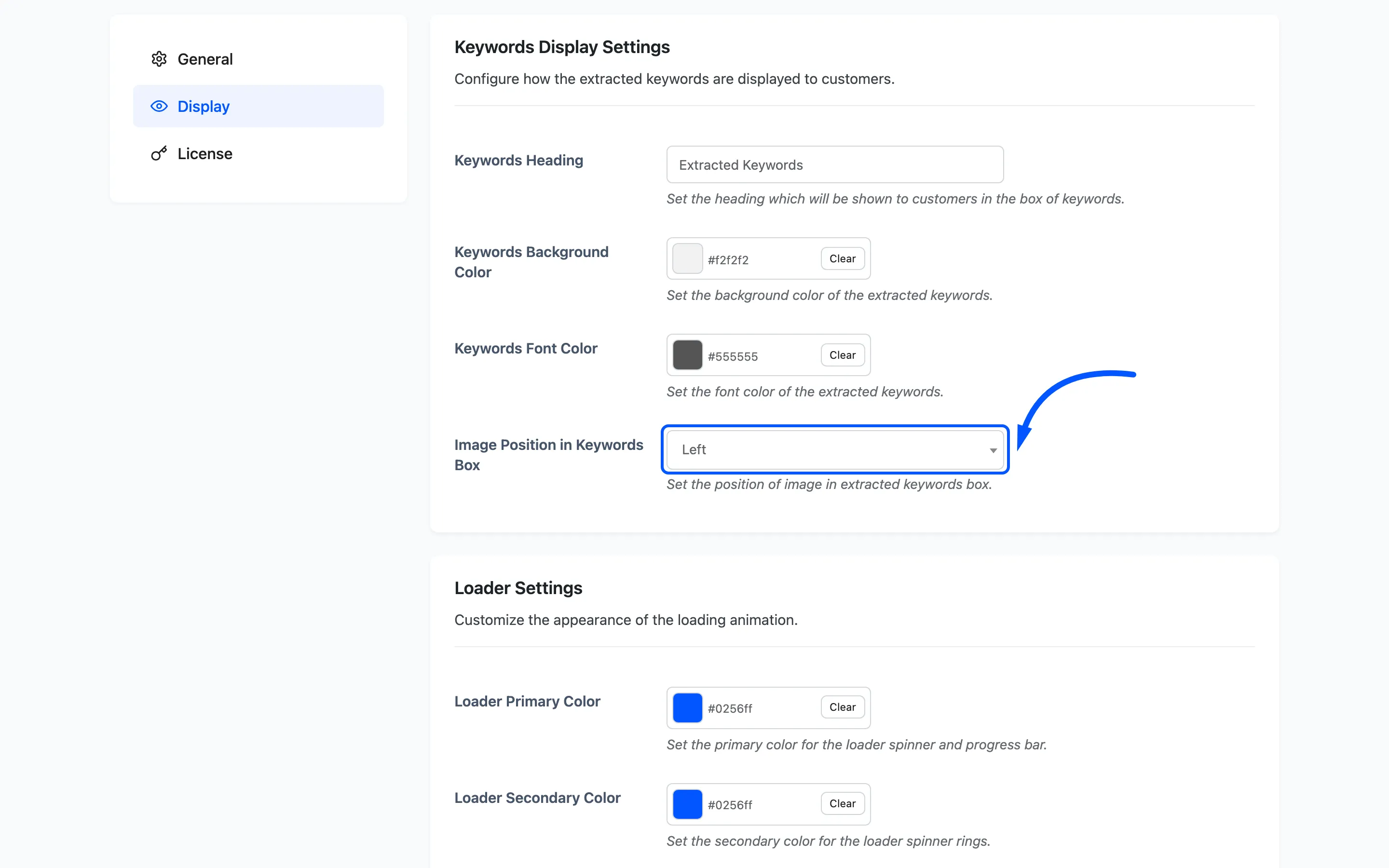
The photo occupies a fixed 110px column and the chips take the rest of the width. On a narrow phone the box drops to a single column and the setting stops mattering.
Loader Settings
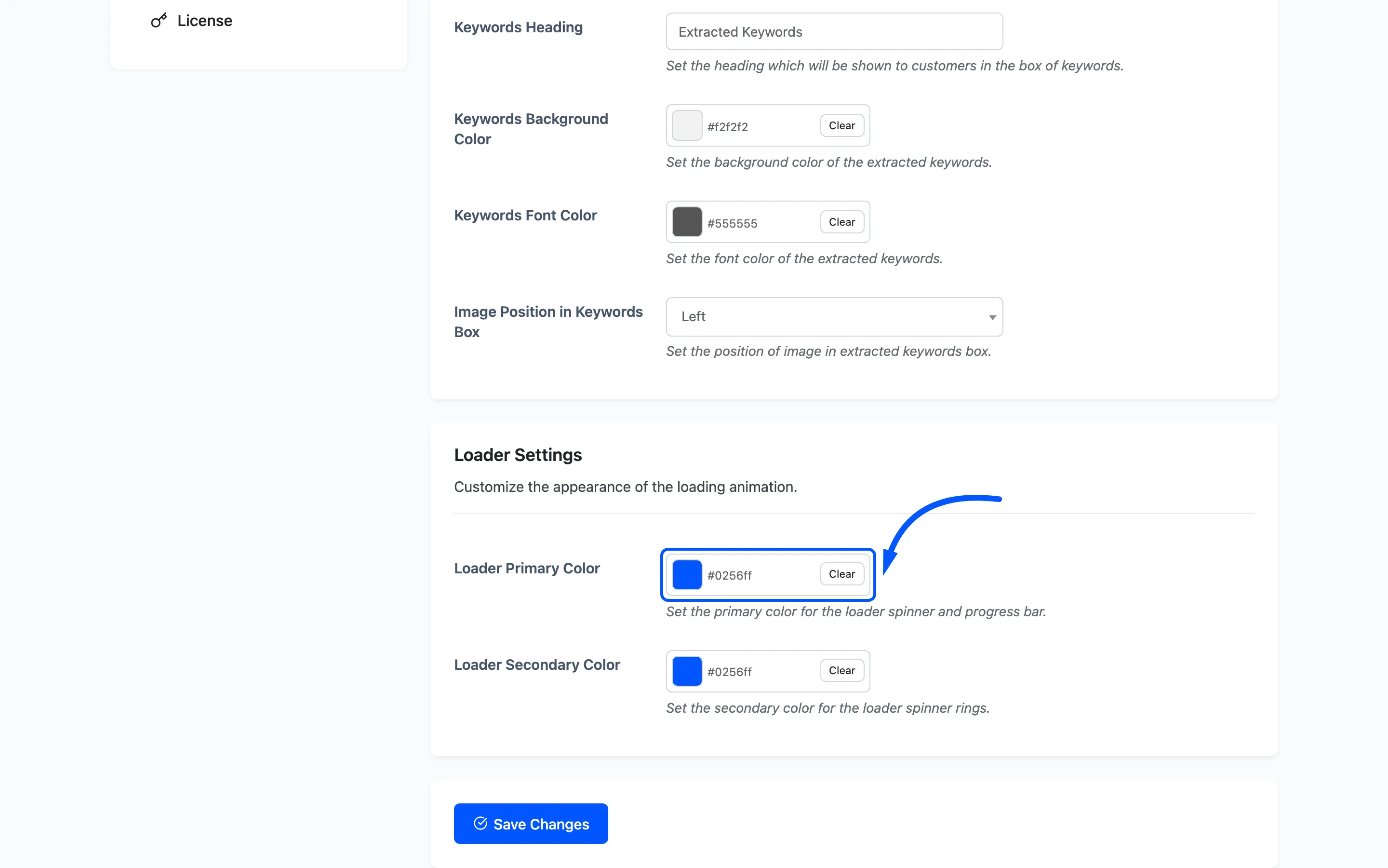
Section titled “Loader Settings”Loader Primary Color
Section titled “Loader Primary Color”The spinner’s main ring and the progress bar. Default #007cba.
Loader Secondary Color
Section titled “Loader Secondary Color”The alternating spinner rings: Default #00a0d2.
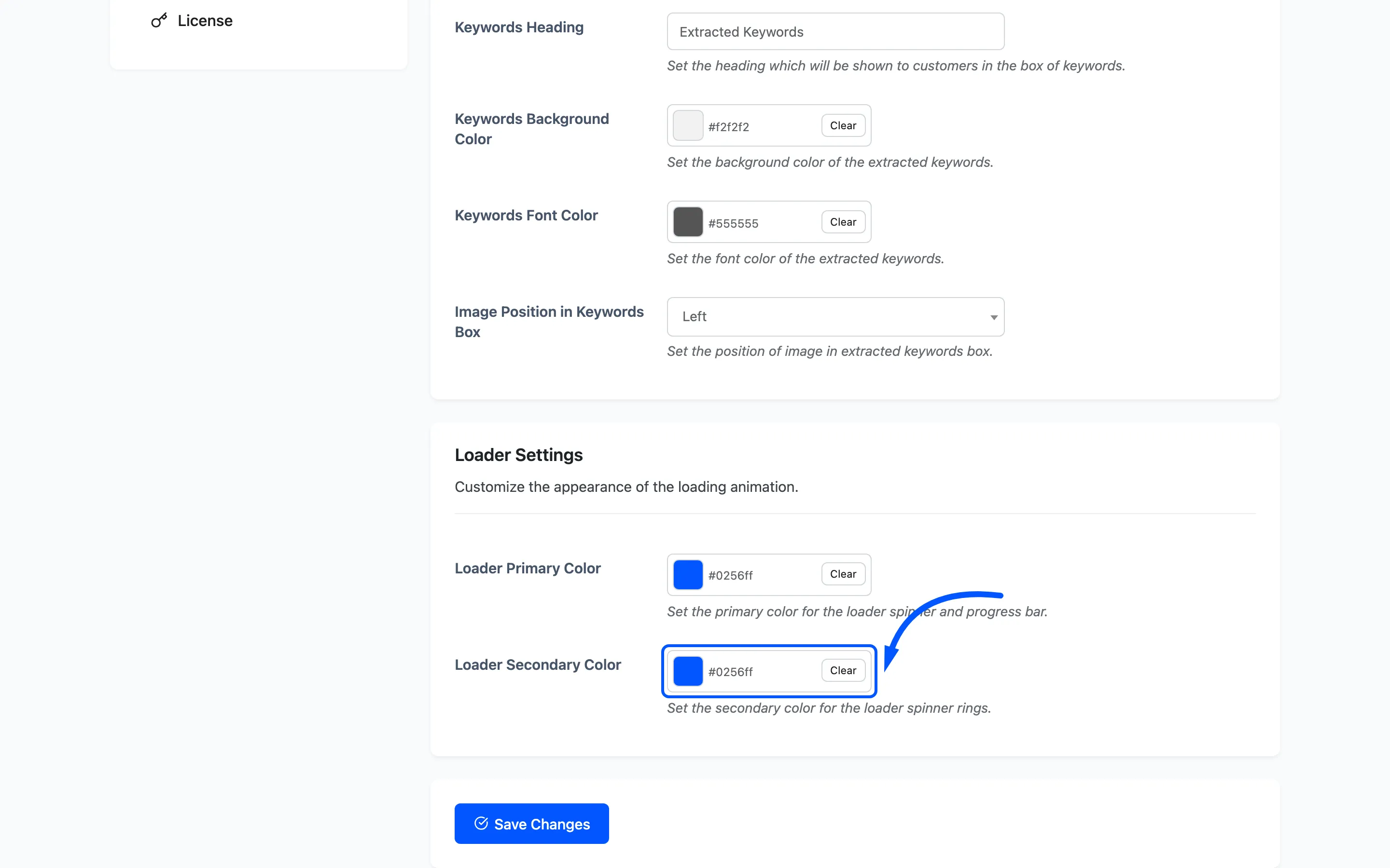
The loader draws four nested rings and alternates the two colours across them. The progress bar is a gradient from primary through secondary and back. Two shades of one brand colour reads as one component. Two unrelated colours reads as a fault.
The loader is on screen for the whole classification. On a shopper’s phone that can be several seconds, so it is worth matching to your brand.
Saving
Section titled “Saving”Save Changes writes all six fields together. The new colours appear on the next storefront page load.